Move beyond Pinterest boards and fleeting trends. Uncover the timeless design principles that resonate with your core identity—and learn exactly how to bring them to life in every room with confidence, clarity, and joy.
Your home should be a sanctuary that whispers you in every corner—not a carbon copy of a viral post or a magazine spread that felt exciting last season but now feels hollow. Yet so many of us cycle through paint swatches, furniture returns, and decor regrets because we’re searching for style outside ourselves instead of uncovering the authentic design language already woven into our memories, values, and daily rhythms. This guide introduces a thoughtful, psychologically informed framework to decode your innate aesthetic preferences. Through reflective exercises, historical context, practical application techniques, and solutions to real-world friction points, you’ll gain clarity to make intentional choices that create spaces you’ll connect with deeply—not just for a season, but for years to come. No design degree required. Just curiosity, a notebook, and the willingness to listen to what your own history has to teach you.
Introduction: Why “Finding Your Style” Feels So Elusive (And Why It Doesn’t Have To)
Walk into any bookstore or scroll online, and you’ll encounter a parade of design labels: Scandinavian minimalism! Japandi fusion! Grandmillennial maximalism! These categories promise clarity but often deliver confusion. You pin a moody, textured living room labeled “Modern Farmhouse,” then fall for a sleek, curved sofa tagged “Contemporary,” and suddenly your vision feels fragmented. You’re not indecisive—you’re navigating a landscape where style is presented as a costume to wear rather than a language to speak fluently. The frustration isn’t yours alone. Environmental psychology research consistently shows that spaces aligned with personal identity can support reduced stress, increased focus, and deeper connection with others. Conversely, environments that feel “inauthentic” may trigger subtle cognitive dissonance—a low-grade hum of unease often misattributed to “bad decorating.” This isn’t about aesthetics alone; it’s about psychological resonance. Drawing on established principles from design theory pioneers like Christopher Alexander (A Pattern Language) and contemporary studies in biophilic design and spatial cognition, this guide reframes style discovery as an act of self-knowledge. Your preferences aren’t random. They’re echoes of places that made you feel safe, inspired, or joyful. They’re reflections of values you hold dear—whether sustainability, hospitality, creativity, or calm. By approaching design through this lens, we shift from asking “What looks good?” to the far more powerful question: “What makes me feel truly at home?” This subtle pivot transforms the entire process from a superficial hunt for pretty objects into a meaningful exploration of identity. And that changes everything.
The Design DNA Framework: A Four-Step Path to Authentic, Enduring Style
Forget quizzes that box you into a single label (“You’re 70% Bohemian!”). True design identity is rarely monolithic. It’s a nuanced blend of influences, priorities, and emotional triggers unique to your life story. The Design DNA Framework is a systematic yet deeply personal methodology synthesized from established design theory, environmental psychology principles, and observed patterns in spaces people consistently describe as “feeling like home.” It moves beyond surface-level “vibes” to uncover foundational patterns that can guide decisions—from paint colors to furniture layouts—with greater confidence. This isn’t about memorizing style rules; it’s about building an internal compass. The framework unfolds in four intentional phases, each building on the last. Take your time. There is no rush. The goal is depth, not speed. Rushing this process is frequently cited as a reason spaces later feel “off” despite checking trendy boxes. True style clarity emerges from reflection, not reaction.
Step 1: The Archaeology of You — Unearthing Your Emotional Blueprint
Before you look at a single paint chip or furniture catalog, you must excavate the raw material of your design identity: your personal history. Your strongest style instincts aren’t invented; they’re remembered. This step is a gentle, guided journey inward. Grab a journal. Find a quiet space. Allow a dedicated block of time without distractions. Answer these prompts slowly, letting memories surface without judgment.
Prompt 1: The Sanctuary Memory
Close your eyes. Travel back to a place—from childhood or adulthood—where you felt an immediate, profound sense of peace, safety, or joy simply by being in the space. It could be your grandmother’s sunlit kitchen, a college dorm room you decorated with care, a cabin visited yearly, a library nook, even a favorite park bench. Don’t just recall the place—immerse yourself.
– What specific sensory details stand out? (The smell of old wood and lemon polish? The sound of rain on a tin roof? The feel of worn velvet on a chair?)
– What colors dominated? (Not paint names—describe them: “the deep green of pine shadows,” “the warm cream of afternoon light on plaster walls.”)
– What textures were present? (Rough-hewn stone? Smooth, cool tile? Nubby wool blankets?)
– How did the space function for you? (Was it a place for quiet reading? Lively family meals? Creative projects?)
Why this matters: These sensory anchors are pure, unfiltered style truth. They bypass trend influence and connect directly to your emotional needs. If your sanctuary memory involves the tactile warmth of knitted throws and the scent of aged paper, a stark, all-glass minimalist space may feel alienating—even if it’s currently popular. Honor these clues. They are your North Star.
Prompt 2: The Object Inventory
Look around your current home. Identify three objects you’ve kept for years—not because they’re valuable or match your decor, but because parting with them feels impossible. A chipped mug from a meaningful trip. A faded quilt. A smooth stone from a beach walk.
– Why does this object hold power for you? (Is it the memory it represents? Its shape? Its texture? The person who gave it to you?)
– What single word best describes its essence? (Comfort? Adventure? Heritage? Simplicity?)
Why this matters: These objects are physical manifestations of your values. They reveal what you actually cherish versus what you think you should cherish. If all three objects are handmade or tell a story, “craftsmanship” and “narrative” are likely core to your Design DNA. If they’re all functional tools you use daily, “utility” and “honesty of materials” may be key pillars. This inventory cuts through aspirational clutter.
Prompt 3: The Friction Audit
Think of a space you’ve lived in (or currently live in) that consistently caused low-grade irritation. Not because it was ugly, but because it didn’t work for how you live.
– What specific moments caused friction? (Tripping over a rug? Struggling to find keys by the door? Feeling exposed on a sofa facing a busy hallway?)
– What need was unmet? (Privacy? Organization? Connection?)
Why this matters: Friction points are equally revealing as joyful memories. They highlight non-negotiable functional needs. If you constantly felt exposed in an open-plan living area, “defined zones” and “visual privacy” are likely essential to your comfort—regardless of whether open plans are trending. Ignoring these needs in pursuit of a “look” often leads to future dissatisfaction.
Common Mistakes to Avoid in Step 1:
– Rushing the prompts. Set a timer. Sit with discomfort. The richest insights often emerge after the initial obvious answers.
– Judging your answers. There is no “right” sanctuary memory. A childhood treehouse holds as much validity as a luxury hotel suite. Authenticity trumps prestige.
– Skipping the sensory details. “Cozy” is vague. “The weight of a heavy wool blanket and the crackle of a wood fire” is actionable intelligence for future choices.
– Confusing nostalgia with limitation. You’re not trying to recreate your grandmother’s house exactly. You’re identifying the principles (warmth, hospitality, tactile richness) that you can reinterpret in a context that fits your present life.
This archaeological work forms the bedrock of your entire design journey. Without it, choices may feel arbitrary. With it, every subsequent decision—from the curve of a chair arm to the sheen of a paint finish—can be measured against this deeply personal benchmark: Does this resonate with the person I am and the life I live?
Step 2: The Style Spectrum Assessment — Decoding the Eight Core Design Archetypes
Now that you’ve gathered raw material from your personal history, it’s time to map it onto the broader landscape of design language. Think of design styles not as rigid boxes to squeeze yourself into, but as dialects within a larger language of space. Understanding the core grammar of each major style archetype allows you to borrow elements intentionally, mix with confidence, and avoid accidental clashes. Below is a nuanced exploration of eight foundational styles. For each, we examine:
– Historical Roots & Philosophy (Why it emerged; the human need it addresses)
– Defining Visual Elements (Lines, shapes, materials, colors)
– Sensory & Emotional Signature (How it feels to inhabit)
– Spot the Style (Key identifiers)
– Common Missteps (Where well-intentioned attempts go wrong)
– Your DNA Connection Point (How to link it back to Step 1 findings)
Important Note: Very few people align 100% with one style. Your goal is not to pick a label. It’s to identify which elements from which styles resonate with your Archaeology findings. You might love the warmth of Traditional (from your grandmother’s kitchen memory) but crave the clean lines of Modern (from your friction audit about visual clutter). That’s not confusion—that’s clarity waiting to be synthesized.
Traditional: The Language of Heritage and Comfort
- Historical Roots & Philosophy: Emerging from 18th- and 19th-century European design (Chippendale, Sheraton, Victorian), Traditional style speaks to a deep human need for continuity, order, and refined comfort. It’s not about stuffiness; it’s about honoring craftsmanship, symmetry, and spaces designed for gracious living and connection. It answers: “How do we create environments that feel established, welcoming, and timeless?”
- Defining Visual Elements:
- Lines & Shapes: Symmetrical layouts; curved silhouettes (cabriole legs, rolled arms); ornate but balanced details (dentil molding, wainscoting).
- Materials: Rich woods (mahogany, cherry, walnut); luxurious fabrics (velvet, silk, damask); polished brass or antique gold finishes.
- Colors: Deep, warm neutrals (navy, forest green, burgundy, cream, taupe); often used in layered, tonal schemes.
- Key Pieces: Wingback chairs, clawfoot tables, upholstered headboards, Persian or Oriental rugs, crystal chandeliers (used thoughtfully).
- Sensory & Emotional Signature: Warm, enveloping, dignified. It feels lived-in yet polished. There’s a sense of history and story in the objects. Light is often soft and layered (lampshades, sconces), creating intimate pools of warmth.
- Spot the Style: Look for symmetry (two matching lamps on a console), ornate wood details, and layered textiles with classic patterns (florals, damasks, stripes).
- Common Missteps:
- Over-accessorizing: Cluttering surfaces negates the intended elegance. Traditional thrives on curated collections, not random accumulation.
- Ignoring scale: Oversized traditional furniture in a small room feels oppressive. Proportion is essential.
- Using cheap reproductions: Flimsy furniture with applied “ornament” reads as costume, not character. Authenticity of material matters deeply here.
- Your DNA Connection Point: If your Sanctuary Memory involved a sense of “being welcomed into a story” or your Object Inventory included heirlooms, Traditional elements (like a well-upholstered chair or warm wood tones) may provide essential emotional grounding. Ask: “Does this element evoke the feeling of my memory, not just mimic its appearance?”
Modern: The Language of Clarity and Intention
- Historical Roots & Philosophy: Born from early-to-mid 20th century Bauhaus and International Style movements (think Mies van der Rohe’s “less is more”), Modern design champions function, honesty of materials, and spatial flow. It answers: “How can form follow function to create serene, uncluttered spaces that enhance how we live?”
- Defining Visual Elements:
- Lines & Shapes: Clean, straight lines; geometric forms; open floor plans; emphasis on negative space.
- Materials: Industrial honesty—exposed steel, concrete, glass; warm woods (teak, oak) used sparingly for contrast; leather.
- Colors: Neutral foundation (white, black, gray, beige); bold accent colors used sparingly and intentionally.
- Key Pieces: Low-profile sofas, cantilevered chairs, modular shelving, large unadorned windows, statement lighting (architectural pendants).
- Sensory & Emotional Signature: Calm, expansive, focused. Light floods the space. Surfaces are clear. There’s a palpable sense of order and intentionality. It feels edited.
- Spot the Style: Look for minimal ornamentation, visible structural elements (beams, ductwork), and furniture where construction is part of the aesthetic (exposed joinery).
- Common Missteps:
- Coldness: Using only cool materials (all gray concrete, black steel) without warmth (wood, textured wool) creates a sterile environment. Modern needs humanizing elements.
- Misinterpreting “minimal” as “empty”: Modern is about purposeful space, not barrenness. Every object should earn its place.
- Ignoring comfort: A beautiful but uncomfortable chair violates Modern’s core “function” principle. Prioritize ergonomics.
- Your DNA Connection Point: If your Friction Audit highlighted visual clutter or a need for calm, Modern’s principles of clarity and intentionality are powerful tools. If your Sanctuary Memory involved vast, open landscapes (a beach, a field), the spatial openness of Modern may resonate deeply. Ask: “Does this clean line create breathing room for my life, or does it feel isolating?”
Contemporary: The Language of Fluid Evolution
- Crucial Distinction: Modern is a historical period (roughly 1920s-1970s). Contemporary is of the moment—it evolves with current tastes, materials, and technologies. Today’s Contemporary style often blends Modern’s clean lines with warmer textures, organic shapes, and global influences. It answers: “How do we create spaces that feel current, adaptable, and reflective of today’s diverse lifestyles?”
- Defining Visual Elements (Current Interpretation):
- Lines & Shapes: Clean lines softened by organic curves (a round mirror, a sculptural sofa); asymmetrical balance.
- Materials: Mix of natural (light oak, rattan, linen, stone) and refined (matte black metal, polished plaster); emphasis on texture.
- Colors: Neutral base (warm whites, soft grays, greiges) with earthy accents (terracotta, olive, ochre) or muted jewel tones.
- Key Pieces: Statement organic-shaped coffee table, textured area rug, gallery wall with mixed media, sculptural lighting.
- Sensory & Emotional Signature: Fresh, balanced, approachable. It feels current without being trendy. There’s warmth and personality within a clean framework.
- Spot the Style: Look for the mix: a sleek sofa paired with a chunky knit throw; a minimalist console holding a collection of handmade ceramics.
- Common Missteps:
- Chasing every micro-trend: Contemporary is about curated relevance, not collecting every viral item. Anchor with timeless pieces.
- Lack of cohesion: Throwing together disparate “of-the-moment” items without a unifying thread (color, material, scale) creates chaos.
- Confusing it with Modern: Contemporary is generally warmer, softer, and more eclectic than strict Modern.
- Your DNA Connection Point: If your Object Inventory revealed a love for both vintage finds and new artisan pieces, Contemporary’s eclectic-but-cohesive approach is ideal. It’s the perfect bridge style for those whose DNA spans multiple archetypes. Ask: “Does this mix feel intentional and harmonious, or haphazard?”
Industrial: The Language of Authenticity and Grit
- Historical Roots & Philosophy: Inspired by repurposed factories, warehouses, and loft spaces of the late 20th century (particularly in NYC and London), Industrial style celebrates raw, unrefined materials and “honest” construction. It rejects polish in favor of character. It answers: “How can we find beauty in the functional, the weathered, and the authentic?”
- Defining Visual Elements:
- Lines & Shapes: Exposed structural elements (ducts, pipes, beams, brick); open, loft-like volumes; utilitarian furniture.
- Materials: Raw or distressed wood; exposed brick or concrete; aged metal (iron, steel, copper); leather.
- Colors: Monochromatic palette dominated by neutrals (charcoal, black, gray, brown, cream); pops of deep rust or forest green.
- Key Pieces: Metal factory carts (repurposed as consoles), Edison bulb lighting, leather club chairs, large sectional sofas on metal frames.
- Sensory & Emotional Signature: Edgy, grounded, masculine-leaning (though adaptable). It feels sturdy, honest, and full of character. There’s a tactile quality to every surface.
- Spot the Style: Look for exposed elements that are functional (not just decorative faux pipes), utilitarian furniture forms, and a predominance of raw, unfinished textures.
- Common Missteps:
- Overdoing the “rough” elements: An entire room of exposed brick, concrete floors, and metal can feel harsh. Balance is key—soften with large rugs, plush textiles, warm wood tones.
- Using cheap faux finishes: Fake brick veneer or poorly executed “distressed” furniture reads as tacky. Authenticity of material and patina is paramount.
- Ignoring acoustics: Hard surfaces amplify sound. Industrial spaces need textiles (rugs, curtains, upholstery) for comfort.
- Your DNA Connection Point: If your Sanctuary Memory involved a workshop, garage, or rustic cabin where function was paramount, Industrial’s honesty may resonate. If your Friction Audit mentioned spaces feeling “too precious” or “fragile,” Industrial’s durability and lack of pretense could be liberating. Ask: “Does this raw element feel authentic and grounding, or cold and unwelcoming?”
Scandinavian: The Language of Hygge and Human-Centered Design
- Historical Roots & Philosophy: Forged in the long, dark winters of Denmark, Sweden, and Norway, Scandinavian design (mid-20th century onward) is fundamentally about human well-being. It merges Modernism’s simplicity with warmth, light, and functionality for everyday life. “Hygge” (coziness) isn’t a trend here—it’s the core purpose. It answers: “How do we design spaces that nurture comfort, light, and connection in challenging environments?”
- Defining Visual Elements:
- Lines & Shapes: Clean, simple lines; functional forms; emphasis on light and airiness.
- Materials: Light woods (pine, ash, beech); wool, cotton, sheepskin; ceramic; glass.
- Colors: Predominantly white and light neutrals to maximize light reflection; soft pastels (blush, sky blue, sage) or muted earth tones as accents.
- Key Pieces: Wishbone chairs, modular shelving, sheepskin throws, simple ceramic tableware, abundant greenery, layered lighting (multiple small sources).
- Sensory & Emotional Signature: Airy, serene, deeply cozy. Light is paramount—both natural and layered artificial sources. Textures are soft and inviting. It feels lived-in and nurturing.
- Spot the Style: Look for light wood tones, abundant textiles (even in summer), functional yet beautiful objects, and strategic use of mirrors to bounce light.
- Common Missteps:
- Sterile minimalism: Forgetting the “hygge” element. Scandinavian isn’t cold white boxes. It requires texture, warmth, and personal touches.
- Overloading on mass-produced items: While accessible brands popularized the style, authentic Scandinavian design values craftsmanship. Mix affordable finds with meaningful, well-made pieces.
- Ignoring lighting layers: A single overhead light destroys the ambiance. Multiple light sources (floor lamps, table lamps, candles) are essential.
- Your DNA Connection Point: If your Sanctuary Memory involved feeling safe and warm during a storm, or your Object Inventory included soft textiles or handmade ceramics, Scandinavian principles are likely core to your comfort. If your Friction Audit mentioned spaces feeling “dark” or “uninviting,” this style’s focus on light and texture is transformative. Ask: “Does this choice add warmth, light, or comfort to my daily experience?”
- Seasonal Note (TAI): Rotate textiles with the seasons—lighter cottons in summer, heavier wools and layered throws in winter—to maintain comfort and connection to natural rhythms.
Bohemian (Boho): The Language of Story and Free Expression
- Historical Roots & Philosophy: Bohemian style draws from centuries of counterculture movements (artists, writers, travelers) who rejected rigid convention. Modern Boho is a global tapestry—inspired by Moroccan riads, Indian textiles, Mexican folk art, and vintage finds. It’s deeply personal, layered, and celebrates imperfection. It answers: “How can our homes become visual diaries of our journeys, passions, and individuality?”
- Defining Visual Elements:
- Lines & Shapes: Eclectic mix; no strict rules; organic, flowing forms dominate.
- Materials: Abundant textiles (kilims, macramé, ikat, embroidery); natural fibers (rattan, jute, cane); vintage and handmade objects; plants (lots of plants!).
- Colors: Rich, saturated, and layered—jewel tones (emerald, sapphire, ruby), earthy terracottas, mustard yellows, deep indigos. Patterns are mixed fearlessly.
- Key Pieces: Low seating (floor cushions, poufs), canopied beds, gallery walls with personal art, hanging plants, vintage trunks as coffee tables.
- Sensory & Emotional Signature: Vibrant, soulful, inviting. It feels collected over time, full of stories and personality. There’s a sense of abundance and creativity.
- Spot the Style: Look for layered rugs, abundant plants, mixed patterns that somehow work together, and objects that clearly have history or meaning.
- Common Missteps:
- Chaos vs. curated clutter: Boho requires intentional layering. Random accumulation feels messy. Create cohesion through a consistent color thread or repeating a key material (e.g., all wood tones are warm oak).
- Ignoring negative space: Even Boho needs breathing room. Overcrowding surfaces eliminates the joy of individual pieces.
- Cultural appropriation: Approach global elements with respect. Seek authentic sources, understand the significance of patterns/symbols where possible, and avoid stereotyping. Honor the culture, don’t just “decorate” with it.
- Your DNA Connection Point: If your Object Inventory was dominated by travel souvenirs, handmade items, or books, Boho’s narrative quality is likely essential. If your Sanctuary Memory involved a space full of art, music, or creative energy, this style’s expressive nature will resonate. Ask: “Does this layer tell my story, or is it just visual noise?”
Coastal: The Language of Serenity and Natural Rhythm
- Beyond the Cliché: True Coastal style is not about literal nautical kitsch (anchors everywhere, ship wheels). It’s about capturing the feeling of the coast: light, air, texture, and the calming rhythm of nature. It draws from Hamptons elegance, Mediterranean simplicity, and West Coast casualness. It answers: “How can we bring the restorative calm of the shoreline into our everyday lives?”
- Defining Visual Elements:
- Lines & Shapes: Clean but soft lines; organic shapes (driftwood, sea glass); airy, uncluttered spaces.
- Materials: Natural textures—light woods (bleached oak, driftwood), rattan, seagrass, linen, cotton, stone.
- Colors: Airy neutrals (white, sand, oat); soft blues and greens (like sea glass or shallow water); accents of coral or driftwood gray. Avoid primary navy and bright red.
- Key Pieces: Slipcovered sofas (in washable linen/cotton), woven pendant lights, jute or sisal rugs, open shelving displaying collected shells or ceramics, large mirrors to reflect light.
- Sensory & Emotional Signature: Calm, fresh, rejuvenating. It feels breezy and light. Textures evoke sand, sea, and sky. Light is soft and diffused.
- Spot the Style: Look for the palette (soft, airy, nature-inspired) and textures (woven, nubby, natural) rather than literal ocean motifs. A single piece of driftwood art is Coastal; a room full of rope and anchors is nautical theme-ing.
- Common Missteps:
- Theming: Overusing literal ocean decor makes it feel like a vacation rental, not a home. Suggest the coast, don’t illustrate it.
- Ignoring regional variation: “Coastal” in Maine (cooler grays, blues, rugged textures) differs from “Coastal” in Southern California (warmer beiges, terracotta, relaxed textures). Adapt to your environment and memories.
- Forgetting function: Slipcovers should be durable and washable. Rugs should withstand sandy feet. Coastal style must work for real life.
- Your DNA Connection Point: If your Sanctuary Memory was a beach, lake house, or any place where water brought you peace, Coastal’s sensory language (light, texture, color) will deeply resonate. If your Friction Audit mentioned needing more calm or connection to nature, this style’s biophilic elements are powerful. Ask: “Does this element evoke the feeling of the coast for me, or is it just a generic ‘beachy’ object?”
Rustic / Farmhouse: The Language of Hearth and Heritage
- Beyond the Shiplap: Authentic Rustic/Farmhouse style is rooted in agrarian life—functionality, durability, and connection to land and community. Modern interpretations (like “Modern Farmhouse”) blend these roots with cleaner lines. At its heart, it’s about warmth, simplicity, and honest materials. It answers: “How can we create spaces that feel grounded, welcoming, and connected to simpler rhythms?”
- Defining Visual Elements:
- Lines & Shapes: Simple, sturdy forms; reclaimed wood beams; apron-front (“farmhouse”) sinks; open shelving.
- Materials: Reclaimed or distressed wood; stone (fireplaces, countertops); wrought iron; galvanized metal; chunky knit textiles.
- Colors: Warm neutrals (creamy whites, soft grays, beige, charcoal); accents of black (for contrast); natural wood tones.
- Key Pieces: Large farmhouse table, Windsor chairs, vintage-inspired lighting (black metal pendants), open shelving in kitchen, deep soaking tub.
- Sensory & Emotional Signature: Warm, inviting, nostalgic (in a comforting way). It feels sturdy, practical, and full of heart. There’s a tactile, handcrafted quality.
- Spot the Style: Look for the use of reclaimed or distressed wood (not perfectly smooth new wood painted white), functional elements like open shelving for daily dishes, and a focus on the hearth (literal or metaphorical) as the heart of the home.
- Common Missteps:
- Over-sanitizing: Using pristine, new materials that mimic rustic looks (faux-distressed furniture, perfect shiplap) lacks soul. Authenticity of material and patina matters. Seek pieces with history or character.
- Ignoring scale: Massive reclaimed beams in a small suburban kitchen feel disproportionate. Adapt elements to your home’s actual architecture.
- Confusing “farmhouse” with “country clutter”: Authentic farmhouse style is uncluttered. Surfaces are clear; objects are functional or deeply meaningful.
- Your DNA Connection Point: If your Sanctuary Memory involved a family kitchen, a cabin, or any place centered around gathering and simple pleasures, Rustic/Farmhouse elements (a sturdy table, warm wood) will feel deeply right. If your Object Inventory included handmade pottery or tools, this style’s celebration of craftsmanship resonates. Ask: “Does this element feel warm, grounded, and welcoming—not just ‘old-looking’?”
The Style Spectrum Synthesis Table
| Style Archetype | Core Philosophy | Key Sensory Trigger | Best For If Your DNA Reveals… | Critical Balance Point |
|---|---|---|---|---|
| Traditional | Heritage, Order, Refined Comfort | Warm wood, layered textiles, symmetry | Need for stability, connection to history, love of craftsmanship | Avoid clutter; prioritize proportion and authentic materials |
| Modern | Clarity, Function, Spatial Serenity | Clean lines, open space, material honesty | Need for calm, reduction of visual noise, appreciation of structure | Inject warmth (wood, texture) to prevent sterility |
| Contemporary | Fluid, Current, Curated Relevance | Mix of clean lines + organic warmth | Desire for freshness without trend-chasing; eclectic tastes | Anchor with timeless pieces; ensure intentional cohesion |
| Industrial | Authenticity, Grit, Functional Beauty | Raw textures, exposed elements, utilitarian forms | Appreciation for honesty, durability, character over polish | Soften with textiles, warmth, and acoustic consideration |
| Scandinavian | Hygge, Light, Human-Centered Well-being | Light wood, layered textiles, abundant soft light | Need for coziness, maximizing light, nurturing daily rituals | Never sacrifice “hygge” (warmth/texture) for minimalism |
| Bohemian | Story, Expression, Global Soul | Layered textiles, plants, collected objects | Desire for personal narrative, creativity, cultural connection | Curate intentionally; create cohesion through color/material threads |
| Coastal | Serenity, Natural Rhythm, Airy Calm | Natural textures, soft airy palette, light diffusion | Need for peace, connection to nature, light-filled spaces | Suggest the coast; avoid literal nautical theming |
| Rustic/Farmhouse | Hearth, Heritage, Grounded Warmth | Reclaimed wood, sturdy forms, functional simplicity | Craving warmth, connection to land/community, simplicity | Prioritize authenticity of material; avoid “faux” distressing |
The Fundamental Principle: Your Design DNA is not a single style label. It is the unique proportion and interpretation of elements drawn from this spectrum that aligns with your emotional blueprint from Step 1. You might resonate with Scandinavian principles for light and hygge, Traditional elements for warmth and heritage objects, and a touch of Industrial for grounding texture. This blend is your authentic signature. Trying to force yourself into 100% of any one archetype is where frustration often begins.
Step 3: The Harmony Matrix — Blending Elements Without Creating Chaos
You’ve uncovered your emotional blueprint (Step 1) and understand the style spectrum (Step 2). Now comes the creative synthesis: how to blend elements intentionally to create a cohesive, personalized whole. This is where many guides fall short, leaving you with a room that feels like a disjointed collage. The Harmony Matrix provides three simple, powerful filters to evaluate every potential addition to your space. Apply these before you buy, paint, or arrange.
Filter 1: The Color & Texture Anchor
Every room benefits from a foundational palette—usually 1-2 dominant neutrals and 1-2 accent colors—that ties disparate elements together. This isn’t about matching everything perfectly. It’s about creating visual threads.
– How to apply it: Pull a color swatch or fabric sample from your most cherished object (from Step 1’s Object Inventory). This becomes your anchor. When considering a new item (a rug, a pillow, a lamp), hold it against your anchor. Does it contain at least one of these colors or a complementary texture? A Bohemian kilim rug can coexist with a Modern sofa if the rug contains the exact shade of charcoal gray in the sofa’s fabric. A Traditional wingback chair feels at home in a Contemporary room if its velvet upholstery matches the accent color in the abstract art on the wall.
– Pro Tip: Texture is a silent unifier. If colors feel disparate, repeat a key texture. If you love a rough-hewn Industrial coffee table and a soft Scandinavian sheepskin rug, repeat the wood tone in a picture frame or side table, and the wool texture in a throw pillow on the sofa. Texture creates subconscious cohesion.
– Real-Life Example: Sarah loved her grandmother’s floral Traditional armchair (emotional anchor) but lived in a Modern apartment with white walls and a gray sofa. Instead of hiding the chair, she used it as her color anchor. She pulled the deep navy and cream from the floral fabric. She added navy throw pillows to the gray sofa, a cream wool rug, and navy ceramic vases on the shelves. The chair no longer looked “out of place”; it became the intentional, meaningful focal point of a harmonious room. The colors created the bridge.
Filter 2: The Scale & Proportion Compass
Clashing scales create visual tension, even if colors match. A massive, ornate Traditional armoire will overwhelm a petite Scandinavian writing desk. Harmony comes from intentional relationships between sizes.
– How to apply it: Identify the dominant scale in your room. Is it mostly low-profile furniture (Modern, Scandinavian)? Or does it feature taller, more substantial pieces (Traditional, Rustic)? When adding a new item, ask: “Does its scale complement the existing rhythm, or disrupt it?” You can mix scales successfully, but it requires strategy. Place a tall, slender Industrial floor lamp next to (not in front of) a low Modern sofa to create vertical interest without blocking sightlines. Pair a large-scale Bohemian tapestry with a substantial, low-slung sofa—not a delicate, spindly chair.
– Pro Tip: Use visual balance principles. Avoid placing two large items side-by-side unless they are identical (like bookshelves). Break up large walls with a combination of one large piece (art) and two smaller groupings (shelves, sconces). This creates dynamic balance.
– Real-Life Example: Mark had a small living room with a compact Contemporary sectional. He fell in love with a large, rustic wooden coffee table he found at a flea market. Instinct said “too big.” Instead of passing it up, he used the Scale Compass. He placed the substantial table centrally but ensured adequate clearance around it for walking space. He then added two very small, delicate brass side tables on either end of the sofa. The contrast in scale (large table + small side tables) created intentional visual interest and prevented the room from feeling monotonous. The key was intentional placement and clearance.
Filter 3: The Narrative Thread
This is the most powerful filter—and the one most overlooked. Every object in your home should feel like it belongs to the same story. This story is your story, defined by Step 1.
– How to apply it: Before bringing an item home, ask: “What chapter of my story does this represent?” Does the vintage map on the wall connect to your love of travel (Sanctuary Memory: backpacking through Europe)? Does the hand-thrown pottery mug reflect your value of supporting local artisans (Object Inventory: handmade items)? Does the deep, comfortable reading chair honor your need for quiet reflection (Friction Audit: lack of a dedicated quiet spot)? When items share a narrative thread—even if stylistically diverse—they feel cohesive. A sleek Modern desk holds meaning because it’s where you write; a chunky Rustic bookshelf holds your well-loved novels. They belong together because they serve your life.
– Pro Tip: Create “micro-narratives” within rooms. Your entryway tells the story of “welcome” (a bench for removing shoes, a bowl for keys, a small plant for life). Your kitchen island tells the story of “connection” (open shelves for daily dishes used in family meals, a vase for flowers from the garden).
– Real-Life Example: Lena’s DNA blended Scandinavian (love of light, hygge) with Bohemian (love of travel, textiles). Her living room could have felt chaotic. Instead, she established a clear narrative: “A sanctuary for connection and creativity.” The light wood floors and white walls (Scandinavian) provided the calm canvas. The layered textiles—a Turkish kilim rug, an Indian block-print throw, a Peruvian alpaca pillow—weren’t random. Each was acquired during meaningful trips with her partner. They were displayed with small framed photos from those trips nearby. The narrative (“our journey together”) unified the eclectic textiles. A simple Scandinavian-style shelf held her ceramics collection (another passion). Every element served the story. The room felt deeply personal, intentional, and harmonious—not like a style mashup.
The Harmony Matrix in Action: A Room Walkthrough
Imagine you’re designing a bedroom. Your Archaeology (Step 1) revealed:
– Sanctuary Memory: Your childhood bedroom with soft morning light filtering through linen curtains, the smell of old books, and the deep comfort of a well-worn quilt.
– Object Inventory: A vintage quilt from your great-grandmother, a smooth river stone from a favorite hike, a well-loved leather-bound journal.
– Friction Audit: Previous bedrooms felt either too sterile (all white, no personality) or too cluttered (surfaces covered).
Applying the Matrix:
1. Color & Texture Anchor: Pull colors from the quilt—soft cream, faded indigo, warm taupe. Anchor textures: linen (curtains/memory), worn cotton (quilt), smooth leather (journal), cool stone (river stone).
2. Scale & Proportion Compass: Choose a low-profile, upholstered bed frame (Modern influence for calm) in a warm taupe fabric. It’s substantial but not overwhelming. Nightstands are simple, light wood (Scandinavian) with clean lines—small enough to not crowd the bed, large enough to hold a lamp and journal.
3. Narrative Thread: “A restful retreat that honors heritage and personal journeys.”
– Bed: Upholstered in taupe linen (texture anchor, connects to memory of soft fabrics).
– Quilt: Draped at the foot of the bed—not hidden. It’s the emotional heart of the room (narrative: heritage).
– Art: Above the bed, a simple framed print of a mountain range (narrative: connection to nature/hikes; color: soft indigo from quilt).
– Nightstand: Holds the leather journal and a small dish holding the river stone (narrative: personal rituals, grounding).
– Lighting: A woven rattan pendant (texture anchor: natural fiber; style: subtle Bohemian warmth) provides soft, diffused light for reading.
– Window: Linen curtains in cream (color anchor, sensory memory of light).
– Floor: A small, textured wool rug in cream and taupe beside the bed (texture anchor, warmth underfoot).
– Seasonal Adaptation (TAI): In cooler months, add a heavier wool blanket in taupe; in warmer months, swap to a lighter cotton coverlet in cream.
No single item screams one style label. Yet every choice is filtered through your personal blueprint and the Harmony Matrix. The result feels unmistakably yours—calm, meaningful, and cohesive. This is the power of moving beyond labels.
Step 4: The Authenticity Filter — Separating Fleeting Trends from Timeless Truths
You have your blueprint. You understand the styles. You know how to blend harmoniously. Now, protect your vision from the siren song of trends. Trends aren’t inherently bad—they can inject freshness. But adopting them without filtering them through your Design DNA is a common path to regret and a home that feels dated the moment the trend fades. The Authenticity Filter is a simple three-question checkpoint for any item, color, or idea you’re considering.
Question 1: “Does this resonate with my emotional blueprint (Step 1), or just my aspirational Pinterest board?”
Pause. Close your eyes. Imagine this item in your space after the initial excitement wears off—six months from now, on a Tuesday morning when you’re rushing to make coffee. Does it still bring you a flicker of joy, comfort, or calm? Or does it feel like a costume you’re wearing? If your Sanctuary Memory was all about warm, textured coziness, will that ultra-sleek, all-glass coffee table truly feel welcoming when you’re curled up with a book? Be honest with yourself. Trends often appeal to our aspirational self (the person who hosts perfect dinner parties daily), while your blueprint speaks to your actual self (who values quiet mornings and comfortable seating). Honor your actual self.
– Trend Example: “Quiet Luxury” (think beige-on-beige, ultra-minimal). If your DNA craves color and pattern (Bohemian/Coastal influences), forcing a monochromatic beige scheme may feel stifling, no matter how “elevated” it looks online. Authenticity would be incorporating one high-quality, textural neutral piece (like a beautiful linen sofa) while keeping your vibrant art and textiles.
– Action Step: Keep your Step 1 journal nearby when shopping or browsing. Physically touch the page describing your Sanctuary Memory. Does the item in question align with that feeling?
Question 2: “Is this a core element or an accent?”
This is the most practical filter. Core elements are expensive, hard to change, and set the foundational tone of a room: large furniture (sofas, beds, dining tables), flooring, cabinetry, major wall colors. Accent elements are affordable, easy to swap, and add personality: pillows, throws, art, lamps, small decor, paint on a single accent wall.
– The Rule: Invest in timelessness for core elements. Play with trends in accents.
– Core Element Decision: Choosing a sofa? Base it on your Harmony Matrix (Step 3). A well-proportioned sofa in a neutral fabric that matches your Color Anchor will serve you for years. Avoid buying a sofa in this season’s “it” color unless that color is deeply rooted in your blueprint (e.g., it’s the exact green from your Sanctuary Memory of a forest).
– Accent Element Freedom: Love the current trend for curved mirrors? Buy one! It’s an accent. If you tire of it in two years, swap it out guilt-free. Want to try a bold wallpaper? Use it in a small powder room (an accent space) or on the back of bookshelves—not on all four walls of your main living area.
– Why it works: This strategy future-proofs your home. Your core investment remains stable and authentic. Your accents allow your space to evolve with you, reflecting current interests without requiring major renovation. It reduces decision fatigue and financial risk.
– Real-Life Application: Maria loved the “Grandmillennial” trend (florals, ruffles, traditional patterns). Her blueprint, however, was strongly Scandinavian (light, airy, minimal). Instead of reupholstering her entire living room in chintz, she used the Accent/Core filter. She kept her light wood floors, white walls, and simple linen sofa (core = timeless Scandinavian). She then added accent pillows with a subtle, modern floral print in her anchor colors (cream and soft blue), and displayed her grandmother’s porcelain teacups on an open shelf. She honored the trend’s spirit (connection to heritage) in a way that harmonized with her DNA, without compromising her core aesthetic. She felt current and authentic.
Question 3: “What is the human story behind this?”
Trends are often mass-produced, anonymous, and disconnected from meaning. Authentic style is infused with story—whether it’s the history of an object, the craft of its maker, or its connection to your life. Before buying, especially for core or meaningful accent pieces, consider the context.
– For vintage/antique: Where did it come from? What era does it represent? Does its history resonate with you? (A mid-century credenza represents post-war optimism and innovation—a story that might align with your values.)
– For new items: Who made it? What materials were used? Are they sustainable? Does the brand’s ethos align with your values? (Choosing a hand-thrown mug from a local potter supports community and craftsmanship—values that might be core to your Rustic/Farmhouse DNA.)
– For personal items: Does this object represent a memory, a person, or a value? (The river stone isn’t just decor; it’s a tactile reminder of peace found on a specific hike.)
– Why it matters: Objects with story create emotional resonance. They transform a room from a decorated box into a lived-in home. They are less susceptible to trend cycles because their value is personal, not market-driven. A mass-produced “farmhouse” sign may feel hollow. A cutting board carved by your uncle, used for family meals, radiates authenticity.
– Action Step: Implement a “one meaningful item per room” rule. Before adding generic decor, ask: “Can I replace this with something that tells my story?” A gallery wall of generic prints vs. a gallery wall of family photos, ticket stubs, and children’s artwork. The latter is authentic. The former is decoration.
Navigating Trend Cycles with Confidence
Trends follow observable cycles. Recognizing this reduces FOMO (fear of missing out). That “new” curved sofa shape? It was popular decades ago. Terrazzo floors? Dominant in previous eras. Understanding this helps you discern:
– Micro-trends: Short-lived (under 2 years), often driven by social media virality (e.g., specific color of the month, a particular decorative object). Filter strictly through Questions 1 & 2. Only adopt if it passes the Authenticity Filter and is an accent.
– Macro-trends: Longer-lasting shifts reflecting broader cultural values (e.g., sustained interest in sustainability, biophilic design, multi-functional spaces). These often align with timeless principles. If your blueprint values connection to nature (Coastal, Scandinavian DNA), incorporating more plants and natural light isn’t “following a trend”—it’s honoring your core needs. These macro-shifts are often safe to integrate thoughtfully.
Your Design DNA is your anchor. Trends are the weather—constantly changing. A strong anchor (your blueprint) allows you to enjoy the sunshine of a trend you love without being capsized by the storm of regret when it passes. You gain the confidence to say, “That’s beautiful, but it’s not me,” without guilt. Or, “I love that idea; how can I adapt its essence to fit my authentic style?” This is the pinnacle of style maturity: not rejecting trends outright, but curating them with intention.
Applying Your Design DNA Room by Room: From Vision to Reality
Understanding your DNA is transformative. Applying it consistently across your home is where magic happens. A cohesive home doesn’t mean every room looks identical. It means every room feels like it belongs to the same thoughtful narrative—your narrative. Below is a tailored guide for translating your unique blueprint into four key living spaces. For each room, we explore:
– Core Function & Emotional Need (What must this room do for you?)
– DNA Translation Checklist (Specific prompts to apply your blueprint)
– Style Blend Examples (How different DNA combinations manifest)
– Budget-Smart Implementation (Prioritizing impact)
– Common Room-Specific Frictions & Solutions
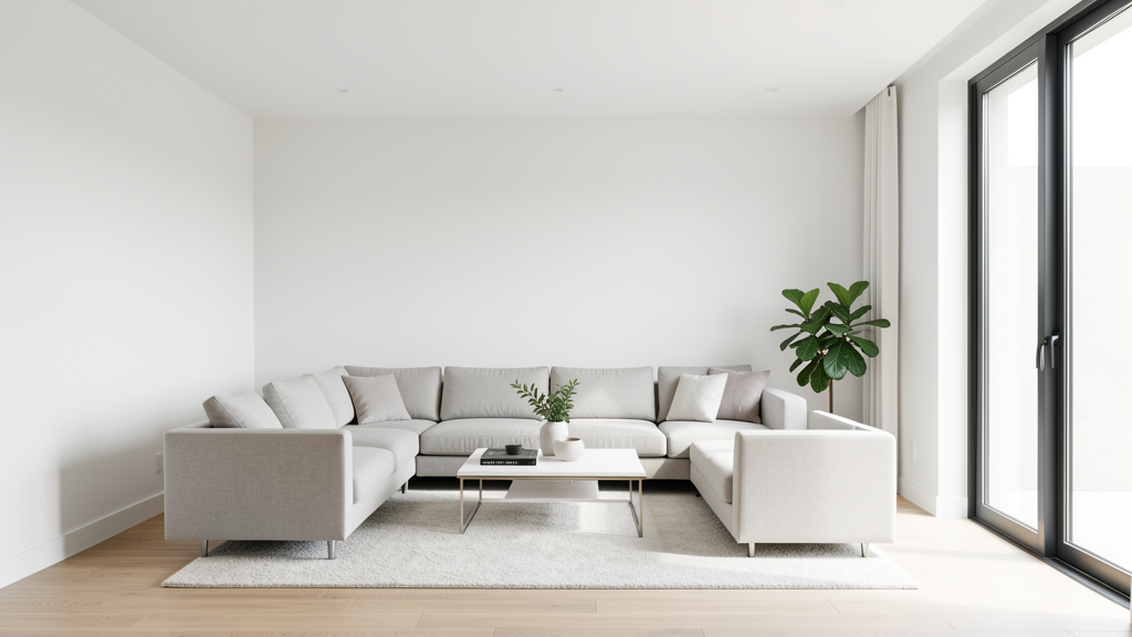
The Living Room: The Heartbeat of Connection
- Core Function & Emotional Need: This is rarely just “watching TV.” Dig deeper. Is it for deep conversation with a partner? Hosting lively game nights with friends? Quiet reading nooks for solo recharge? Family movie cuddles? Your room’s layout and choices must serve its primary emotional function. A room designed for lively connection will feel isolating if your need is quiet intimacy, and vice versa.
- DNA Translation Checklist:
- Recall your Sanctuary Memory: What feeling from that memory do you want to evoke here? (Warmth? Openness? Coziness?) How can furniture arrangement or textiles create that?
- Review your Friction Audit: What past living room frustrations must be solved? (e.g., “No one sits together” → arrange seating in a conversational circle; “Too dark” → prioritize layered lighting plan).
- Identify your Narrative Thread: What story should this room tell? (“Our home is a place of welcome,” “This is where we create memories,” “A calm retreat from busy lives”). Let this guide art and object choices.
- Apply the Harmony Matrix:
- Color Anchor: Pull from a meaningful object (e.g., the blue in a travel photo).
- Scale Compass: Ensure seating arrangement allows easy conversation (sofas/chairs facing each other, not all facing the TV).
- Narrative Thread: Display objects that support the story (e.g., a basket of board games for “connection,” a well-stocked bookshelf for “curiosity”).
- Style Blend Examples:
- Scandinavian (60%) + Bohemian (40%): Light wood floors, white walls, simple linen sofa (Scandi base). Layered with a vintage Turkish rug, macramé wall hanging, and abundant plants (Boho accents). Cohesion comes from the shared love of natural materials and texture; the neutral Scandi base prevents Boho chaos. Narrative: “A light-filled, creative sanctuary for gathering.”
- Modern (70%) + Traditional (30%): Clean-lined sectional, open floor plan, large unadorned windows (Modern core). Anchored by a single, beautifully proportioned Traditional wingback chair in a rich velvet (Traditional accent), and symmetrical sconces flanking the fireplace. Cohesion comes from the velvet color matching the sofa’s accent pillows; the Traditional elements add warmth and heritage without clutter. Narrative: “Serene modern living, grounded in comfort and history.”
- Budget-Smart Implementation:
- High Impact, Low Cost: Paint is transformative. Choose a color that supports your emotional need (warm beige for coziness, soft gray for calm). Rearrange existing furniture to improve flow and conversation. Deep clean windows to maximize natural light (critical for Scandinavian/Coastal DNA).
- Medium Investment: A quality area rug defines the space and adds crucial texture/color (your Color Anchor!). Update lighting—replace a harsh overhead with floor lamps and table lamps for layered, flattering light (essential for Hygge).
- Save for Later: Large furniture (sofa, sectional). Wait until you’re clear on scale, comfort, and fabric that aligns with your DNA. Rent or buy secondhand temporarily if needed.
- Common Frictions & Solutions:
- Friction: “Open-plan living/dining/kitchen feels chaotic.”
Solution: Use area rugs and furniture arrangement to define zones. A rug under the sofa group signals “living area.” A console table behind the sofa can subtly separate spaces. Repeat a color or material (e.g., wood tone) across zones for cohesion. - Friction: “TV dominates the room.”
Solution: If connection is the priority, avoid making the TV the focal point. Place it off-center, use a media console with doors to hide it when not in use, or invest in a TV that displays art. Arrange seating primarily for conversation, with the TV as a secondary option. - Friction: “Too many competing styles from inherited furniture.”
Solution: Apply the Harmony Matrix rigorously. Choose one inherited piece as your anchor (e.g., Grandma’s armchair). Use its colors and wood tone to select new pieces that complement it. Repurpose other inherited items in less prominent rooms (guest bedroom, home office) where they can shine without clashing.
- Friction: “Open-plan living/dining/kitchen feels chaotic.”
The Kitchen: The Soul of Nourishment and Ritual
- Core Function & Emotional Need: Beyond cooking, what role does the kitchen play? Is it the command center for family logistics? A serene space for mindful morning coffee? A bustling hub for entertaining? The emotional need shapes everything—from counter height to storage solutions. A kitchen designed solely for efficiency will feel cold if your need is connection; one designed for large gatherings will feel overwhelming if you cook solo.
- DNA Translation Checklist:
- Sanctuary Memory Connection: Does your memory involve the warmth of a kitchen? Incorporate elements that evoke that sensory feeling (e.g., warm wood tones, soft lighting over the sink, the sound of a ticking clock).
- Friction Audit Focus: What kitchen frustrations drain your joy? (e.g., “Can’t find anything” → prioritize intuitive organization; “Feels dark and closed off” → explore lighting or layout tweaks within budget).
- Object Inventory Insight: Do meaningful objects relate to food, craft, or gathering? (A cherished mixing bowl, pottery from a market). How can these be displayed functionally? Open shelving for daily-use dishes you love turns storage into narrative.
- Harmony Matrix Application:
- Color Anchor: Pull from your favorite dishware or a meaningful kitchen memory (e.g., the green of herbs from your garden).
- Scale Compass: Ensure countertops have clear zones (prep, cooking, cleanup). Avoid overcrowding with small appliances.
- Narrative Thread: “This kitchen nourishes body and spirit.” Display cookbooks you use, herbs on the windowsill, a small vase with flowers.
- Style Blend Examples:
- Rustic/Farmhouse (50%) + Contemporary (50%): Shaker-style cabinets in a warm white (Farmhouse simplicity), paired with sleek matte black hardware and open shelving displaying minimalist ceramic dishes (Contemporary edge). A large farmhouse sink is functional; the open shelves keep the space feeling airy. Cohesion comes from the warm wood of the open shelves matching the table. Narrative: “Warm, functional, and uncluttered—a place for real cooking and connection.”
- Scandinavian (80%) + Industrial (20%): Light wood open shelving, white subway tile, abundant natural light (Scandi core). Accents: matte black faucet and pendant lights over the island (Industrial honesty), a single exposed pipe detail if architecture allows. Cohesion comes from the black accents being minimal and functional; the light wood and white keep it warm. Narrative: “Bright, efficient, and calming—a joyful space for daily rituals.”
- Budget-Smart Implementation:
- High Impact, Low Cost: Paint cabinets (a transformative DIY if done carefully). Update hardware (knobs, pulls)—this is the “jewelry” of the kitchen. Add under-cabinet lighting for task illumination and ambiance. Style open shelves intentionally with dishes you love.
- Medium Investment: Replace outdated lighting fixtures. Install a new backsplash (peel-and-stick options offer huge impact with lower cost/risk). Add a runner rug for comfort and color.
- Save for Later: Major layout changes, new countertops, full cabinet replacement. Focus first on optimizing what you have through organization and styling.
- Common Frictions & Solutions:
- Friction: “Small kitchen feels cramped and dark.”
Solution: Maximize light reflection—use light colors on walls/cabinets, add a mirror backsplash (strategically placed to reflect window light), under-cabinet lighting. Declutter ruthlessly; every item should earn its place. Use vertical space (wall-mounted racks for pots, magnetic strip for knives). A single bold color on the island or lower cabinets can add personality without overwhelming. - Friction: “Open shelving looks messy.”
Solution: This is a DNA check. If your Friction Audit highlighted visual clutter as stressful, open shelving may not suit you—opt for closed cabinets with glass fronts for display. If you proceed: curate ruthlessly. Display only items you use daily and love visually. Group by color or material. Keep countertops clear except for 1-2 essential items (knife block, coffee maker). - Friction: “Mixed styles from previous owners (e.g., modern appliances in traditional cabinets).”
Solution: Create cohesion through color and styling. Paint cabinets to unify. Use consistent hardware. Style countertops and shelves with items that bridge the styles (e.g., modern ceramic canisters on a traditional wood counter). Focus on the feeling you want to create, not perfect stylistic purity.
- Friction: “Small kitchen feels cramped and dark.”
The Bedroom: The Sanctuary of Rest and Recharge
- Core Function & Emotional Need: This room has one non-negotiable primary function: to support deep, restorative rest. Every choice should be filtered through this lens. Secondary needs vary: Is it a romantic retreat? A personal haven for reading? A calm space for morning meditation? Avoid designing it as a “showroom” or multi-purpose room (e.g., home office crammed in). Protect its sanctity.
- DNA Translation Checklist:
- Sanctuary Memory Deep Dive: This is critical. What specific elements from your most peaceful memory can be translated here? (Soft textures? Specific light quality? Sense of enclosure?) Prioritize these above all else.
- Friction Audit Priority: What has disrupted sleep or relaxation in past bedrooms? (Street noise → prioritize blackout curtains; cluttered surfaces → implement strict bedside organization; poor lighting → plan layered, dimmable sources).
- Object Inventory Filter: Which cherished objects truly belong here? A single meaningful photo? A smooth stone for grounding? Avoid overcrowding with items that carry stress (work documents, overflowing laundry).
- Harmony Matrix Focus:
- Color Anchor: Choose calming, low-saturation colors pulled from your Sanctuary Memory (soft blues, warm taupes, creamy whites). Avoid high-energy colors on large surfaces.
- Scale Compass: Ensure furniture allows easy movement (minimum clearance around bed). Bed should be proportional to room—too large feels oppressive; too small feels insignificant.
- Narrative Thread: “A true sanctuary for rest and renewal.” Every object should support this story. Remove anything that doesn’t.
- Seasonal Adaptation (TAI): Rotate bedding textiles with seasons—lighter cottons/linens in warmer months, heavier wools/flannels in cooler months—to maintain physical comfort and sensory connection to the year’s rhythm.
- Style Blend Examples:
- Coastal (70%) + Scandinavian (30%): Light wood floors, white walls, layered white and oat-colored linen bedding (Scandi lightness). Accents: a textured jute rug, a single piece of driftwood art, soft blue ceramic lamp (Coastal serenity). Cohesion comes from the shared emphasis on light, texture, and calm. Narrative: “A breezy, light-filled retreat that evokes the calm of the shore.”
- Traditional (60%) + Modern (40%): Upholstered bed frame in a soft taupe fabric (Traditional comfort), crisp white bedding. Nightstands are simple, low-profile wood boxes (Modern simplicity). A single elegant table lamp with a fabric shade provides warm, focused light. Cohesion comes from the neutral palette and the shared value of quality materials. Narrative: “Timeless comfort with serene, uncluttered elegance.”
- Budget-Smart Implementation:
- High Impact, Low Cost: Invest in quality bedding—this is where you feel the style most. Layer textures (cotton sheets, linen duvet cover, wool blanket). Paint walls a calming color. Install blackout curtains (critical for sleep quality and a serene look). Declutter surfaces completely.
- Medium Investment: A comfortable rug beside the bed for warmth underfoot. Update lighting—dimmable bedside lamps are essential. An upholstered bench at the foot of the bed adds function and softness.
- Save for Later: Bed frame, mattress. These are foundational to comfort. Wait until you find pieces that perfectly align with your scale needs and comfort preferences.
- Common Frictions & Solutions:
- Friction: “Room feels too sterile or hotel-like.”
Solution: Inject personal warmth through texture and meaningful objects. A chunky knit throw at the foot of the bed. A small stack of beloved books on the nightstand. A framed photo of a peaceful place. Avoid generic art; choose something that genuinely brings you calm. - Friction: “Small bedroom feels cramped.”
Solution: Prioritize scale. Choose a low-profile bed frame. Use wall-mounted sconces instead of bulky bedside tables to free up floor space. Mirrors strategically placed to reflect light and create illusion of space. Stick to a light, monochromatic color palette to avoid visual fragmentation. - Friction: “Partner has different style preferences.”
Solution: Focus on the shared emotional need: rest. Agree on core elements that serve function (bed size, mattress comfort, blackout capability). Then, allow small, personal zones. Each person gets one bedside table to style as they wish. Compromise on larger elements using the Harmony Matrix—find a neutral color anchor you both like, then incorporate individual accent colors through pillows or art. Remember the narrative: “Our shared sanctuary.” Prioritize harmony over individual expression in this space.
- Friction: “Room feels too sterile or hotel-like.”
The Bathroom: The Ritual Space of Renewal
- Core Function & Emotional Need: Beyond hygiene, what experience do you want? A spa-like escape for deep relaxation? An efficient, uplifting space to start the day? A nurturing haven for self-care? The emotional need dictates material choices, lighting, and storage. A bathroom designed for quick efficiency will feel cold if your need is rejuvenation; one designed as a spa may feel impractical if mornings are rushed.
- DNA Translation Checklist:
- Sanctuary Memory Sensory Link: What sensory detail from your peaceful memory can be incorporated? (The sound of water → consider a rainfall showerhead; the feel of stone → natural stone tiles; the scent of eucalyptus → essential oil diffuser).
- Friction Audit Practicality: What daily frustrations occur? (Lack of storage → prioritize smart organization; poor lighting for grooming → layer task lighting at mirror); cold floors → consider heated floors or a plush rug).
- Object Inventory for Ritual: Do you have objects tied to self-care? (A special soap dish, a beautiful brush). How can these be displayed to enhance the ritual?
- Harmony Matrix Application:
- Color Anchor: Choose calming, nature-inspired palettes (soft whites, warm grays, gentle blues/greens). Avoid stark contrasts unless your DNA specifically craves drama (rare for bathrooms).
- Scale Compass: Ensure clear counter space around the sink. Storage should be intuitive—daily items accessible, extras hidden.
- Narrative Thread: “A space for mindful renewal.” Every element should support this—calming colors, organized surfaces, items that elevate the routine.
- Style Blend Examples:
- Scandinavian (75%) + Japanese (25%): White subway tile, light wood vanity, simple fixtures (Scandi cleanliness). Accents: a hinoki wood bath mat, a small stone basin for handwashing, minimalist bamboo accessories (Japanese wabi-sabi). Cohesion comes from shared values of simplicity, natural materials, and ritual. Narrative: “A clean, calming space that honors the ritual of cleansing.”
- Coastal (60%) + Modern (40%): Large-format light gray tile (Modern simplicity), walk-in shower with frameless glass. Accents: woven seagrass basket for towels, soft blue hand towels, a single piece of coral on a shelf (Coastal serenity). Cohesion comes from the neutral base allowing subtle coastal accents to shine without theming. Narrative: “A serene, light-filled retreat that evokes ocean calm.”
- Budget-Smart Implementation:
- High Impact, Low Cost: Paint vanity (if wood) or walls. Update hardware (faucet handles, towel bars)—matte black or brushed brass can modernize instantly. Replace shower curtain and bath mat with high-quality, cohesive textiles. Add a small plant (e.g., snake plant tolerates humidity). Style surfaces minimally with matching containers for cotton balls, Q-tips.
- Medium Investment: Replace light fixture over mirror with one that provides even, shadow-free illumination (critical for grooming). Install a new faucet or showerhead for improved function and style. Add open shelving for displaying folded towels and a plant.
- Save for Later: Tile replacement, vanity replacement, major layout changes. Focus first on styling and small updates that maximize the existing footprint.
- Common Frictions & Solutions:
- Friction: “Small bathroom feels cramped and dark.”
Solution: Maximize light reflection—use large mirrors, light-colored tiles/paint, under-vanity lighting. Choose a frameless glass shower door to maintain sightlines. Keep surfaces clear; use baskets inside cabinets for organization. A single bold accent (like dark grout on white tile) can add depth without shrinking the space. - Friction: “Lack of storage leads to clutter.”
Solution: Go vertical. Install shelves above the toilet. Use the inside of cabinet doors for organizers. Choose a vanity with deep drawers instead of doors for better organization. Implement the “one in, one out” rule for products. - Friction: “Feels cold and impersonal.”
Solution: Layer textures—plush bath mat, woven basket for towels, wood stool. Add warmth with lighting (dimmable sconces flanking the mirror). Incorporate a single meaningful object—a small piece of art, a special soap dish. Scent is powerful: a subtle reed diffuser with a calming essential oil (lavender, eucalyptus).
- Friction: “Small bathroom feels cramped and dark.”
Navigating Common Frictions: Real-World Scenarios and Solutions
Even with a clear Design DNA, real life presents challenges. Budget constraints, conflicting household preferences, rental limitations, and evolving needs can test the best-laid plans. These aren’t failures—they’re opportunities to apply your framework with creativity and resilience. Below are solutions to frequent friction points, grounded in the principles of your DNA.
Friction Point 1: “My Partner/Family Member Has Completely Different Style Preferences”
This is a common source of design tension. The solution isn’t compromise that leaves both parties dissatisfied (“You pick the sofa, I pick the rug”). It’s collaborative synthesis using shared values as the foundation.
-
The Mediation Framework:
- Separate Style from Need: Have each person complete Step 1 (The Archaeology of You) independently. Focus on the why behind preferences. Partner A might say “I love dark, moody colors” (style), but their Sanctuary Memory reveals “feeling safe and cocooned in a library” (need: security, intimacy). Partner B says “I need everything bright and white” (style), but their Friction Audit reveals “past spaces felt chaotic and stressful” (need: calm, order). The conflict isn’t really about color—it’s about unmet emotional needs.
- Find the Shared Narrative: Identify overlapping values from your Archaeology exercises. Do you both value “comfort”? “Connection”? “Creativity”? “Calm”? This becomes your joint Narrative Thread. “Our home is a calm, comfortable sanctuary for connection.”
- Apply the Harmony Matrix Jointly:
- Color Anchor: Find a neutral base you both find calming (e.g., a warm greige). This becomes the wall color, large furniture foundation.
- Scale Compass: Agree on furniture arrangements that serve shared functions (e.g., seating arranged for conversation).
- Narrative Thread: Decorate common areas with objects that represent shared memories or values (photos from trips together, books you both enjoy).
- Designate Personal Zones: Not every space needs consensus. The home office can reflect Partner A’s love of rich colors and books. The craft room can be Partner B’s bright, organized haven. Common areas (living room, kitchen) follow the shared narrative; private zones honor individual expression.
- Start Small, Iterate: Don’t overhaul the entire house at once. Redecorate one shared room using this framework. Celebrate the success. Build trust and momentum.
-
Real Example: David resonated with Traditional warmth (wood, symmetry); Lena loved Contemporary minimalism (clean lines, open space). Conflict arose constantly. They did the Archaeology exercise. David’s need: “feeling grounded and connected to family history.” Lena’s need: “mental clarity and freedom from visual clutter.” Shared value: “creating a welcoming home for our children.” Solution: They chose a light, warm neutral for walls (shared calm base). In the living room, they selected a simple, low-profile Contemporary sofa (Lena’s need for clarity) but in a rich, textured charcoal fabric. They placed David’s cherished antique wooden trunk at the foot of the sofa (his need for heritage) and used it as a coffee table—functional and meaningful. Symmetrical sconces flanking the fireplace provided Traditional balance without clutter. The room felt calm and warm, modern and personal. They found harmony by focusing on needs, not styles.
Friction Point 2: “I’m on a Tight Budget—How Do I Start Without Feeling Overwhelmed?”
Style clarity is more critical on a budget. Random, cheap purchases create visual chaos and waste money. A clear DNA acts as a filter, ensuring every dollar spent moves you closer to your vision.
- The Phased Investment Strategy:
- Phase 1: The Foundation (Cost: $0 – $100)
Focus: Clarity and curation.
Actions: Complete Steps 1-4 of the Design DNA Framework thoroughly. This costs nothing but time—and prevents costly mistakes. Then, edit ruthlessly. Declutter every room. Remove items that don’t align with your blueprint or narrative. Clean windows. Rearrange existing furniture for better flow. Deep clean. This phase transforms spaces instantly and builds momentum. Impact: High. You’ll see your home with new eyes. - Phase 2: The Anchors (Cost: $100 – $500 per room)
Focus: High-impact, low-cost updates that establish your Color & Texture Anchor.
Actions: Paint one accent wall (or entire room if feasible) in your anchor color. Buy one quality area rug that defines the space and incorporates your palette. Update lighting—replace harsh bulbs with warm 2700K LEDs; add a floor lamp for layered light. Style surfaces intentionally with items you already own. Impact: Very High. These changes create immediate cohesion and set the tone. - Phase 3: The Intentional Adds (Cost: Variable, Prioritized)
Focus: Strategic purchases that fill functional gaps and align with DNA.
Actions: Make a prioritized list: “Need a comfortable reading chair for the corner” (functional need from Friction Audit) that also fits your style blend (e.g., a simple armchair in your anchor fabric). Shop secondhand, vintage, or sales with your blueprint in hand. Wait for the right piece. Avoid “filler” items. Impact: Sustainable. Each addition is meaningful and lasting. - Phase 4: The Legacy Pieces (Cost: Save for)
Focus: Major investments that define the space long-term.
*Actions
- Phase 1: The Foundation (Cost: $0 – $100)