Stop Fighting Your Limitations—Start Designing With Them
Small-space living doesn’t require a blank check or a contractor’s license. This guide reframes constraints as creative catalysts, delivering a step-by-step framework to transform cramped apartments, awkward corners, and tight budgets into functional, beautiful homes. Forget generic tips; we tackle the real barriers holding you back—structural quirks, rental restrictions, time limitations, and emotional friction—with actionable strategies grounded in observable patterns from diverse living environments worldwide.
Introduction
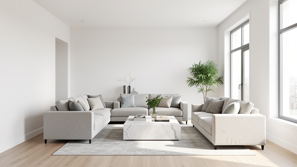
You’ve seen the curated images: a 300-square-foot studio transformed into a sun-drenched sanctuary with a floating desk, a lush vertical garden, and a perfectly styled reading nook. You feel inspired. Then you look around your own space—the radiator blocking the only logical sofa spot, the closet that consumes precious bedroom square footage, the lease agreement forbidding wall modifications—and inspiration curdles into frustration. This gap between idealized fantasy and lived reality isn’t accidental. Most small-space advice operates in a constraint-free vacuum, ignoring the tangible boundaries that define actual homes.
Drawing on documented principles from environmental psychology and architectural case studies across dense urban contexts—from Tokyo micro-apartments to Parisian chambres de bonne—this guide introduces a paradigm shift: constraints are not obstacles to overcome but the very foundation of intelligent design. When you design with limitations rather than against them, you unlock solutions that are not only achievable but uniquely suited to your life. This approach has been observed consistently across diverse living situations: the most enduring small-space transformations succeed not by ignoring constraints but by leveraging them as creative parameters. Whether you’re navigating a studio under 400 square feet, a narrow hallway that defies furniture placement, or the need to accommodate evolving household needs within fixed walls, this framework provides a clear, actionable path forward. The goal isn’t to replicate a magazine spread but to cultivate a space that functions seamlessly within your reality—where every choice reflects clarity, care, and purpose.
The Constraint-First Framework: Designing Within Your Reality
Most design processes begin with desire: “I want a reading nook, a home office, and a dining area.” Then reality intervenes—the space is limited, the budget constrained, the timeline tight. The Constraint-First Framework reverses this sequence. Instead of starting with aspirations, we begin by mapping your non-negotiable boundaries. This isn’t about limitation; it’s about clarity. By defining constraints upfront, you eliminate decision fatigue, avoid common pitfalls, and channel creativity into solutions that work within your reality. Think of it as composing a haiku: the defined structure doesn’t stifle expression—it fuels precision and depth. Similarly, your constraints will guide you toward choices that are intentional, efficient, and deeply personal.
The framework operates in three sequential layers. Skipping a layer risks solutions that look appealing in theory but falter in daily use. We move from the immovable (physical and regulatory boundaries) to the adjustable (budget and time) and finally to the human element (lifestyle and emotional needs). Each layer builds on the previous one, creating a filter that narrows possibilities until only the most viable options remain. This method transforms overwhelm into agency—one documented constraint at a time.
Layer 1: The Immutable Constraints (What You Cannot Change)
Before purchasing a single item or moving furniture, conduct a thorough audit of your space’s fixed elements. These are the anchors around which all decisions must orbit. Ignoring them leads to frustration—like buying a sofa that blocks a radiator or planning built-ins where plumbing runs. This layer demands objectivity. Grab your phone, a measuring tape, and a notebook. Walk through your space slowly, documenting everything that cannot be altered without significant cost, permission, or structural risk. This audit becomes your design constitution—the non-negotiable rules guiding every subsequent choice.
Step 1: Document Every Physical Boundary
Begin with structural elements. In rental properties, assume all walls are load-bearing unless explicitly confirmed otherwise by management. In owned homes, consult original blueprints or a qualified structural professional for verification—never guess. Why this step is crucial: Altering structural elements without proper assessment risks safety and integrity. How to identify practically: Load-bearing walls often run perpendicular to visible floor joists (in basements or attics), feel denser when tapped, or align with support beams below. Common mistake: Assuming a narrow closet wall is non-structural and modifying it, only to discover it supports the floor above. Real-world example: In a Brooklyn brownstone renovation, a homeowner planned to open a wall between kitchen and dining areas. Blueprints revealed a critical header beam. Instead of demolition, they installed a custom steel shelf within the existing opening, creating display space while honoring the structure. Nuance: In older homes, “pocket doors” may be embedded in walls—tapping reveals hollow sections. Document these; they inform future possibilities if ownership allows.
Next, catalog utilities and infrastructure with care. Radiators require clearance on all sides for safety and efficiency—measure from the outermost fin. Blocking vents can significantly increase HVAC strain. Photograph electrical panels, noting circuit labels; mark locations of plumbing stacks (vertical pipes often hidden in closets or corners). Why crucial? Furniture placement must accommodate these elements. A bookshelf shoved against a radiator risks damage and inefficiency. How to document thoroughly: Sketch a simple floor plan on graph paper or use a free app like MagicPlan. Take photos with a tape measure visible beside key elements (e.g., “Radiator: 36″ wide, clearance zone marked”). Pro tip: In older buildings, verify radiator functionality—some are purely decorative. Contact building management before planning around them. Counter-example: A renter placed a custom media console over a radiator. Within weeks, heat exposure damaged the wood, and the landlord issued a violation notice. Repair costs far exceeded the minimal investment of initial measurement.
Architectural quirks demand special attention. Sloped ceilings require multi-point height measurements. Use a level app on your phone to check floor angles; note where ceiling height drops below standard door height. Protruding pipes, uneven floors, or low doorframes dictate furniture scale and placement. Why crucial? Standard-height furniture won’t fit under sloped ceilings. How to measure effectively: Create a “height map”—measure ceiling height every 12 inches along problematic walls. Photograph quirks in morning, noon, and evening light to assess shadow patterns critical for lighting plans. Real example: A resident converted an attic bedroom by building a custom desk under the lowest ceiling section, using the slope as a natural room divider. The desk depth matched the available vertical space precisely—no wasted inches. Nuance: Uneven floors aren’t always flaws; in historic homes, they add character. Use furniture levelers (inexpensive rubber discs) under table legs instead of attempting costly subfloor repairs.
Regulatory constraints are non-negotiable anchors. Review your lease agreement thoroughly. Note restrictions: “No nails or screws in walls,” “Adhesive hooks must be landlord-approved,” “No window film altering exterior appearance.” For owned homes in historic districts, contact your local planning department about modification rules. Building codes include egress requirements for bedrooms—critical if converting a basement. Why crucial? Violations can trigger fines, lease complications, or safety risks. How to verify: Email management with specific questions: “Are tension rods permitted for curtains?” Get approvals in writing. Budget alternatives for renters: Tension rods for curtains or room dividers; freestanding shelving units; removable adhesive hooks rated for your wall type (test in an inconspicuous area first with a small weight for 48 hours). Emergency fix: For temporary needs, use folding screens or bookshelves on casters—zero wall contact. Critical reminder: Never attempt electrical modifications without proper certification. Plug-in alternatives exist for nearly every lighting need.
The Fundamental Principle: Constraints are not creative enemies—they are the guardrails that keep your project on the road to success. By mapping the immovable first, you transform anxiety about limitations into confidence in direction.
Step 2: Translate Boundaries into Design Parameters
Raw measurements become actionable rules. Convert your audit into a “Constraint Cheat Sheet”—a single-page reference for shopping and planning. Examples:
– “No furniture within 12 inches of north wall radiator.”
– “Ceiling height drops below 6′ at 8′ from east wall—storage above 5’6″ must be shallow or angled.”
– “Window on south wall requires clearance for operation; no fixtures within zone.”
– “Lease prohibits wall anchors >5 lbs—prioritize freestanding or tension-based solutions.”
Why this works: It shifts focus from “What do I want?” to “What fits within my rules?” reducing cognitive load. Design professionals use this method; specialists in compact living observe that clients who see constraints written as clear parameters stop fighting the space and start solving puzzles—which is inherently more engaging and less stressful. How to implement: Keep the cheat sheet on your phone wallpaper or taped to your fridge. When browsing furniture online, immediately check dimensions against your rules. Real application: A resident needed seating for a 10×12-foot living room. Her cheat sheet noted: “Door swing requires 30-inch clearance.” She avoided a loveseat that would have blocked the path, selecting a compact armchair that fit perfectly. Nuance: Parameters evolve. Update your cheat sheet after each project phase. If you add a room divider, note its impact on traffic flow for future decisions. Common mistake: Creating overly rigid rules. Allow flexibility where possible—e.g., “Storage units must be under 30 inches deep” rather than “No storage on west wall.” This preserves creative options.
Layer 2: The Adjustable Constraints (What You Can Influence)
With immutable boundaries defined, we address the levers you can control: budget, timeline, and skill level. These are fluid but require honest self-assessment. Overestimating here is a common cause of abandoned projects. This layer demands clarity—not about what you wish you had, but what you genuinely possess today. There is no judgment in constraints; only practicality.
Step 3: Budget Realism—Beyond the Total Number
Most guides say “set a budget,” then vanish into aspirational imagery. A constraint-aware budget accounts for visible and hidden costs. Break it into categories:
– Direct costs: Furniture, materials, tools, hired labor.
– Indirect costs: Delivery fees, disposal of old items, sales tax, unexpected repairs (allocate a contingency buffer).
– Opportunity costs: Time spent sourcing vs. buying ready-made; mental energy expended on complex DIY vs. simplicity; transportation costs.
How to build a constraint-aware budget:
1. Categorize by priority using the MoSCoW method:
– Must-have: Non-negotiable for function (e.g., seating for two, adequate task lighting).
– Should-have: Important but flexible (e.g., storage for media, area rug to define zone).
– Could-have: Nice if budget allows (e.g., accent wall, decorative art).
– Won’t-have: Explicitly deferred (e.g., custom built-ins due to rental constraints).
For a small living room: Must = sofa bed for guests; Should = floating shelves for books; Could = vintage floor lamp; Won’t = wall-mounted TV (lease restriction).
2. Research true costs across three tiers before committing:
– Budget tier (Thrift/Marketplace): Functional sofa bed starts used. Verify mechanism works smoothly.
– Mid-tier (Retail): Reputable brands offer reliable options with delivery and return policies.
– Premium (Custom): Local artisans provide tailored solutions with longer lead times.
Why crucial? Prevents mid-project surprises. Common mistake: Allocating $500 for a sofa but not accounting for delivery or assembly tools. Pro tip: Factor in “frustration cost.” If assembling flat-pack furniture causes significant stress, budget for assembly help.
3. Time-value consideration: If your time has significant value, is building a shelf kit truly more economical than buying pre-assembled? Calculate the true cost including your time. Real example: A resident allocated $200 for shelving. After spending hours on a wobbly unit and additional money on stabilizers, she later chose a sturdy pre-assembled unit for a similar total cost but with preserved peace of mind. Nuance: For skill-building projects (e.g., learning to sew cushion covers), budget extra time and materials for practice—it’s an investment in future capability.
Step 4: Timeline Mapping—Phased Implementation
Small-space improvements rarely happen overnight. A phased approach prevents burnout, allows for adjustments, and builds momentum through visible progress. Align phases with your energy patterns and life rhythm—not an arbitrary deadline.
- Phase 1 (Days 1–7): Quick Wins
Tasks requiring under 2 hours each with immediate visual impact: - Declutter one zone (e.g., junk drawer, closet shelf).
- Add peel-and-stick wallpaper to closet interior or bookshelf back.
- Install over-door organizers for pantry or bathroom.
- Rearrange furniture using paper templates (trace footprint on newspaper, test layouts).
Psychological benefit: Immediate progress builds confidence. Behavioral psychology indicates that small wins reinforce continued action. Renter advantage: All Phase 1 actions are reversible. - Phase 2 (Weeks 2–4): Medium Projects
Half-day to weekend efforts requiring moderate planning: - Paint an accent wall (use painter’s tape rated for your wall type; remove within 24 hours).
- Assemble flat-pack furniture (watch targeted tutorials before starting).
- Install tension rod curtains or room dividers.
- Add plug-in wall sconces or battery-operated puck lights.
Why crucial? Matches effort to available energy. Schedule painting for a low-commitment Saturday, not the night before a work deadline. Common mistake: Attempting a full-room makeover in one weekend, leading to exhaustion. Pro tip: Break medium projects into sub-steps. “Assemble bookshelf” becomes: 1) Unbox and sort parts, 2) Attach back panel, 3) Install shelves. Acknowledge each sub-step completion. - Phase 3 (Month 2+): Long-Term or Saved-For Items
Projects requiring savings, permissions, or professional help: - Saving for a custom Murphy bed (research local carpenters; get quotes).
- Planning kitchenette reorganization with landlord approval (submit written proposal with photos).
- Installing permanent shelving in owned home (hire licensed contractor).
Nuance for renters: Prioritize reversible changes in Phase 1–2. Document original condition with photos before Phase 3 discussions. Real example: During periods of remote work adoption, many successfully used Phase 1–2 actions (tension rods, portable desks) to create functional home offices instantly. Those who skipped phasing faced complications.
Step 5: Skill Assessment—Honesty Over Ambition
Rate your comfort level for each task on a scale of 1–5 (1 = need full tutorial and supervision, 5 = could teach others confidently). Be honest—this isn’t about capability but current capacity. Stress and fatigue increase error risk.
- Painting: If you’ve never cut in edges cleanly, start with a small accent wall (not the entire room). Practice on cardboard first.
- Furniture assembly: If Allen keys induce anxiety, opt for pre-assembled or hire help. Many retailers offer assembly services.
- Electrical: Never attempt wiring without certification. Use plug-in alternatives (battery-operated puck lights vs. hardwired under-cabinet lighting).
- Measuring: Double-check all dimensions. “Measure twice” isn’t just a cliché—it prevents errors.
Budget alternatives framework:
– Method A (Ideal): Hire a professional for complex or safety-critical tasks (e.g., mounting heavy shelves into studs).
– Method B (Budget): Partner with a skilled friend for a trade (e.g., you cook their favorite meal while they assemble furniture). Use community resources like Tool Libraries for equipment access.
– Method C (Emergency): Use temporary solutions that honor constraints (freestanding room divider instead of building a half-wall; rolling cart for mobile storage).
Real example: After struggling with a bookshelf kit, a resident filmed his attempt, identified the sticking point (misaligned cam locks), and watched a targeted tutorial. His second attempt succeeded—turning frustration into skill growth. Critical insight: Skill assessment includes emotional bandwidth. If you’re navigating a major life transition, choose Method C solutions. There is wisdom in choosing simplicity during high-stress seasons. Safety note: For tasks involving ladders, power tools, or heights, have a second person present when possible.
Layer 3: The Human Constraints (Lifestyle and Emotional Needs)
The most technically sound design fails if it doesn’t serve the people living in it. This layer addresses how space is used and felt—the invisible constraints of daily life. A space that ignores human rhythms becomes a source of friction, not refuge. This requires introspection, not inspiration boards.
Step 6: Activity Mapping—How Space is Actually Used
Track your movements for three consecutive days. Use sticky notes on the floor or a simple sketch to mark:
– Peak usage times: When is the space most active? (e.g., 7–9 AM kitchen activity; 6–8 PM living room convergence).
– Activity zones: Where do you read, work, eat, relax? Note duration and frequency.
– Traffic flow: Walk the paths you take daily. Is there a “pinch point” where you constantly bump into furniture? Measure clearance—aim for comfortable passage.
Why crucial? Prevents designing for an idealized lifestyle. Example: A resident planned a cozy reading chair in the corner, but her activity map showed she only read in bed nightly. She repurposed the corner for a compact desk she’d actually use daily. Tool: Sketch a simple bubble diagram: circles for activities (sleeping, cooking, working), arrows for movement between them. Overlap indicates multi-use zones needing flexible furniture. Nuance: Track emotional states too. Note where you feel calm (“sunbeam on sofa at 3 PM”) or stressed (“cluttered entryway triggers morning anxiety”). These insights inform placement of calming elements or decluttering priorities. Common mistake: Mapping only “ideal” use. Be honest about realities—like the pile of mail accumulating on the console table. Design a solution for that behavior (a small tray with labeled sections). Real-world application: A household mapped their tiny kitchen and discovered the microwave blocked the fridge door swing. Relocating it to a cart created smoother workflow—saving time during meal prep.
Step 7: Emotional Constraints—The Psychology of Space
Small spaces can trigger feelings of confinement or chaos if not designed mindfully. Address these with intention:
– Visual weight tolerance: Be honest—are you energized by curated surfaces or calmed by empty space? If you dislike daily tidying, prioritize closed storage (cabinets over open shelves). If styled vignettes bring joy, allocate a small “display zone” with intentional limits.
– Sensory needs: Do you need quiet for focused work? Add sound-absorbing textiles (thick rugs, heavy curtains, upholstered furniture). Is natural light scarce? Prioritize layered artificial lighting with warm color temperatures.
– Color considerations: Dark colors absorb light but can feel cozy in a north-facing room with little sun; light colors reflect light but may feel sterile. Nuance: Use dark colors on one accent wall to create depth, not all four walls. In a windowless powder room, deep navy with brass fixtures can feel luxurious.
– Clutter perception: Research in environmental psychology suggests that perceived space expands through strategic sightlines and reflective surfaces—more impactful than square footage alone. A clear pathway feels larger than a cluttered one, even if dimensions are identical.
Why crucial? A space that feels good is used more effectively. Counter-example: A resident painted his tiny studio pure white for “airiness,” but glare from his computer screen caused discomfort. He added a warm-toned wool rug, amber task light, and oat-colored textiles—improving comfort without sacrificing light reflection. Pro tip: Create a “mood board” of textures and colors that evoke calm for you. Visit fabric stores to touch samples; note how materials make you feel. Critical reminder: Your emotional needs are valid. If “minimalism” feels cold, embrace warmth. If “maximalism” feels chaotic, choose restraint. This is your sanctuary.
Step 8: Future-Proofing—Anticipating Change
Constraints evolve. Build flexibility into your design to accommodate life’s shifts:
– Modular furniture: Nesting tables, stackable bins, adjustable shelving, rolling carts.
– Zoning with movable elements: Curtains on ceiling tracks (renter-friendly with tension rods), folding screens, bookshelves on casters.
– Documentation: Keep your Constraint Cheat Sheet updated. When life changes (new remote work requirement, pet adoption, family expansion), revisit Layers 1–3.
– Exit strategy: For renters, photograph original condition. For owners, note modifications that may appeal to future occupants vs. personal preferences.
Why crucial? Prevents obsolescence. Real example: During periods requiring home adaptation, those with tension-rod curtains or freestanding dividers adapted instantly to create dedicated zones. Others faced complications. Nuance: Future-proofing isn’t about predicting the future—it’s about designing resilience. A desk that converts to a dining table serves multiple life stages. Pro tip: When purchasing furniture, ask: “Can this be repurposed if my needs change?” A storage ottoman works as seating, footrest, or coffee table. Common mistake: Over-engineering for hypothetical futures. Focus on near-term likely changes (next 1–2 years). Wisdom: The most adaptable spaces honor present needs while leaving room for evolution.
Navigating Common Small-Space Scenarios: Applying the Framework
Theory becomes powerful when applied. Below, we dissect frequent challenges through the Constraint-First lens. For each scenario, we identify the dominant constraint, apply all three framework layers, and provide tailored solutions with budget alternatives. This section absorbs sub-intentions like “small apartment storage ideas” or “making a narrow room look bigger” by embedding answers within scenario-based narratives.
Scenario 1: The Studio Apartment Juggling Act (Sleeping, Living, Working in <500 Sq Ft)
Dominant Constraint: Multi-functional needs competing for minimal square footage without visual or psychological chaos.
Immutable Constraints Audit (Layer 1):
– Typically one window (primary light source and egress point—never block).
– Radiator commonly positioned under window (requires clearance).
– Minimal closet space.
– Rental restrictions highly probable (no wall anchors, paint limitations).
– Ceiling height may be standard or compromised.
Adjustable Constraints Approach (Layer 2):
– Budget: Prioritize versatile, multi-functional items. Allocate for delivery fees.
– Timeline: Phase over weeks to avoid burnout; start with decluttering.
– Skill: Focus on no-damage, reversible solutions for renters.
Human Constraints Insight (Layer 3):
– Critical need for psychological separation between sleep/work zones.
– Storage must be hyper-efficient to prevent visual clutter.
– Privacy needs for video calls or changing clothes.
Action Plan:
1. Zone with Verticality, Not Walls: Use a tall bookshelf (72+ inches) placed perpendicular to the main wall to separate sleeping area from living space. Why it works: Provides essential storage while creating psychological separation; open shelves maintain sightlines. Budget alternative: A clothing rack with a heavy-weave curtain (ensure it doesn’t block pathways or exits). Common mistake: Placing the bed against the only window—blocks light and violates egress considerations. Position bed parallel to window with a low-profile headboard. Real example: In a NYC studio, a resident installed a tall bookshelf between bed and living area. Books on the living side, linens on the bedroom side—gaining functional separation without walls.
2. Elevate the Bed Strategically: A loft bed (if ceiling height allows sufficient clearance underneath) creates dedicated zones below. Ideal solution: Pre-made loft bed frame with desk or storage underneath. Critical safety check: Verify ceiling height; ensure adequate headroom under loft. Secure frame appropriately. Add guardrails. Budget alternative: Platform bed with under-bed storage drawers (wheeled bins for easy access). Renter-friendly: Ensure loft is freestanding; use furniture pads to protect floors. Document setup with photos. Nuance: Lofts aren’t for everyone—consider mobility needs, heat distribution, and personal comfort with height. Pro tip: Place the loft over the least-used zone.
3. Storage Within Furniture (The Russian Doll Principle): Choose pieces that serve multiple functions:
– Sofa bed with hidden storage compartment.
– Ottoman with lift-top lid.
– Desk with built-in shelves or file drawers.
Why crucial: Maximizes utility per square inch. Pro tip: Measure twice—ensure mechanisms don’t require clearance against walls. Test in-store if possible. Nuance: In humid climates, avoid fabric storage for clothing; use bins with moisture control. Label clearly. Real example: A Seattle studio resident used a storage ottoman as coffee table, extra seating, and blanket storage. During guest visits, it became a bedside table—triple functionality.
4. Lighting Layers for Psychological Zoning: Implement three layers:
– Ambient: Plug-in wall sconces on either side of the bed or living area. Battery-operated LED options available.
– Task: Adjustable desk lamp with warm-white bulb for work zone; clip-on reading light for bed.
– Accent: Battery-operated LED strips under shelves or bed frame for soft evening glow.
Why crucial: Different lighting modes signal the brain to switch activities. Budget alternative: Use smart bulbs in existing lamps—program scenes via app (“Work,” “Relax”). Pro tip: Place lights at varying heights to create depth. A floor lamp in the corner bounces light off the ceiling, enhancing perceived height. Safety note: Secure cords with clips to prevent tripping.
Designer Insight: “In compact living traditions worldwide, the ‘one object, multiple functions’ principle is foundational. A dining table must also serve as a desk and guest seating. This isn’t deprivation—it’s precision design that honors limited resources.” — Reflecting documented approaches in dense urban housing globally
Scenario 2: The Narrow Hallway or Galley Kitchen (Long, Thin Spaces)
Dominant Constraint: Awkward proportions creating dead zones, poor flow, and psychological “tunnel vision.”
Immutable Constraints Audit (Layer 1):
– Length significantly exceeds width.
– Doors opening into the space—document swing radius.
– Limited wall space for fixtures due to door swings or utility access.
– Often minimal natural light (hallways) or single light source (kitchen window at one end).
Adjustable Constraints Approach (Layer 2):
– Budget: Focus on high-impact, low-cost visual strategies (paint, lighting, textiles).
– Timeline: Quick wins possible in a weekend.
– Skill: Mostly painting, adhesive installations, and furniture arrangement—accessible.
Human Constraints Insight (Layer 3):
– Need to feel the space is purposeful, not just a pass-through.
– Storage must not impede movement (safety and flow critical).
– Psychological need to “break” the tunnel effect.
Action Plan:
1. Create Rhythm with Repetition: Paint the entire hallway one light, reflective color. Install identical floating shelves at consistent intervals on one long wall. Why it works: Repetition guides the eye intentionally, transforming a corridor into a curated passage. Shelves hold small functional items or art without clutter. Budget alternative: Use removable adhesive hooks rated for your wall type to hang lightweight woven baskets. Common mistake: Placing a large mirror at the very end—can feel like a dead end. Instead, place a small mirror on the side wall midway to bounce light and create depth. Real example: A London flat’s narrow hallway felt oppressive until the owner added three matching floating shelves with small art pieces. The space now feels like a deliberate journey.
2. Define Zones with Flooring and Color: If renovating is possible, use different flooring materials to mark transitions. Renter solution: A narrow runner rug with vertical stripes visually shortens the space and adds warmth. Why crucial: Vertical lines draw the eye upward, countering the horizontal tunnel effect. Nuance: Avoid busy patterns—they amplify visual chaos. Choose subtle textures in neutral tones. Pro tip: Extend the runner slightly beyond the hallway entrance into adjacent rooms to visually “pull” the space outward.
3. Strategic Lighting to Widen Perception: Install lighting that washes the walls, not the floor.
– Ideal: Hardwired sconces on both long walls at consistent heights (consult electrician if owned home).
– Budget/Renter: Battery-operated LED picture lights above art; plug-in wall sconces with cord covers.
– Pro technique: Place small LED puck lights inside shallow shelves to create glowing niches.
Why crucial: Light on walls creates perceived width; light on floor emphasizes narrowness. Real example: A Boston condo hallway had only one overhead light, creating deep shadows. Adding matching plug-in sconces transformed it into a welcoming passage—residents reported feeling less rushed moving through it. Safety note: Ensure all fixtures are securely mounted and cords are hidden.
4. Door Solutions for Flow: Document door swing paths. Replace swinging doors where possible:
– Pocket doors: Require wall cavity modification (owned homes only).
– Barn doors: Need header space; may not be rental-friendly.
– Emergency fix: Install door stops to limit swing; replace with curtains on tension rods for closets.
Why crucial: Unchecked door swings consume precious floor space. Pro tip: For bathroom doors opening into narrow hallways, install a hook on the back of the door to hold items—utilizing otherwise wasted space. Nuance: In galley kitchens, position frequently used items away from door swing zones. Use the “work triangle” principle: minimize crossing paths between sink, stove, and fridge.
Scenario 3: The Low-Ceilinged Room (Basements, Attics, Older Homes)
Dominant Constraint: Vertical compression triggering feelings of confinement.
Immutable Constraints Audit (Layer 1):
– Ceiling height under standard (common in attics: 6–7 ft at edges; basements: 7–7.5 ft).
– Exposed beams, ductwork, or pipes limiting usable height.
– Limited or no natural light (basements); sloped ceilings creating unusable zones.
– Potential moisture concerns (basements—verify before adding textiles).
Adjustable Constraints Approach (Layer 2):
– Budget: Lighting and paint offer highest impact per dollar.
– Timeline: Painting can be completed in a weekend; lighting upgrades phased.
– Skill: Basic painting skills sufficient; lighting installations use plug-in alternatives.
Human Constraints Insight (Layer 3):
– Need to create illusion of height without structural changes.
– Avoid making the space feel cave-like.
– Desire for coziness without confinement.
Action Plan:
1. Unified Color Strategy: Paint ceiling and walls the same light, cool-toned color. Why it works: Eliminates the visual “box” effect, blending surfaces to feel expansive. The eye doesn’t stop at the ceiling line. Nuance: In north-facing rooms with little sun, avoid cool tones—they can feel chilly. Opt for warm whites with subtle undertones. Common mistake: Painting ceiling bright white and walls a darker color—this accentuates low height. Pro tip: Use eggshell or satin finish on walls and ceiling—reflects more light than flat paint without glare. Real example: An attic bedroom with low ceiling felt cramped until painted floor-to-ceiling in a soft greige. Occupants reported the space feeling “airier and more intentional.”
2. Vertical Lines to Lift the Eye: Install floor-to-ceiling curtains on the longest wall (even if no window exists). Budget alternative: Apply removable vertical stripe wallpaper in a subtle pattern. Why crucial: Vertical lines create upward visual momentum. Critical detail: Mount curtain rod above the highest point of the wall to maximize perceived height. Counter-example: Horizontal stripes or wide artwork emphasize width, making ceiling feel lower. Real application: In a basement office with low ceilings, floor-length curtains on a white wall created a dramatic vertical line. Paired with uplighting, the space felt taller and more professional.
3. Lighting to Elevate Perception: Avoid downward-facing recessed lights (creates pools of shadow). Instead:
– Uplighting: Place LED strip lights on top of tall furniture to wash the ceiling with soft light.
– Wall washing: Install plug-in wall sconces with upward-facing shades.
– Strategic task lighting: Adjustable floor lamps with slender profiles.
Pro tip: In windowless basements, use cooler temperature bulbs in work areas for alertness, but layer with warmer bulbs for ambient light to avoid clinical feel. Safety note: Ensure all lighting is rated for damp locations if moisture is a concern. Real example: A basement rec room felt cave-like under a single overhead light. Adding floor lamps with upward-facing shades and LED strips atop a media console transformed it into a welcoming space.
4. Furniture Scale and Placement: Choose low-profile furniture (sofa height under 32 inches; coffee table under 16 inches). Why crucial: Creates more visible wall space above furniture, enhancing height perception. Critical rule: Maintain clear space between top of furniture and ceiling visually. Counter-example: A tall bookshelf in a low-ceiling room makes the ceiling feel oppressive. Opt for horizontal storage units or low credenzas. Pro technique: Float shelves below ceiling height—draws eye upward without crowding. Nuance: In sloped ceiling areas, place low furniture under the lowest section; use the higher section for standing activities.
Scenario 4: The Multi-Generational or Shared Small Space (Kids, Roommates, Elderly)
Dominant Constraint: Conflicting needs, privacy demands, and storage competition within tight quarters.
Immutable Constraints Audit (Layer 1):
– Fixed number of rooms/doors (non-negotiable layout).
– Shared utilities (one bathroom, single kitchen).
– Safety requirements (childproofing, accessibility clearances).
– Structural limitations for modifications.
Adjustable Constraints Approach (Layer 2):
– Budget: Prioritize safety and privacy investments; phase communal vs. personal upgrades.
– Timeline: Coordinate changes around household schedules.
– Skill: May require professional help for safety modifications; focus on collaborative DIY for shared zones.
Human Constraints Insight (Layer 3):
– Need for visual and acoustic separation to reduce friction.
– Storage must be personalized to minimize conflicts.
– Emotional need for individual territory within shared space.
– Respect for differing sensory preferences.
Action Plan:
1. Acoustic Zoning for Peace:
– Add thick rugs in high-traffic zones to absorb footfall noise.
– Install heavy curtains on shared walls or windows.
– Use bookshelves filled with books (natural sound dampeners) as room dividers.
Budget alternative: Hang moving blankets temporarily during noisy activities; store folded. Why crucial: Sound travels easily in small spaces; acoustic management reduces tension. Real example: Roommates in a studio used a tall bookshelf filled with books between sleeping and living areas. They reported fewer noise complaints and better sleep quality. Pro tip: Place soft furnishings strategically to break sound waves. Avoid large empty walls opposite seating areas.
2. Personalized Storage Systems:
– Color-code bins, baskets, or labels for each person.
– Install hooks at varying heights: low for children’s coats, standard for adults, higher for rarely used items.
– Use under-bed storage with personalized labels (wheeled bins for easy access).
Why crucial: Reduces daily friction over misplaced items. Real example: A family of four used labeled under-bed bins for off-season clothing, freeing closet space for daily use. Children had their own colored bins—they took ownership of tidying. Nuance: For shared kitchens, assign shelf zones with removable labels. Pro technique: Take photos of “ideal” organized states for each zone; post discreetly as visual reminders.
3. Flexible Privacy Solutions:
– For shared bedrooms: Twin beds with a tall, narrow bookshelf between them—holds books, blocks sightlines, minimal footprint.
– Curtains on ceiling tracks around bed areas (renter-friendly with tension rods).
– Folding screens for temporary privacy.
Safety note: Ensure all privacy solutions are flame-retardant, away from heat sources, and don’t block emergency exits. For elderly or mobility-impaired residents, avoid floor-based dividers that create tripping hazards. Real example: College roommates used tension rods with blackout curtains around each bed. They gained privacy for studying/sleeping without permanent changes—landlord approved. Pro tip: Choose curtain fabrics that complement room colors; avoid stark contrasts that visually chop the space.
4. Co-Created Shared Space Agreements:
– Hold a brief household meeting to establish clear, written agreements:
– “Desk area is quiet zone after 8 PM.”
– “Kitchen cleanup rotation: [Schedule].”
– “Common area clutter reset every Sunday evening.”
– Create a shared digital calendar for scheduling kitchen/bathroom use during peak times.
Why crucial: Addresses emotional constraints—respect and communication prevent resentment. Research insight: Studies in shared housing indicate that explicit agreements can significantly reduce conflict compared to implicit expectations. Pro technique: Frame agreements positively (“We value quiet after 10 PM”) rather than restrictively. Critical reminder: Revisit agreements periodically; life changes require flexibility.
When Constraints Conflict: Navigating Trade-Offs and Exceptions
No framework survives first contact with reality unchanged. Sometimes constraints clash: your budget says “thrift store,” but your timeline demands “ready-made.” Or your immutable constraint (a radiator) blocks your ideal furniture layout. This section addresses friction points with pragmatic trade-off strategies—because real life is messy, and wisdom lies in navigating nuance.
The Budget vs. Quality Dilemma
Scenario: You need a sofa bed for guests in your studio, but high-quality models exceed your budget.
– Trade-off analysis:
– Budget option: May be uncomfortable, less durable.
– Mid-tier option: Comfortable for occasional use, reliable mechanism, reasonable lifespan.
– Premium option: Daily-use comfort, long lifespan, customizable.
– Constraint-First decision path:
1. Human constraint check: How often will guests stay? If infrequent, mid-tier may suffice. If daily use, prioritize comfort.
2. Adjustable constraint check: Can you find a lightly used mid-tier option? Inspect mechanism thoroughly.
3. Alternative path: Rent furniture short-term for guest visits. Cost-effective for infrequent needs.
– Pro tip: Invest in a quality mattress topper. It can significantly improve comfort. Store it compactly when not in use. Real example: A resident needed a sofa bed for quarterly guest visits. She bought a used mid-tier model, added a topper, and stored extra pillows in the storage compartment. Guests consistently complimented the comfort. Wisdom: “Good enough” that aligns with your constraints is better than “perfect” that causes stress.
The “Perfect” Item That Breaks a Constraint
Scenario: You found an ideal desk at a flea market—perfect size, vintage charm—but it blocks the radiator when placed in your planned work zone.
– Framework application:
– Immutable constraint violation: Blocking radiator is non-negotiable (safety, efficiency, lease considerations).
– Solution path:
1. Measure required clearance. Verify with building management if unsure.
2. Can the desk be modified? Rarely advisable; compromises integrity.
3. Search for alternatives with same aesthetic but different dimensions (e.g., wall-mounted drop-leaf desk).
4. Repurpose the desk elsewhere and find a radiator-compatible solution for the work zone.
– Mindset shift: “The perfect is the enemy of the good.” A functional, constraint-compliant solution beats an idealized but impractical one. Pro technique: Before purchasing any furniture, cross-reference dimensions with your Constraint Cheat Sheet. Save photos of “maybe” items in a phone album labeled “Measure First.” Critical reminder: Constraints protect you. Honor them.
When to Break the Rules (Intentionally)
Constraints are guides, not chains. Exceptions exist—but they must be intentional, not impulsive. Document your reasoning.
– Rule: “Avoid dark colors in small spaces.”
Exception: A north-facing room with no natural light feels cold in light colors. A deep navy on one accent wall with warm lighting and reflective surfaces creates cozy intimacy. Test first: Paint a large board, live with it for several days at different times. Observe emotional response. Why it works: In low-light rooms, dark colors can prevent a “gray void” effect. Real example: A basement office felt sterile in white. One navy wall with art and warm lighting transformed it into a focused, inviting workspace.
– Rule: “Maximize every inch of storage.”
Exception: If visual clutter increases your anxiety, prioritize open space. Use off-site storage for seasonal items. Keep only daily essentials visible. Why it works: Psychological well-being trumps theoretical efficiency. A calm space reduces decision fatigue. Real example: A resident felt overwhelmed by her “maximized” studio. She donated items, removed storage units, and embraced negative space. Her anxiety decreased significantly—proving that less storage can be more functional for her needs.
– Rule: “Never block a window.”
Exception: In a ground-floor apartment with privacy concerns, a low bookshelf (under window sill height) placed slightly from the window can hold plants while maintaining light flow. Critical checks: Verify lease allows it; ensure emergency egress remains unobstructed; use lightweight materials. Why it works: Balances privacy needs with light requirements. Safety first: Never block egress windows required by code.
Key principle: Break rules to serve human constraints better, not to bypass immutable constraints. Document the exception: “Chose dark accent wall because north-facing room felt cold in light colors; added warm lighting and mirror to compensate.” This creates accountability and learning.
Your Questions, Answered
Q: How do I make a small room look bigger without spending money?
A: Focus on adjustments within your control at zero cost. First, declutter ruthlessly—remove items using the “four-box method” (Keep, Donate, Trash, Relocate). Then, rearrange furniture to create clear pathways; pull furniture slightly away from walls to create depth. Use existing mirrors to reflect light sources. Finally, edit wall displays: group small art into one intentional gallery wall. These steps leverage perception psychology—uncluttered spaces with defined zones and strategic reflections can create the perception of a more spacious environment. Pro tip: Open curtains fully during daytime; use sheer layers at night to maintain light flow while providing privacy.
Q: What’s the biggest mistake people make in small-space design?
A: Prioritizing aesthetics over function. Buying a beautiful but oversized coffee table that blocks movement, choosing open shelving when you dislike dusting, or installing a space-saving bed without verifying clearance. The Constraint-First Framework prevents this by starting with immutable and human constraints. Remember: a space that works beautifully for your life—where you move freely, find items easily, and feel calm—is infinitely more valuable than one that looks perfect in a photograph but frustrates daily. Supporting insight: Design professionals consistently observe that clients who skip the constraint audit often spend more correcting avoidable issues.
Q: Are Murphy beds worth the investment for a studio apartment?
A: It depends entirely on your constraint profile. Ideal for: Owned homes with sufficient ceiling height, adequate budget, need for daily bed clearance, and physical ability to operate the mechanism. Not ideal for: Renters (requires secure wall mounting—lease violation risk), low ceilings (insufficient clearance), infrequent guests (over-engineering), or mobility limitations. Budget alternative: A high-quality sofa bed or futon with a supportive topper. Safety critical: If proceeding, professional installation is strongly recommended. Never attempt alone if inexperienced—improper mounting risks serious injury. Real consideration: Murphy bed mechanisms typically last many years with proper use; factor long-term value into your decision.
Q: How can I add storage to a rental without damaging walls?
A: Focus on freestanding, tension-based, and underutilized-space solutions. Use bookshelves as room dividers with storage on both sides (ensure stability with anti-tip straps). Over-door organizers for closets, pantries, or bathrooms. Tension rods can create hanging storage in closets or under sinks. For corners, consider a corner shelf unit that sits securely on the floor. Always check lease terms explicitly. Pro tip: Test adhesive hooks with a small weight for 48 hours in an inconspicuous area before committing. Document wall condition with photos before and after use. Real example: A renter used a rolling cart in her narrow kitchen for spices and oils—mobile, zero wall contact, and easily moved during inspections.
Q: What paint colors actually make a small space feel larger?
A: Light, cool-toned neutrals (soft grays, warm whites) reflect light well. However, the finish matters: eggshell or satin sheens reflect more light than flat paint without glare. Avoid pure white in rooms with little natural light—it can feel sterile. Instead, choose an off-white with subtle warmth. For accent walls, use the same color family but one shade darker to create depth. Critical step: Always sample paint on a large board and observe at different times of day for several days. Lighting changes color perception dramatically. Nuance: In a room with abundant warm afternoon light, a cool gray may feel balanced; in a north-facing room, it may feel chilly. Trust your eyes over swatches.
Q: How do I zone a studio apartment without making it feel cramped?
A: Use “soft” divisions that maintain sightlines and light flow. A tall, open-bookcase room divider defines zones while allowing light to pass through. Area rugs anchor each zone distinctly. Lighting is your most powerful zoning tool: use distinct light sources for each zone (arc floor lamp for living area, adjustable desk lamp for work) to signal function. Avoid floor-to-ceiling curtains unless ceiling height is generous—they can visually chop the space. Pro technique: Place the tallest piece of furniture against the longest wall to create a “backdrop” that enhances depth perception. Real example: A studio used a low bookshelf between bed and living area—providing separation without blocking light. Paired with zone-specific lighting, the space felt intentionally divided yet cohesive.
Q: Is it better to have fewer large furniture pieces or many small ones in a small space?
A: Fewer, appropriately scaled large pieces. One well-proportioned sofa (measured to leave clearance on sides) feels more spacious than two small chairs that create visual clutter and disrupt flow. The exception: modular furniture that can be reconfigured (nesting tables, stackable stools) for flexibility. Rule of thumb: Leave clear pathway between furniture pieces for comfortable movement. Pro tip: Create paper templates of furniture footprints, arrange on floor to test layouts before buying. Photograph layouts from multiple angles to assess visual weight. Critical insight: Visual clutter from many small items increases cognitive load. Edit thoughtfully.
Q: How can I improve lighting in a room with only one window?
A: Layer three types of light intentionally:
– Ambient: Overall illumination. Place a floor lamp in the corner opposite the window to bounce light off walls and ceiling. Choose a lamp with an upward-facing shade.
– Task: Focused light for activities. Adjustable desk lamp for work zone; clip-on reading light for bed.
– Accent: Highlighting features. Plug-in wall sconces to wash walls with light; battery-operated puck lights inside shelves.
Choose bulbs with warm color temperatures for living areas. In windowless rooms, use cooler bulbs in work areas but layer with warmer bulbs for ambient light to avoid clinical feel. Pro technique: Use dimmer switches (plug-in dimmers available for lamps) to adjust intensity. Safety note: Secure cords with clips to prevent tripping.
Q: What are renter-friendly ways to add personality without painting?
A: Textiles are versatile: removable peel-and-stick wallpaper on a single accent wall or inside bookshelf backs; colorful curtains; layered rugs. Use furniture placement to create intentional vignettes—a small side table with a lamp, books, and a plant. Display collections on shelves grouped by color or theme. For walls, lean large art against the wall on shelves, or use adhesive hooks rated for your wall type for lightweight frames. Change is easy, so rotate items seasonally. Pro tip: Add personality through scent (reed diffusers) and sound (small speaker)—often overlooked sensory layers.
Q: How do I store seasonal items in a tiny apartment?
A: Think vertically and use underutilized spaces. Under-bed storage bins with wheels for off-season clothing. Vacuum-seal bags compress bulky items but use sparingly—they can damage delicate fabrics. For holiday decor, use clear, labeled bins stored on top of closets (if height allows) or under sofa seats. If space is critically limited, consider off-site storage for rarely used items. Critical habit: Audit seasonally. When packing away items, donate anything unused. The “one in, one out” rule prevents accumulation. Real example: A renter stores winter coats in vacuum bags under the bed seasonally, freeing closet space for current wardrobe. Clear labeling prevents frantic searching.
Q: Can plants work in small spaces with low light?
A: Absolutely—choose low-light tolerant varieties proven to thrive. Snake plants, ZZ plants, and pothos are resilient in indirect light and purify air. Use vertical space: wall-mounted planters with removable adhesive hooks (test weight limit first), or hanging planters. Avoid large floor plants that crowd pathways. Group small plants on a windowsill, shelf, or dedicated plant stand. Pro tip: Rotate plants weekly toward the light source. Wipe leaves monthly with a damp cloth. Safety note: If you have pets, verify plant safety before purchasing. Real example: An apartment with north-facing windows thrives with a snake plant on a bookshelf and pothos trailing from a high shelf—adding life without demanding bright light.
Q: How do I keep a small kitchen organized with limited cabinet space?
A: Maximize vertical and door space. Install tension rods under cabinets to hang mugs or small pots. Use over-door organizers for spices or cleaning supplies. Drawer dividers keep utensils tidy. For countertops, choose multi-functional appliances and store rarely used items elsewhere. Implement the “first in, last out” rule for pantry items. Critical habit: The “10-minute nightly reset”—spend minutes before bed returning items to their homes. This prevents clutter creep. Real example: A resident uses a rolling cart for frequently used oils and spices—mobile, accessible, and tucks away when not in use. Pro tip: Audit kitchen items quarterly. Donate duplicates or gadgets used infrequently.
Q: What’s the most overlooked small-space upgrade with the biggest impact?
A: Thoughtful lighting layering combined with intentional decluttering. Most small spaces rely on a single overhead light, creating harsh shadows. Adding just two additional light sources (e.g., a floor lamp and a plug-in wall sconce) transforms ambiance and perceived spaciousness. Pair this with removing visible items—suddenly the space feels calmer and more intentional. Why it works: Light manipulates perception; clutter competes for visual attention. This dual approach is accessible and requires no structural changes. Real observation: Many users report this combination makes their space feel “significantly more welcoming” than any single furniture purchase. Start here before buying anything new.
Conclusion and Next Step
Small-space living is not a compromise—it’s a catalyst for intentionality. By embracing constraints as your design compass, you shift from frustration to empowerment. The Constraint-First Framework transforms overwhelming choices into a clear, step-by-step path: honor what cannot change, strategically allocate what can, and center the human experience above all. This approach has reshaped how countless individuals approach their homes, turning limitations into signatures of clever, personalized design. Your space is not a problem to solve but a canvas to curate within your unique reality.
Recap: The 3 Pillars of Constraint-First Design
- Map the Immutable: Document physical and regulatory boundaries before making any decision. This prevents common pitfalls and channels creativity productively. Your Constraint Cheat Sheet is your most valuable tool—keep it visible.
- Budget Realistically: Break down costs beyond the sticker price, phase projects to match your energy, and match tasks to your true skill level—not aspirational ones. Honor your time and emotional bandwidth as finite resources.
- Design for Humans: Prioritize how the space feels and functions for your daily life over generic aesthetics. A space that supports your routines, reduces friction, and brings calm is a successful space—regardless of square footage.
The 24-Hour Rule: Your First Step Starts Now
Within the next 24 hours, complete one micro-action that builds momentum—no excuses, no perfectionism:
– If overwhelmed by clutter: Spend 15 minutes decluttering a single drawer or shelf. Bag items to donate immediately.
– If planning a change: Grab your phone and take three photos of your space’s biggest pain point (e.g., cluttered entryway, awkward corner). Save them to a “Project” album with a note: “Constraint: [describe].”
– If stuck in analysis: Write down one constraint you’ve been ignoring (e.g., “I can’t move the radiator”) and one human need (“I need a quiet zone for video calls”). Tape this note to your fridge.
This tiny action breaks inertia. Progress, not perfection, is the goal. Momentum compounds—today’s 15 minutes becomes tomorrow’s confidence.
The Big Picture: Your Space, Your Story
Your home is not a showroom—it’s a living document of your life. Constraints are not flaws to hide but chapters in your story: the radiator under the window speaks of the building’s history; the narrow hallway holds memories of hurried mornings; the closet that consumes space reflects generations of adaptation. By designing with compassion for these realities, you create a space that doesn’t just look good, but works for you—today, tomorrow, and through every change life brings. The most beautiful small spaces aren’t the ones with the most square footage, but the ones where every choice reflects clarity, care, and purpose. You have everything you need to begin. Start where you are. Use what you have. Do what you can.
Explore Our Complete System:
The Ultimate Guide to Multi-Functional Furniture | Lighting Layouts for Rooms Without Windows | Decluttering Deep Dive: From Overwhelm to Order | Renter-Friendly Upgrades That Landlords Love | The Psychology of Color in Compact Living | Budget Breakdowns: Real Small-Space Makeovers Under $500 | Future-Proofing Your Home: Adaptable Designs for Life Changes