Transform your inland home into a serene coastal retreat using intentional design principles, adaptable material guidance, and actionable steps—no ocean required.
Coastal design transcends seashells and ship wheels. At its core, it’s an intentional psychology of space that harnesses light, texture, and flow to evoke the calm of shoreline living—regardless of your zip code. This guide shares a time-tested, adaptable framework observed across diverse design practices to translate coastal serenity into any home, climate, or architectural style. You’ll discover how to avoid common pitfalls, select materials suited to your local environment, and cultivate a space that feels authentically restorative—not like a theme park attraction.
Introduction
Walk into a thoughtfully designed coastal-inspired space, and something shifts. Shoulders relax. Breathing deepens. The mind quiets. This isn’t accidental. Environmental psychology research, including studies published in the Journal of Environmental Psychology, consistently demonstrates that environments incorporating natural light gradients, organic textures, and uncluttered sightlines support reduced stress responses and enhanced perceived well-being. Coastal design, when executed with intentionality, leverages these very principles. It draws from centuries of vernacular architecture worldwide—from Cape Cod saltboxes and Mediterranean casas to Australian beach shacks—where form followed function: wide eaves for sun protection, cross-ventilation for cooling, light-reflective surfaces to amplify available daylight, and durable, locally sourced materials that weathered gracefully. This historical foundation wasn’t about aesthetics alone; it was a sophisticated response to environment. Today, we can ethically and effectively adapt these time-tested strategies to homes hundreds of miles from any coastline. The goal isn’t replication—it’s resonance. It’s capturing the feeling of coastal living: openness, tranquility, connection to natural elements, and gentle, weathered elegance. Whether you reside in a landlocked Midwest suburb, a dense urban apartment, or a mountain foothills ranch, this guide provides a practical methodology to cultivate that serene atmosphere authentically and sustainably. Forget fleeting trends; this is about building a sanctuary rooted in human-centered design.
The Tranquility Triad™ Framework: Your Foundation for Authentic Coastal Living
Many attempts at coastal design falter because they focus solely on decor—adding rope mirrors or blue throw pillows without addressing foundational elements. True coastal ambiance emerges from a holistic approach. Enduring coastal-inspired spaces across diverse climates and home styles consistently demonstrate mastery of three interconnected pillars. We call this the Tranquility Triad™. Neglect any one pillar, and the result may feel superficial or disjointed. Integrate all three, and you create a space that feels inherently calm, cohesive, and deeply personal. This framework works because it addresses the why behind coastal aesthetics, not just the what. It’s adaptable, scalable, and resilient against changing trends.
Pillar 1: Light & Atmosphere – Capturing the Coastal Glow
Coastal light possesses a distinctive quality—diffused by atmospheric moisture, reflected off water and sand, often soft and luminous even on bright days. Replicating this effect isn’t about installing brighter bulbs; it’s about thoughtfully manipulating light quality, direction, and reflection throughout your space.
Why This Pillar Matters: Light profoundly influences mood and perception. Harsh, direct overhead lighting can create visual tension and confining shadows. Coastal light, by contrast, feels enveloping and gentle. Research in circadian lighting design indicates that spaces with layered, warm-toned, indirect light sources better support natural rhythms and visual comfort. In homes with limited natural light or northern exposures, intentional light layering becomes especially valuable to avoid flat or lifeless interiors.
How to Cultivate Coastal Light (Step-by-Step):
- Assess Your Existing Light: Spend a full day observing how sunlight moves through your room. Note where harsh shadows fall, where glare occurs on screens or floors, and which areas remain dim. Use your phone camera (without flash) to take pictures at different times; the screen often reveals contrasts your eyes adjust to. Is your light cool and blue (common with north-facing windows or LED-heavy fixtures)? Or warm but overly direct? This observation forms your starting point.
- Master Window Treatments: This is often the most impactful adjustment. Avoid heavy, light-blocking drapes. Instead:
- Sheer Layers: Install floor-length sheers in natural fibers like linen or cotton voile. They diffuse harsh direct sun into a soft glow while maintaining privacy and views. For bedrooms requiring darkness, use a discreet roller shade behind the sheers—visible only when needed.
- Wooden Shutters or Café Curtains: In kitchens or bathrooms, these offer adjustable light control while adding architectural interest. Paint them in soft whites or natural wood tones.
- Strategic Reflection: Place a large, leaning floor mirror opposite your main window. This actively bounces available light deeper into the space. For subtler reflection, consider a console table with a light wood or pale stone top beneath the mirror.
- Layer Your Artificial Lighting (The 3-Layer Rule):
- Ambient Layer (Foundation): This provides general room illumination. Consider moving away from reliance on a single central ceiling fixture. Instead, use multiple low-level sources: wall sconces with fabric shades (aimed upwards for indirect “wash” lighting), plug-in floor lamps with wide drum shades in corners, or discreet LED tape lighting hidden atop tall bookshelves or under floating cabinets. Aim for warm color temperatures (2700K–3000K). Dimmer switches allow you to adjust ambiance from “bright task” to “sunset serenity.”
- Task Layer (Function): Under-cabinet lighting in kitchens, adjustable swing-arm wall lamps beside reading chairs, focused pendants over islands or desks. Ensure these are shielded to prevent glare.
- Accent Layer (Depth): This creates visual interest and highlights texture. Use small LED spotlights to graze a textured plaster wall, illuminate a piece of driftwood art, or uplight a tall indoor plant like a fiddle-leaf fig. String lights with warm bulbs tucked into a bookshelf or draped softly over a headboard add gentle ambiance. Tip: Place a small, dimmable lamp on a low table behind your sofa. This creates a warm “halo” effect that softens the shadow a sofa casts against a wall—a subtle but calming technique.
- Amplify with Surfaces: Wall and floor colors actively participate in light management. Light, matte finishes absorb less light than glossy ones, creating softer diffusion. A wall painted in a warm off-white (like Benjamin Moore’s White Dove or Sherwin-Williams’ Alabaster) reflects light more gently than a stark, cool white. Similarly, light oak floors with a matte finish scatter light beautifully. If replacing floors isn’t feasible, a large, light-colored natural fiber rug (jute, sisal, seagrass) significantly alters light reflection underfoot.
Common Considerations:
* Color in Low Light: Painting walls deep blue in a room with minimal natural light may result in a cave-like feeling. Save deeper tones for accents or well-lit spaces.
* Light Temperature Consistency: Mixing cool white (4000K+) and warm white (2700K) bulbs in the same space can create visual discord. Auditing and standardizing bulbs supports harmony.
* Ceiling Treatment: A stark white ceiling can feel jarring. Painting it a very slightly warmer white than the walls (or matching the wall color) creates a more enveloping atmosphere—reminiscent of a soft sky on a hazy beach day.
Contextual Example: Consider a residence in Denver, Colorado, within a modern townhouse featuring large south-facing windows. While abundant, the high-altitude sun creates intense hot spots. A thoughtful response included motorized sheer roller shades for precise diffusion, three floor lamps with linen shades placed in living area corners to reduce reliance on harsh overhead can lights, and a large mirror opposite the main window to bounce light into the adjacent dining nook. The result feels bright yet serene, blending mountain clarity with coastal softness.
Pillar 2: Material Palette – The Language of Texture and Time
Authentic coastal design communicates through materials that suggest interaction with nature—weathered wood, smoothed stone, woven fibers, aged metals. It celebrates character earned through time and elements, moving beyond pristine perfection toward soulful warmth. This pillar is where “beach house” transcends “beach theme.”
Why Texture Matters: In environments without the ocean’s constant visual rhythm, texture provides essential sensory depth. Smooth, flat surfaces can feel sterile. Varied textures—rough, smooth, nubby, soft—engage the eye and mind subtly, creating visual interest without relying on bold patterns. Neuroaesthetics research suggests moderate visual complexity (like the subtle variations in a handwoven rug or reclaimed wood beam) tends to be more calming and engaging than stark minimalism or chaotic clutter. Additionally, natural materials like wood or clay plaster may offer subtle hygroscopic properties that contribute to physical comfort—a meaningful consideration for non-coastal climates.
Building Your Authentic Material Library:
- Wood (The Backbone): Seek woods with visible grain and character. Reclaimed barn wood (sanded smooth for safety), light oak with a matte oil finish, bleached teak, or sustainably sourced bamboo are excellent choices. Avoid overly orange-toned pine or high-gloss cherry. Application: Wide-plank flooring (or as an accent wall treatment), exposed ceiling beams (real or faux for architectural interest), live-edge shelves, furniture with visible joinery. Climate Note: In dry climates (like Arizona or Colorado), ensure wood is properly acclimated and sealed to minimize cracking. In humid inland areas (like the Southeast), prioritize kiln-dried woods and finishes with mildew resistance. A light wash of white or gray stain (“pickling”) on oak lightens the wood while preserving grain—ideal for brightening darker rooms.
- Natural Fibers (The Soul): These introduce organic softness and acoustic dampening. Think jute, sisal, seagrass, abaca, hemp, linen, and cotton. Application: Area rugs (layer a smaller sisal rug under a larger jute one for added texture), throw blankets draped over sofas, linen slipcovers on chairs, woven pendant lights, rope or rattan accent chairs. Nuance: Sisal is durable but can feel rough underfoot; layer a soft cotton or wool rug on top in seating areas. Seagrass offers more pliability and comfort barefoot. Linen wrinkles beautifully—that’s part of its relaxed character. Prioritize natural fibers over synthetic “look-alikes,” which often lack subtle color variations and tactile authenticity.
- Stone, Plaster & Ceramics (The Grounding Element): These materials connect interior spaces to the earth. Consider honed (not polished) limestone, travertine with visible pits, tumbled marble, textured lime wash plaster walls, handmade zellige tiles, or unglazed terracotta. Application: A honed limestone fireplace surround, a plaster feature wall with subtle trowel marks, zellige tile backsplash with gentle undulations that catch light, terracotta planters. Why Honed/Matte? Polished stone creates sharp reflections that disrupt soft light. Honed or textured surfaces absorb and diffuse light gently. Lime wash plaster possesses mineral depth that shifts subtly with daylight, mimicking sand and sky. Budget-Friendly Alternative: High-quality plaster-look wallpaper (from brands like Calico or Graham & Brown) can achieve similar textured effects on a feature wall at a lower cost.
- Metals (The Subtle Accent): Less is more. Avoid shiny chrome or brass. Opt for metals that develop patina: unlacquered brass (which darkens naturally over time), oil-rubbed bronze, matte black iron, or brushed nickel. Application: Cabinet hardware, light fixture frames, picture frames, small decorative objects. Allow them to age gracefully; subtle tarnish tells a story. A single unlacquered brass door handle that darkens with use feels more authentic than numerous shiny new fixtures.
Achieving the “Weathered” Look Authentically: Many attempt to “distress” new furniture with sandpaper—a technique that often appears forced. True weathering is nuanced. Instead:
1. Source Thoughtfully: Explore antique stores, salvage yards, or reputable vintage dealers for pieces with genuine history. A 1920s pine cupboard with worn edges carries irreplaceable character.
2. Finish Strategically: When purchasing new, choose pieces with matte or satin finishes. Request a “dry brush” technique where a lighter color is lightly brushed over a darker base to mimic sun-bleaching. For wood furniture, a whitewash or light gray wash allows grain to show through softly.
3. Embrace Imperfection: Place a handmade ceramic vase with slight glaze variation on your shelf. Choose a jute rug with subtle color inconsistencies. These “flaws” reflect the human hand and natural materials—they are features, not defects.
Consider This Contrast: A room filled with brand-new, uniformly white MDF furniture, glossy ceramic tiles, polyester rugs, and chrome fixtures—even decorated with seashells—may feel cold and sterile. It lacks the soulful texture and warmth defining authentic coastal style. The materials themselves must evoke connection to nature and time.
Pillar 3: Spatial Flow – The Architecture of Ease
Historically, coastal homes prioritized openness, fluid movement, and blurred boundaries between inside and out—designed for ventilation and connection. This pillar addresses the experience of moving through your space. Cluttered pathways, closed-off rooms, and visual barriers can create subconscious tension. Coastal flow cultivates ease and psychological comfort.
Why Flow Supports Well-Being: Environmental psychology references “prospect-refuge” theory: we feel secure with open views (prospect) to assess our surroundings, paired with cozy nooks (refuge) for retreat. Coastal design often balances these elements—open living areas offer prospect, while window seats or sheltered patios provide refuge. Additionally, unobstructed pathways reduce cognitive load, which is especially valuable in smaller homes or apartments where spatial efficiency matters.
Cultivating Flow in Any Floor Plan:
- Declutter Thoughtfully (The Essential First Step): Coastal design embraces uncluttered simplicity—not stark minimalism, but intentional curation. Every object should earn its place through function or deep personal meaning. Begin with a room-by-room review. Donate unused items. Store daily essentials in closed cabinets (painted to blend with walls for seamless integration). Open shelves should display only a curated few items—grouped intentionally, not stacked haphazardly. Why it helps: Visual clutter competes for attention, potentially increasing mental fatigue. Clear surfaces allow the eye to rest on the textures and light you’ve cultivated.
- Define Zones, Not Walls: In open-concept spaces, use furniture and rugs to create distinct areas without physical barriers.
- Living Zone: Anchor with a large area rug (large enough that front legs of sofa/chairs sit on it). Position seating to encourage conversation.
- Dining Zone: Center a rug under the dining table (extend 24+ inches beyond table edges so chairs remain on rug when pulled out).
- Work/Reading Nook: Tuck a comfortable chair, small side table, and floor lamp into a quiet corner. A tall plant in a woven basket can subtly separate the space.
- Create Intentional Sightlines: When entering a room, the eye should travel comfortably, ideally landing on a pleasing focal point (a window, art, or plant). Avoid placing tall furniture directly opposite the main entrance. Float furniture slightly away from walls where possible (even 2–3 inches) to improve circulation and perceived spaciousness. Maintain clear passage widths (minimum 36 inches in hallways).
- Bridge Indoors and Out (Even Without a Yard): This adaptation is potent for non-coastal homes.
- Maximize Existing Views: Keep window treatments minimal. Frame a view of your garden, a tree, or a bird feeder. If the view is less ideal (a brick wall, parking lot), create an indoor focal point: position a thriving plant, meaningful art, or a textured screen where the eye naturally lands.
- Bring Nature In: Incorporate greenery suited to your light conditions: snake plants, ZZ plants, pothos, or peace lilies. Group plants of varying heights in natural fiber pots. Display branches in a tall vase. Use botanical prints in art. Note: While NASA’s Clean Air Study highlighted certain plants’ air-purifying potential, biophilic design research consistently notes that even small doses of nature indoors correlate with reduced stress and enhanced mood.
- Sensory Cues: A small tabletop fountain introduces the sound of moving water. Essential oil diffusers with subtle scents like sea salt, driftwood, or eucalyptus (avoid overpowering synthetics) can enhance ambiance. Opening windows regularly for fresh air circulation powerfully evokes the coastal experience of sea breezes when weather permits.
The Guiding Insight: Coastal design is not a style you apply; it is an atmosphere you cultivate through the intentional interplay of light, authentic materials, and unobstructed flow. Integrate these three pillars, and every subsequent choice will feel harmonious and deeply restorative.
Room-by-Room Implementation: Translating the Triad into Action
The Tranquility Triad provides the foundation. Now, let’s walk through your home, applying these principles with precision and practicality. Each room presents unique opportunities. This section offers actionable strategies, material specifics, and adaptation tips for your context.
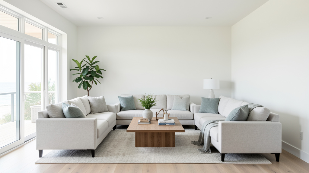
The Living Room: The Heart of Coastal Calm
This is where the Triad converges most visibly. The goal: a space that invites lingering, conversation, and quiet contemplation.
-
Light & Atmosphere in Action:
- Window Strategy: Replace heavy curtains with layered sheers where possible. Install dimmable wall sconces beside the main seating area instead of relying solely on overhead light. Place a tall, adjustable arc floor lamp behind the sofa to provide soft upward light and reduce shadow behind seating.
- Reflective Surfaces: Choose a coffee table with a light wood or honed stone top (like travertine) instead of glass, which can create harsh reflections. A large mirror leaning against the wall opposite the window is transformative. Tip: Angle the mirror slightly to reflect greenery from a nearby plant, doubling the biophilic effect.
- Ambiance Boosters: String warm-white fairy lights inside a large glass vase filled with sand and smooth stones. Place a small Himalayan salt lamp on a side table—it emits a gentle, warm glow.
-
Material Palette Deep Dive:
- Seating: A linen or cotton slipcovered sofa is a versatile choice. Linen breathes well, develops a soft drape over time, and hides minor stains. Opt for a neutral base (oatmeal, stone, light gray). If slipcovers aren’t feasible, choose performance fabric in a textured weave (bouclé or chenille) in a warm, light tone. Leather may feel sticky in hot climates or cold initially in very cold ones; if preferred, select light, distressed tan aniline leather that ages gracefully.
- Textiles: Layer textures intentionally. Start with a large, neutral jute or sisal rug as the base. Layer a smaller, softer rug (wool blend in oatmeal or a vintage-inspired Turkish rug with faded blues and creams) in the main seating area. Add throw pillows in varying textures: nubby bouclé, smooth washed cotton, subtle embroidery. Crucially: Limit your accent palette. Stick to 2–3 accent colors max (e.g., soft clay, sea glass green, sand). Avoid bright blues or reds unless deeply personal (like a cherished heirloom pillow).
- Furniture & Accents: Choose a media console in light oak or matte white paint. Display books with neutral-toned spines facing out for cohesion. Style shelves with varied heights: a tall ceramic vase, stacked books, a small piece of driftwood, one framed black-and-white photograph in a thin black or natural wood frame. Avoid: Cluttering shelves with numerous small objects. Edit thoughtfully.
-
Spatial Flow Optimization:
- Furniture Layout: Arrange seating to encourage face-to-face interaction. Float the sofa slightly away from the wall if space allows. Ensure clear pathways around seating (at least 18 inches). In long, narrow rooms, define two zones: a conversation area near the window and a reading nook in the quieter end.
- Biophilic Integration: Place a large floor plant (bird of paradise or fiddle-leaf fig) in a woven seagrass planter in an empty corner. Position a comfortable armchair beside a window with a small side table and dedicated reading lamp—creating a refuge spot. If you have a fireplace, style the mantel minimally: a single piece of driftwood, a small cluster of white candles, perhaps one small framed photo. Less is more.
-
Climate-Specific Adaptation:
- Dry Climates (Desert, Mountain): Prioritize materials that complement dry air. Lean into smooth textures like honed stone, linen, and cotton. Use a humidifier discreetly in winter. Incorporate warm terracotta tones to echo the local landscape—this creates authenticity rather than fighting your environment.
- Humid Inland Climates (Southeast, Gulf Coast): Choose upholstery and rugs labeled “mildew-resistant.” Opt for furniture with open bases (tapered legs) to allow air circulation. Use dehumidifiers strategically. Select woods known for stability in humidity (teak or cedar for accents). Ensure good ventilation—open windows when outdoor humidity is lower than indoor.
The Kitchen: Where Function Meets Serene Simplicity
Kitchens are high-traffic zones. Coastal design here should feel clean, organized, and calming—a place of nourishment, not chaos.
-
Light & Atmosphere Strategy:
- Task Lighting is Key: Under-cabinet lighting is highly recommended. Choose warm-white (2700K), dimmable LED tape lights. This eliminates countertop shadows while cooking and provides soft ambient glow. Pendant lights over an island should have fabric or woven shades to diffuse light; avoid exposed bulbs that create glare. Position pendants 30–36 inches above the countertop.
- Maximize Natural Light: Keep windows clear. For privacy (ground floor), use frosted window film on the lower half or café curtains covering only the bottom portion, preserving view and light from the top.
- Reflective Backsplash: A backsplash in honed marble, handmade zellige tile, or large-format matte ceramic tile in a light neutral reflects light beautifully without the glare of high-gloss subway tile. Budget-Friendly Idea: Paint existing cabinets a soft, warm white (like Swiss Coffee by Benjamin Moore) and replace hardware with unlacquered brass pulls. This single change dramatically refreshes a kitchen.
-
Material Palette for Durability & Beauty:
- Countertops: Honed granite or quartzite offers durability with a soft, matte finish. Concrete provides a modern, textured look but requires sealing. Butcher block (maple or walnut) adds warmth; maintain diligently with mineral oil. Consider avoiding: High-gloss laminates or polished black granite—they can feel cold and show every mark.
- Cabinets: Painted cabinets in soft, warm white or light gray are classic. For authenticity, consider open shelving on one wall (using sturdy oil-rubbed bronze brackets) to display beautiful ceramics and cookbooks—but only if you commit to keeping it tidy. Closed cabinets with shaker-style doors are timeless. Finish Note: Choose matte or satin paint finishes over high-gloss.
- Flooring: Light oak hardwood with a matte finish is ideal. If replacing isn’t an option, large-format vinyl plank flooring (LVP) designed to mimic light wood with texture is a durable, budget-friendly alternative. Avoid dark floors—they show every speck and absorb light. A small, washable jute or cotton rug in front of the sink adds comfort and texture.
-
Spatial Flow & Organization:
- Clear Counters: Coastal kitchens feel serene because counters are clear. Dedicate cabinet or drawer space for every appliance. Use drawer dividers. Install a discreet knife block inside a drawer. Store daily-use dishes in open shelving only if used daily and kept minimal. The visual calm of empty counters supports the overall atmosphere.
- Zone Your Workflow: Ensure the “work triangle” (sink, stove, refrigerator) functions efficiently. Keep frequently used items within easy reach. Use matching clear glass or ceramic containers for pantry staples stored on open shelves—this creates visual order.
- Biophilic Touches: Keep a small herb garden (basil, mint, rosemary) on a sunny windowsill in terracotta pots. Display a bowl of lemons or limes. Hang a small framed print of botanical illustrations near the eating area.
-
Apartment/Kitchenette Adaptation: In a small galley kitchen, maximize vertical space. Install floating shelves above the counter (painted to match the wall) for frequently used items. Use a tension rod under the sink to hang spray bottles. Choose a single, beautiful tea towel in a natural fiber to hang on a hook—functional art. A small mirror placed strategically on a cabinet door can enhance the sense of space and light.
The Bedroom: A Sanctuary for Deep Rest
This room must prioritize tranquility above all else. It’s your personal refuge. The goal is to minimize visual and sensory stressors that may interfere with rest.
-
Light & Atmosphere for Rest:
- Blackout Solutions (Discreetly Integrated): Invest in quality blackout roller shades or cellular shades. Layer them behind beautiful, light-filtering linen or cotton curtains. During the day, keep the blackout layer hidden; deploy it at night for darkness. This combines function with aesthetics.
- Bedside Lighting: Consider wall-mounted swing-arm sconces with fabric shades (dimmed low) for reading. This frees bedside table space and provides focused, glare-free light. If sconces aren’t possible, choose table lamps with heavy fabric shades directing light downward.
- Evening Ambiance: Place a small, dimmable salt lamp or safely contained candle on a dresser. Very low, warm light can signal wind-down time. Important: Minimize blue light before bed. Charge phones outside the bedroom. Cover tiny LED lights on electronics with opaque tape if bothersome.
-
Material Palette for Sensory Comfort:
- Bedding is Central: Invest in quality within your means. Long-staple cotton (Egyptian or Pima) or linen sheets in neutral tones (oatmeal, stone, soft white). Linen is temperature-regulating (cool in summer, warm in winter) and softens with use. Choose a duvet cover in a textured weave. Layer with a lightweight cotton or wool blanket at the foot of the bed. Note: Satin, silk, or synthetics may not suit all preferences or climates.
- Headboard & Furniture: An upholstered headboard in textured fabric (bouclé or linen-look performance fabric) adds softness and absorbs sound. A simple reclaimed wood headboard brings organic warmth. Nightstands in light wood or matte white paint. Keep surfaces clear—only a lamp, a book, and perhaps a small plant or diffuser.
- Flooring & Rugs: If you have hardwood floors, place a large, plush rug (wool or high-pile cotton) extending well beyond the bed’s sides and foot. The sensation of stepping onto soft texture upon waking is comforting. In carpeted rooms, ensure the pile is low and neutral-toned.
-
Spatial Flow for Serenity:
- Declutter Consistently: Bedrooms accumulate items quickly. Implement a “one in, one out” rule for clothing. Use under-bed storage boxes (fabric-covered) for off-season items. Keep closet doors closed. Making the bed each morning significantly impacts perceived calm.
- Create a Resting Nook: If space allows, tuck a small armchair or floor cushion in a corner with a floor lamp. This becomes a dedicated spot for morning coffee or evening reading, separate from the sleep zone.
- Sensory Minimization: A white noise machine or small fountain can mask disruptive sounds. Choose a calming, subtle scent for a diffuser (lavender, chamomile, cedarwood)—test carefully for sensitivities. Keep electronics out of sight.
-
Small Bedroom / Studio Apartment Hack: Use a room divider (a tall bookshelf, a folding screen covered in linen, or a large plant like bamboo palm) to visually separate sleeping and living areas. This creates psychological boundaries crucial for rest. Choose dual-function furniture: an ottoman with storage, a bedside table that doubles as a small desk. Mirrors enhance space and light—place one to reflect a window or green plant.
The Bathroom: A Personal Spa Experience
Transform this utilitarian space into a daily ritual of renewal. Coastal bathrooms feel clean, airy, and connected to elemental simplicity.
-
Light & Atmosphere for Relaxation:
- Vanity Lighting: Critical for comfort. Avoid single overhead lights or lights mounted on the mirror (which cast shadows downward). Install sconces flanking the mirror at eye level, with bulbs pointing up and down (or just up for softer light). Choose warm white (2700K) bulbs. Dimmer switches are highly recommended.
- Shower/Tub Ambiance: If renovating, include a small, waterproof niche light. For existing setups, a battery-operated LED candle (designed for bathrooms) placed safely outside the tub creates instant spa ambiance during baths. Ensure exhaust fans are quiet and used to control moisture.
- Maximize Natural Light: Keep windows unobstructed. Use waterproof roller shades or faux wood blinds for privacy that don’t block light when raised.
-
Material Palette for Serene Durability:
- Walls & Shower: Large-format tiles in light, matte finishes (porcelain mimicking honed limestone or travertine) minimize grout lines and create a calming backdrop. Avoid small, busy mosaic tiles. For a refresh, high-quality peel-and-stick tile decals designed for bathrooms can update a dated backsplash. Tip: Paint the ceiling the same light color as the walls to enhance height and airiness.
- Vanity & Countertop: A floating vanity creates openness and eases cleaning. Choose a countertop in honed quartz (for durability) or concrete-look quartz. Open shelving below the sink (if plumbing allows) can display neatly folded towels in natural fiber baskets, though closed storage is often more practical. Hardware: Unlacquered brass or matte black fixtures age beautifully.
- Textiles & Accessories: Invest in thick, absorbent cotton or bamboo towels in neutral tones (white, oatmeal, light gray). Roll them neatly on open shelves or in a woven basket. Use a bath mat made of natural rubber with a cotton top, or a teak bath mat allowing water drainage. Store toiletries in matching apothecary jars or simple ceramic containers. A small tray holds only daily essentials.
-
Spatial Flow & Biophilic Touches:
- Declutter the Counter: Essential for a spa feel. Store everything possible in drawers or cabinets. Use drawer organizers. Keep only a soap dispenser and perhaps a small plant visible.
- Bring in Nature: A small, humidity-tolerant plant like a ZZ plant, snake plant, or peace lily adds life. Display smooth river stones in a glass bowl. Hang sealed botanical art. Use a bamboo or teak stool in the shower.
- Sensory Details: Keep a small diffuser with eucalyptus oil near the shower (steam releases the scent). Use unscented or lightly scented natural soap. Play soft, ambient music via a waterproof speaker during baths.
-
Powder Room / Half-Bath Idea: This small space is ideal for subtle coastal character. Paint walls a soft, warm clay color (like Canyon Dusk by Sherwin-Williams) instead of stark white. Install one dramatic piece of art—a large-scale photograph of weathered wood or abstract ocean waves in muted tones. Use a unique vessel sink in matte ceramic. A small framed mirror with a natural wood detail. Keep impeccably tidy. This room makes a gentle impression with minimal investment.
Outdoor Spaces (Balcony, Patio, Garden): Extending the Sanctuary
Even a tiny balcony can become a coastal-inspired retreat. This is where the “connection to outdoors” pillar shines.
-
Light & Atmosphere Al Fresco:
- String Lights: Drape warm-white LED string lights overhead. They provide gentle, ambient illumination perfect for evenings. Solar-powered options offer convenience.
- Task Lighting: A small, weatherproof lantern on a side table provides light for reading. Solar path lights along a garden edge add subtle guidance.
- Fire Element: A tabletop fire bowl (ethanol or propane) or small chiminea provides mesmerizing flickering light and warmth on cool evenings—a powerful sensory anchor.
-
Material Palette for the Elements:
- Furniture: Teak, eucalyptus, or aluminum with powder-coated matte white or charcoal finishes are durable. Crucially: Add deep seating cushions covered in solution-dyed acrylic fabric (like Sunbrella). This fabric resists fading, mildew, and is easy to clean—worth the investment. Choose cushion colors in neutrals (sand, stone, oat) or subtle stripes.
- Textiles & Accessories: Outdoor rugs made of polypropylene (mimics sisal, weatherproof) define the space. Throw blankets stored in a weatherproof trunk for cool evenings. Woven hanging chairs or porch swings add movement. Use galvanized metal or terracotta pots.
- Surfaces: If possible, replace concrete with decking (composite or sustainably sourced wood) or add a large outdoor rug. Pebble pathways or a small gravel area introduce natural texture and sound.
-
Spatial Flow & Biophilic Immersion:
- Create Zones: Even on a small balcony, define areas: a bistro set for dining, a single lounge chair with an ottoman for relaxing. Use a tall plant in a corner to create enclosure and privacy.
- Maximize Greenery: Use vertical space: wall planters, hanging baskets (ferns, ivy), railing planters. Choose plants suited to your sun exposure: herbs (rosemary, thyme) for sun; hostas, ferns, or impatiens for shade. Group pots of varying heights. Tip: Incorporate plants with silver or gray foliage (lamb’s ear, artemisia)—they reflect light beautifully and echo sea grasses.
- Water & Sound: A small, recirculating tabletop fountain provides soothing water sound. Wind chimes made of bamboo or driftwood add gentle auditory texture. Place a bird feeder nearby to attract wildlife.
- Sensory Pathway: Create a small path of smooth, flat river stones leading to a seating area. The feel underfoot is grounding and connects you directly to nature.
-
Apartment Balcony Transformation (Under 50 sq ft):
- Declutter: Remove storage boxes, bikes, etc. Dedicate this space solely to relaxation.
- Flooring: Lay interlocking outdoor deck tiles (composite wood-look) over existing concrete. Instant upgrade.
- Seating: A single comfortable folding chair or compact bistro set. Add thick Sunbrella cushions.
- Greenery: Hang two ferns in macramé hangers from the railing. Place a tall snake plant in a corner (tolerates balcony conditions). Add a small railing planter with trailing ivy.
- Ambiance: String lights overhead. A small side table holds a candle lantern and a book. A folded outdoor blanket in a basket. This tiny oasis becomes a daily escape.
Adapting Coastal Design to Your Unique Climate and Location: Beyond the Postcard
Authenticity means working with your environment, not against it. Forcing a Nantucket aesthetic onto a Phoenix adobe home creates dissonance. True mastery lies in adapting the principles of coastal design to honor your local context. This section provides nuanced guidance often overlooked.
Navigating Humidity: Inland vs. Coastal Realities
Coastal humidity is constant and salt-laden. Inland humidity (common in the Southeast, Midwest summers) is often more variable and lacks salt, but presents challenges: mold, mildew, wood swelling, and that pervasive “sticky” feeling.
-
Material Selection Considerations:
- Wood: In high-humidity zones, solid wood furniture requires proper acclimation and sealing. Engineered wood cores with real wood veneers, or sustainably sourced bamboo (naturally more dimensionally stable), may be preferable. For outdoor furniture, choose aluminum, HDPE lumber (looks like wood, won’t rot), or properly sealed teak. Untreated pine outdoors inland may warp or rot quickly.
- Upholstery & Rugs: Prioritize performance fabrics explicitly labeled “mildew-resistant” and “quick-dry.” Sunbrella indoor/outdoor fabric works well for cushions. For rugs, choose polypropylene (indoor/outdoor) or tightly woven jute (handles humidity better than sisal). Wool rugs may not suit consistently damp basements or bathrooms.
- Wall Finishes: In bathrooms and basements, mold-resistant drywall and mold-inhibiting paint are practical choices. Lime wash plaster is naturally mold-resistant due to its high pH—an excellent (though pricier) option for feature walls in humid climates. Ensure proper ventilation: exhaust fans vented outside, and strategic dehumidifier use. Monitor humidity with a hygrometer; aim to keep indoor levels below 60%.
-
Design Strategies for Comfort:
- Promote Airflow: Arrange furniture to avoid blocking vents. Use ceiling fans (counter-clockwise in summer for cooling downdraft). Install window fans to pull in cooler evening air. Choose furniture with open bases (tapered legs) to allow air circulation underneath.
- Cooling Color Psychology: While warm neutrals are coastal staples, in intensely hot/humid climates, lean slightly cooler within the neutral spectrum. A wall color with a hint of green-gray (like Revere Pewter by Benjamin Moore) or soft blue-gray may feel more cooling than a warm beige, without abandoning the coastal palette. Test large swatches at different times of day.
- Textile Choices: Linen and cotton breathe well. Avoid heavy velvets or thick wools in main living areas during summer. Keep lightweight cotton or linen throws available.
Thriving in Arid Climates: Desert, Mountain, High Plains
Dry air (common in the Southwest, Rockies, Intermountain West) can cause wood to crack, increase static, and dry skin/respiratory passages. Intense sun may fade fabrics rapidly.
-
Material Resilience:
- Wood Care: Acclimate new wood furniture slowly. Maintain consistent indoor humidity (ideally 40–50%) using humidifiers, especially during winter heating. Choose woods known for stability: mesquite, walnut, or quartersawn oak. Reclaimed wood is often exceptionally stable. Seal wood surfaces regularly with oil (like tung oil) rather than film finishes (like polyurethane), which may crack; oil penetrates and moves with the wood.
- Fabric Protection: UV damage is a concern. Install UV-filtering window film on south and west-facing windows—it’s nearly invisible but blocks fading rays. Choose upholstery fabrics with high UV resistance ratings. Rotate cushions and rugs periodically. Linen and tightly woven cotton hold up better than delicate silks.
- Stone & Tile: These materials excel in dry climates. Honed travertine, limestone, or slate floors stay cool. Terracotta tiles are authentic to Southwestern vernacular and regulate temperature well. Ensure grout is sealed to prevent dust infiltration.
-
Harmonizing with the Landscape:
- Embrace Local Palette: Incorporate warm terracotta, dusty rose, sage green, and sand tones into your accent colors. These resonate with the local environment, creating a sense of place far deeper than generic “beach blue.” A throw pillow in a handwoven textile from a local artisan connects your space to its region.
- Water Features: In arid regions, the sound and sight of water are profoundly calming. A small indoor tabletop fountain or carefully placed outdoor water feature (designed to minimize evaporation) becomes a powerful focal point, directly echoing the coastal principle of water connection.
- Light Management: Intense sun requires smart shading. Exterior solutions are most effective: awnings, pergolas with climbing vines (trumpet vine, wisteria), or deciduous trees providing summer shade and winter sun. Inside, use light-filtering roller shades or woven wood shades to diffuse harsh light while preserving views.
Urban Apartments: Creating Calm Amidst the Concrete
City living presents unique challenges: limited natural light, noise pollution, lack of private outdoor space, and views of buildings. Coastal design principles are especially potent here as an antidote to urban stress.
-
Mastering Limited Light:
- Mirror Strategy: Place a large mirror directly across from your largest window. Add a smaller mirror on an adjacent wall to bounce light sideways. Lean a floor-length mirror against a wall to capture light from a hallway window.
- Reflective Surfaces: Choose furniture with light wood tops or matte stone surfaces. Use glass or acrylic furniture sparingly (a single coffee table) to maintain visual lightness. Metallic accents (unlacquered brass, matte black) should be small and intentional to catch light.
- Artificial Light Layering: Ditch harsh ceiling fixtures. Use multiple plug-in floor lamps and table lamps with warm bulbs. Install plug-in wall sconces (no hardwiring needed) to free up space. Under-cabinet lighting in the kitchen. LED tape lights inside open shelving. Create pools of warm light throughout.
-
Sound Dampening for Serenity:
- Textiles as Shields: Natural fiber rugs, heavy linen curtains, upholstered furniture, and throw blankets absorb sound waves significantly better than hard surfaces. Layer a thick rug pad under your area rug for extra dampening.
- Strategic Furnishings: Bookshelves filled with books act as sound barriers. Place them against shared walls. A tall, dense plant like a fiddle-leaf fig or bamboo palm also helps absorb sound.
- Ambient Sound: A discreet white noise machine, small fountain, or fan can mask street noise, especially at night. Nature sound apps (gentle waves, rain) may provide comfort during relaxation time.
-
Creating “Nature” Where None Exists:
- The View Hack: If your window looks onto a brick wall, create a beautiful indoor focal point. Position your favorite reading chair to face a well-styled bookshelf, meaningful art, or a thriving plant collection. Use window film with a subtle etched pattern (reeds, waves) to diffuse an unattractive view while allowing light.
- Biophilic Density: Bring nature in abundantly. Group plants together on shelves, windowsills, and floors. Choose varieties thriving in lower light (snake plant, ZZ plant, pothos, peace lily). Display collections of interesting stones, ethically sourced shells, or driftwood. Use artwork featuring landscapes, seascapes, or botanical illustrations. Play nature sounds softly during relaxation time.
- Balcony/Patio Maximization: Treat even a tiny Juliet balcony as sacred space. Add one comfortable chair, a small side table, string lights, and lush hanging plants. This becomes your essential outdoor connection point.
Historic Homes & Non-Traditional Architecture: Respectful Integration
Applying coastal principles to a Victorian, Craftsman, or mid-century modern home requires sensitivity. The goal is harmony, not erasure of character.
-
Work With, Don’t Against, Architectural Features:
- Victorian/Ornate Homes: Avoid painting intricate woodwork flat white. Instead, paint moldings and trim in a slightly lighter or darker shade of your wall color for subtle definition. Use the coastal palette within the rooms: light, airy colors on walls, natural fiber rugs over original hardwoods, linen curtains. Let the architecture provide the “detail”; keep furnishings and decor serene and uncluttered to avoid visual competition. A single piece of driftwood on the mantel complements ornate carvings without clashing.
- Craftsman/Bungalow Homes: These are a natural fit! Emphasize existing wood beams, built-ins, and tapered columns. Stain wood features in a light, natural tone (avoid dark stains). Use Arts and Crafts-inspired textiles with subtle geometric patterns in your coastal color palette (soft clay, olive green, ochre). Mission-style furniture complements the architecture beautifully.
- Mid-Century Modern Homes: Honor clean lines and connection to outdoors. Use the coastal palette in a graphic way: a large area rug with subtle organic pattern, a statement light fixture in woven rattan. Keep window treatments minimal to preserve architectural lines and views. Choose furniture with slender profiles (tapered legs) to maintain airy feel. A large potted fiddle-leaf fig bridges MCM and coastal styles.
-
Color Strategy for Character Homes: Instead of painting all walls stark white, choose a warm, complex neutral that complements the era. For a Craftsman, a soft clay or warm gray. For a Victorian, a very pale sage or greige. Test large swatches next to existing woodwork and flooring. The coastal feeling emerges from the combination of light, texture, and flow—not from a specific white paint color.
Avoiding the Pitfalls: From Cliché to Authentic
Even with good intentions, it’s easy to slip into coastal caricature. Awareness is your best defense. Let’s examine common missteps and provide thoughtful alternatives.
Pitfall 1: The “Theme Park” Trap (Overusing Literal Motifs)
- What It Looks Like: Walls covered in ship wheel art, anchor-print pillows everywhere, rope-wrapped mirrors, life preservers as decor, excessive seashell collections, “Beach Please” signs.
- Why It Fails: It feels costume-like and lacks sophistication. It tells people where you want to be rather than making them feel tranquility right here. It appeals to a narrow interpretation of the style.
- The Authentic Alternative: Evoke the coast through sensation, not symbols.
- Instead of a ship wheel: Display a beautifully framed, abstract photograph of weathered wood grain or layered sand dunes in muted tones.
- Instead of anchor pillows: Choose pillows in textures that feel like the coast: nubby bouclé (like sand), smooth washed cotton (like sea glass), subtle embroidery mimicking wave patterns.
- Instead of a rope mirror: Select a mirror with a simple, natural wood frame or thin black metal frame. Let the reflection of your serene room be the focus.
- Instead of a seashell collection: Place one exceptionally beautiful, large conch shell on a windowsill where light catches its curve. Or use a small cluster of smooth, grey river stones in a ceramic bowl. Restraint speaks volumes.
- Guiding Principle: If an object explicitly says “BEACH” in words or unmistakable imagery, question its necessity. Does it bring genuine joy, or is it just filling space? Edit thoughtfully.
Pitfall 2: The “All Blue” Monotony
- What It Looks Like: Walls painted sky blue, navy blue sofas, turquoise accents, blue patterned rugs. The room feels cold, dated, and one-dimensional.
- Why It Fails: Coastal environments are not monochromatic blue. Look closely: sand is beige, taupe, pink, grey. Driftwood is grey, brown, white. Sea glass is green, brown, white. Sky shifts through pale grey, blush, deep indigo. Water appears grey-green, steel blue, transparent. Limiting yourself to blue ignores the rich, nuanced palette of the actual coast and creates visual fatigue.
- The Authentic Alternative: Build a sophisticated neutral foundation, then introduce color thoughtfully.
- Foundation: 70% of your palette should be warm neutrals: whites with beige/gray undertones (not cool blue undertones), taupes, warm greys, oatmeals, soft clays. These mimic sand, stone, weathered wood, and clouds.
- Secondary Neutrals (20%): Introduce texture through natural materials: jute (brown), sisal (beige), linen (ivory), light oak (honey), rattan (warm brown).
- Accent Colors (10%): Then add subtle color inspired by specific coastal elements:
- Sea Glass Green: A single ceramic vase, the spine of a book on a shelf.
- Driftwood Grey: A textured throw blanket, a piece of art mat.
- Clay/Sand: A terracotta pot, a pillow with subtle ochre stitching.
- Deep Navy (Use Sparingly): Only if it resonates with your local coast (e.g., New England). Use it on a single armchair, or as piping on a pillow. Avoid large surfaces like sofas in rooms with limited light.
- Tip: Create a physical mood board. Collect paint chips, fabric swatches, wood samples, and photos of natural elements you love. Arrange them together. Do they feel harmonious? Does the blue feel integrated, or does it shout? Trust your eyes.
Pitfall 3: Ignoring Scale and Proportion
- What It Looks Like: A massive, heavy dark wood armoire dominating a small, light-filled coastal-inspired bedroom. A tiny, delicate wicker chair lost in a vast living room. A huge abstract painting overwhelming a narrow hallway.
- Why It Fails: Scale and proportion are fundamental to visual comfort. Furniture or art too large for a space feels oppressive; items too small feel insignificant. Coastal design emphasizes ease and openness; incorrect scale contradicts this directly.
- The Authentic Alternative: Measure meticulously and visualize before buying.
- The 2/3 Rule: For area rugs, the rug should be at least 2/3 the length of the largest furniture piece in the zone. For art over a sofa, width should be roughly 2/3 the sofa’s width.
- Clearance is Key: Ensure at least 36 inches of clear pathway around furniture. In seating areas, leave 16–18 inches between coffee table and sofa for comfortable legroom.
- Float Furniture: In rooms larger than 12×12 feet, avoid pushing all furniture against walls. Floating the sofa 4–6 inches out creates a more intimate seating area and improves flow.
- Visual Weight: Balance heavy pieces (solid wood console) with lighter ones (glass-top side table, chair with slender legs). In small rooms, choose furniture with exposed legs to maintain sightlines.
- Test Before You Buy: Use painter’s tape on the floor to outline a new sofa or rug’s footprint. Live with the tape outline for a day. Does it feel right? Does it block pathways? This simple step prevents costly mistakes.
Pitfall 4: Neglecting Maintenance Realities
- What It Looks Like: A beautiful light-colored jute rug in a home with muddy-pawed dogs and toddlers. Unsealed reclaimed wood table stained by water rings. Delicate linen slipcovers ruined by spills. A high-maintenance plant placed in low light where it dies.
- Why It Fails: Design that isn’t livable creates stress. Authentic coastal living is relaxed, not anxiety-inducing. Ignoring your household’s real-life needs (pets, kids, cooking habits, time for upkeep) guarantees the design will feel unsustainable.
- The Authentic Alternative: Design for your life, not an idealized version.
- Honest Assessment: Be realistic. Do you have pets? Kids? How much time will you actually spend cleaning? Choose materials accordingly.
- Performance Fabrics: For families or pet owners, high-performance fabrics (Crypton, Revolution, Sunbrella Indoor) are practical. They resemble linen or cotton but resist stains and moisture. This supports authenticity: A clean, intact sofa your family uses aligns better with coastal ease than a pristine but unusable antique.
- Rug Strategy: In high-traffic or spill-prone areas (entryways, under dining tables), choose indoor/outdoor polypropylene rugs. They are durable, easy to clean, and come in textures mimicking jute or sisal. Layer a softer rug on top in low-traffic seating areas.
- Plant Realism: Choose plants matching your light and commitment level. Snake plant, ZZ plant, pothos, and peace lily are resilient. Place them where they’ll thrive. A thriving plant is beautiful; a dying one adds clutter.
- Embrace “Good Enough”: Coastal design celebrates the beauty of age and use. A small scratch on a wood table tells a story. A slightly faded linen cushion has character. Perfection is the enemy of authentic, lived-in serenity. Choose durable materials, but release the need for everything to stay pristine.
Your Questions, Answered
Q: I live hundreds of miles from the ocean. Won’t coastal design feel out of place or inauthentic in my region?
A: Authenticity in design stems from intentionality and personal resonance, not geographic accuracy. The principles of coastal design—maximizing natural light, using natural materials, creating open flow, connecting to nature—are universal supports for well-being. Adapting these principles to your environment (incorporating local stone, honoring your climate with smart material choices, using colors inspired by your local landscape) creates a deeply authentic space that feels right for you. It’s about capturing the essence of coastal serenity, not replicating a location. A home in Colorado using light woods, warm neutrals, and abundant greenery to evoke mountain tranquility through a coastal lens is profoundly authentic to its inhabitants.
Q: Can coastal design work in a very small apartment or studio?
A: Absolutely—and it’s often more effective in small spaces. The core tenets of coastal design (light reflection, uncluttered surfaces, visual flow) are precisely what make small spaces feel larger and more serene. Focus on high-impact levers: maximize light with mirrors and sheers, declutter consistently, choose furniture with slender profiles and light colors, use a large area rug to define the main zone, and bring in vertical greenery. The “less is more” philosophy of coastal design supports compact living. A tiny, thoughtfully curated coastal-inspired nook feels infinitely more expansive and calming than a cluttered, dark studio.
Q: I have dark wood floors/stained wood trim that I can’t change. How can I make coastal design work?
A: Dark wood isn’t a barrier; it’s an opportunity for contrast and warmth. The key is balance. First, ensure walls are painted in a warm, light neutral (avoid cool whites which may clash). Introduce light-reflective surfaces: large mirrors, light-colored area rugs (jute or light wool) covering most of the floor, light wood or white furniture. Use textiles strategically: light linen slipcovers on dark wood furniture, light-colored curtains. The dark wood then becomes a grounding element, adding depth—much like rich tones of driftwood against pale sand. Avoid adding more dark furniture; let the existing wood be the primary dark element. Embrace it as part of your home’s character.
Q: Is coastal design just for summer? How do I keep it feeling cozy in winter?
A: Coastal design is inherently adaptable across seasons. The foundation (light neutrals, natural textures) remains year-round. For winter warmth, layer in richer textiles and deeper accent colors. Swap lightweight cotton throws for chunky knit wool or faux fur blankets in oatmeal or charcoal. Add pillows in deeper, earthy tones like clay red, forest green, or mustard yellow—colors inspired by winter landscapes. Incorporate more wood elements: a wooden tray on the coffee table, additional wood-framed art. Use warmer-toned lighting (dim lights lower, add candlelight). The serene base ensures it never feels heavy; seasonal layers provide comforting warmth without abandoning the core aesthetic.
Q: What’s the most budget-friendly way to start transforming my space?
A: Begin with light and decluttering—both cost little but yield significant impact. Deep clean windows. Remove heavy curtains; use temporary tension rods with inexpensive white cotton sheets as sheers. Declutter one surface completely (a coffee table, a bookshelf). Next, paint one wall (or all walls) in a warm, light neutral—paint offers one of the most transformative updates for the effort and cost involved. Then, add one meaningful textural element: a large jute rug, a single large floor plant in a simple pot, or swap harsh light bulbs for warm 2700K LEDs with dimmers. Avoid buying many small, cheap decor items; invest slowly in one or two quality natural fiber pieces. Progress, not perfection.
Q: How do I incorporate family heirlooms or existing furniture that doesn’t fit the “coastal” look?
A: Coastal design is a flexible framework, not a rigid rulebook. Your home should reflect your story. Assess each heirloom: Does it bring joy? Does it have quality craftsmanship? If yes, integrate it thoughtfully. A dark wood antique chest can be painted a soft matte white or light gray. A vibrant patterned rug can be layered under a larger, neutral jute rug, letting just the border show. A bold piece of art can be the focal point; build the room’s palette around one subtle color within it. The goal is cohesion, not uniformity. A space with one or two meaningful, non-coastal pieces feels curated and personal; a room filled with clashing items feels chaotic. Edit around the heirlooms you love.
Q: Are there ethical concerns with using materials like rattan, seagrass, or driftwood?
A: This is an important consideration. Sustainability and ethical sourcing matter. For rattan and seagrass: Seek suppliers specifying sustainably harvested materials and fair labor practices. Look for certifications like FSC (Forest Stewardship Council) where applicable. Many reputable brands now prioritize ethical sourcing—research their policies. For driftwood: Never remove driftwood from protected beaches or ecosystems where it serves as habitat. Instead, purchase from artisans who source legally (often from riverbanks or fallen trees) or create “faux” driftwood by weathering fallen branches from your property (with permission). When in doubt, choose abundant, rapidly renewable materials like bamboo (ensure sustainable sourcing), jute, or hemp. Your choices can support both beautiful design and planetary health.
Q: I’m overwhelmed by where to start. What’s the single most important first step?
A: Commit to the 24-Hour Declutter Challenge. Choose one small, manageable area: your coffee table, the top of your dresser, the kitchen counter beside the sink. Set a timer for 20 minutes. Remove everything. Clean the surface. Then, return only the items that are essential or bring genuine joy. Store the rest. Notice the immediate sense of calm and space. This tiny victory builds momentum. It directly supports the Spatial Flow pillar and proves that simplicity is achievable. Success here fuels confidence to tackle the next small step—perhaps swapping light bulbs or adding a single plant. Start small, win quickly, and build from there.
Q: Can coastal design work with bold personal style or vibrant art collections?
A: Emphatically yes. Coastal design provides a serene backdrop, not a restrictive cage. A calm foundation of light neutrals, natural textures, and uncluttered space allows bold art or colorful collections to shine more effectively. Think of a museum: white walls and open space let the artwork be the star. Hang your vibrant painting on a light, textured wall. Display your collection of colorful ceramics on open shelves against a neutral backdrop. The coastal framework prevents visual competition, ensuring your personal treasures are seen and appreciated. Your style isn’t diminished; it’s elevated and given room to breathe.
Q: How do I maintain the “lived-in but not messy” balance that coastal design embodies?
A: It’s about sustainable systems, not perfection. Implement gentle “closing rituals”: spend 10 minutes each evening returning items to their designated homes (a basket for remotes, a tray for mail, hooks for bags). Use closed storage (baskets with lids, cabinets) for items creating visual clutter (toys, craft supplies). Embrace “visual weight”—a few meaningful objects displayed thoughtfully feel curated; many small objects feel messy. Seasonally reassess surfaces: does what’s on your coffee table still serve a purpose or bring joy? If not, thank it and let it go. Coastal ease comes from intentional curation, not the absence of life. A well-loved book left on the chair, a child’s drawing temporarily on the fridge—these are signs of a home lived in, not a design failure. The framework provides calm structure; your life fills it with warmth.
Conclusion and Your Path Forward
Coastal design, at its most meaningful, is not merely about decorating a house. It is a mindful practice of crafting environments that actively support human well-being. It is the deliberate cultivation of light to soothe the senses, the thoughtful selection of materials that connect us to the natural world, and the intentional shaping of space to encourage ease, connection, and presence. You now hold the Tranquility Triad™ framework—a resilient, adaptable system that transcends geography, budget, and architectural style. You understand how to avoid clichés and build authenticity through sensory experience and personal resonance. You possess room-by-room strategies, climate-specific adaptations, and answers to real-world questions.
This journey is not about achieving a magazine-perfect photograph. It is about creating a sanctuary that feels uniquely yours—a space where the constant hum of daily life softens, where breath comes easier, and where you consistently feel a sense of calm return. The power lies not in grand, overnight transformations, but in consistent, intentional steps aligned with your reality.
1. Recap: Your Three Anchors
- Master Light: Layer warm, dimmable sources; diffuse harsh sun; amplify reflection. Light sets the emotional tone.
- Curate Texture: Prioritize natural, authentic materials (wood, fiber, stone) with character. Texture provides soulful depth and sensory comfort.
- Engineer Flow: Declutter thoughtfully; define zones; create sightlines; bridge indoors and out. Flow cultivates psychological ease and physical comfort.
2. The 24-Hour Rule: Your Immediate Next Step
Within the next 24 hours, complete this single, tiny action: Identify one light source in your most-used room that creates harsh glare or shadows (likely an overhead fixture or bare bulb). Replace its bulb with a warm white (2700K) LED bulb, and if possible, add a fabric shade or dimmer switch. If replacing isn’t feasible today, simply turn that light off for 24 hours and rely solely on softer, existing lamps. Notice the shift in ambiance. This micro-action proves that meaningful change begins with a single, accessible choice. It builds momentum. It is your anchor point.
3. The Big Picture: Design as a Living Practice
View your home not as a static project to be “finished,” but as a living ecosystem that evolves with you. Revisit the Tranquility Triad quarterly. Does the light still serve you as seasons change? Have new textures been introduced that bring joy? Does the flow still support your current life rhythms? Tweak, adjust, and refine. Share this framework with a friend; discuss what “coastal calm” means to them. The true measure of success is not how closely your home matches an image online, but how deeply it supports your peace, connection, and well-being—day after day, mile after mile from any shoreline. You carry the essence of the coast within you; now you have the tools to let it breathe in your home.
Explore Our Complete Sanctuary System:
Crafting Your Biophilic Home: 12 Science-Backed Ways to Bring Nature Indoors | The Mindful Declutter: A Room-by-Room Guide to Calm | Light Alchemy: Mastering Ambiance in Every Room | Sustainable Style: Ethical Material Guide for Conscious Homes | The 5-Minute Reset: Daily Rituals for a Calmer Home | Texture Toolkit: A Field Guide to Natural Fibers & Finishes | Climate-Adaptive Design: Thriving in Humidity, Aridity, and Urban Density