Transform flat, monochromatic spaces into rich, inviting environments using intentional texture-layering techniques—no color required.
In a world saturated with color palettes and hue-matching guides, a thoughtful shift is reshaping interior design: the intentional use of texture. When color recedes, texture emerges as a profoundly expressive tool for cultivating depth, warmth, and sensory engagement. This guide gently dismantles the misconception that neutral or monochromatic rooms must feel flat or impersonal. Instead, it offers a structured yet flexible approach to weaving tactile experiences through walls, floors, textiles, and objects—so that light, shadow, and touch reveal new dimensions with every glance. Whether working within an all-white canvas, a grayscale scheme, or earth-toned foundation, you’ll discover how to build spaces that feel layered, intentional, and deeply resonant—without introducing a single chromatic element.
Introduction: Why Texture is the Silent Language of Design
Step into a space that feels instantly comforting—a rustic cabin with rough-hewn beams, a minimalist Tokyo apartment featuring tatami mats and washi paper screens, a coastal cottage adorned with weathered driftwood and slubby linen curtains. What unites them? A thoughtful integration of texture. While color may capture initial attention, texture sustains engagement, speaking directly to our sensory memory and emotional response. Across cultures and eras—from the Japanese appreciation of wabi-sabi (beauty in imperfection) to Scandinavian hygge (coziness through simplicity)—texture has long conveyed warmth, history, and meaning within predominantly neutral environments. In contemporary living, where open layouts and serene backdrops are common, understanding texture layering becomes a valuable skill for crafting spaces that feel human-centered, layered, and alive.
Consider the subtle psychological resonance: smooth surfaces often evoke calm and clarity; rough textures suggest authenticity and grounding; soft fabrics invite comfort and connection. When layered with intention, these tactile elements guide the eye, define spatial zones, and evoke feeling without chromatic cues. This guide serves as your practical companion for harnessing that potential. We move beyond generalized suggestions like “add a chunky knit throw” into a repeatable framework for observing, selecting, and harmonizing textures across every surface. You’ll begin to see your environment anew—a plaster wall not merely as white, but as a landscape of gentle ridges; a jute rug not simply as brown, but as a weave of coarse and fine fibers. By the end, you’ll feel equipped to thoughtfully transform any monochromatic room from flat to fascinating, one considered texture at a time.
The Tactile Triad Framework: Scale, Contrast, Rhythm
At the heart of intentional texture layering lies a clear, adaptable mental model: the Tactile Triad. Drawn from principles in visual arts, architecture, and sensory perception, this framework offers a reliable structure for building depth without color. Rather than random additions, every texture introduced can serve one of these three interconnected pillars. Understanding them provides a compass for creating spaces that feel cohesive and alive.
Step 1: Scale – The Foundation of Visual Hierarchy
Scale refers to the perceived size of textural elements—from the delicate weave of a linen curtain to the pronounced grooves of reclaimed wood paneling. In monochromatic settings, scale establishes visual hierarchy, guiding the eye and preventing uniformity.
Why this step matters: Without variation in scale, textures can blur into visual monotony. A room featuring only fine-scale textures (smooth plaster walls, silk pillows, polished surfaces) may feel cool or detached. Conversely, an overabundance of large-scale textures (heavy beams, deep-pile rugs, chunky knits) can feel visually heavy. Balance is key: large-scale textures anchor the space, medium-scale elements connect zones, and fine-scale details invite closer engagement.
How to apply scale intentionally:
– Large-scale textures (anchors): These define the room’s character. Examples include board-formed concrete walls, exposed brick, wide-plank flooring with visible grain, timber beams, or a stone fireplace surround. Introduce one or two per space to establish grounding. In a living area, this might be a textured feature wall; in a bedroom, a tactile headboard treatment.
– Medium-scale textures (connectors): These bridge anchors and details. Think woven seagrass rugs, bouclé upholstery, ribbed ceramics, or vertical shiplap paneling. They occupy moderate visual space and encourage exploration. A seagrass rug beneath a coffee table, for instance, links floor texture to the finer details of cushions.
– Fine-scale textures (details): These reward proximity and touch. Examples include the slub in a linen tablecloth, subtle stitching on leather goods, faint grain in matte-finish frames, or delicate loops in a velvet cushion. Place these on surfaces encountered closely—bedding, desk items, shelved objects—to create moments of quiet discovery.
Common considerations:
– Challenge: Uniform scale creates flatness. A room with smooth walls, a smooth sofa, and a glass table lacks tactile variation.
Approach: Introduce a medium-scale element (e.g., a woven jute rug) and a large-scale accent (e.g., a textured wall treatment or wood beam detail).
– Challenge: Too many competing large-scale elements can feel overwhelming.
Approach: Select one dominant anchor. Soften secondary elements—matte-finish beams, a low-profile textured rug—to maintain balance.
Illustrative example: A modern farmhouse kitchen with smooth white cabinets may feel clinical without textural variation. Applying scale:
– Large-scale: A reclaimed wood beam across the ceiling.
– Medium-scale: A herringbone ceramic tile backsplash (pattern creates visual texture).
– Fine-scale: Hand-thrown pottery bowls on open shelves, revealing subtle clay variations.
Result: A kitchen that feels warm, layered, and intentional—all within a restrained palette.
The Guiding Insight: Scale provides the structural foundation for texture; without thoughtful variation, depth remains elusive.
Step 2: Contrast – The Catalyst for Visual Engagement
Contrast involves the purposeful pairing of differing textures to create dynamic interest and highlight individual qualities. Smooth beside rough, matte beside glossy, soft beside firm—these juxtapositions sharpen perception and invite curiosity. In monochromatic design, contrast replaces color contrast as the primary tool for defining focal points and sustaining visual interest.
Why this step matters: Human perception is attuned to difference. A space with only matte, soft textures (velvet sofa, wool rug, flat walls) may feel pleasant but indistinct. Introducing contrast clarifies form: a single glossy ceramic vessel on a matte wood surface doesn’t just add shine—it enhances the perceived richness of both materials.
How to cultivate meaningful contrast:
– Tactile opposites: Pair textures with distinct hand-feel.
– Rough + Smooth: A nubby bouclé chair beside a sleek stone side table.
– Soft + Firm: A plush textile rug over a rigid concrete floor.
– Matte + Glossy: Unfinished plaster walls with a high-gloss ceramic accent.
– Visual weight interplay: Combine dense, substantial textures with lighter, airy ones.
– Example: A solid oak table (substantial weight) paired with cane-back chairs (lighter visual presence). This contrast emphasizes craftsmanship in both.
– Patterned vs. Solid textures: Even without color, pattern adds complexity. A herringbone floor against a smooth wall creates rhythm and movement.
Nuanced considerations:
– Balance is key: Excessive contrast in every element (rough wall + glossy floor + spiky metal art) may feel disjointed. Limit strong juxtapositions to 2–3 intentional pairings per space.
– Style alignment: In wabi-sabi-inspired spaces, contrast is subtle—slight variations between natural wood tones. In maximalist settings, bolder contrasts may feel appropriate. Adapt to your aesthetic intent.
– Lighting’s role: Directional light amplifies contrast. A grazing light on a plaster wall deepens shadow play. Use adjustable lighting to highlight intentional pairings.
Accessible contrast approaches:
– Ideal path: Custom plaster finish with integrated smooth niche.
– Budget-conscious: Textured peel-and-stick wallpaper on one wall; a mirrored tray on a sideboard introduces reflective quality.
– Quick adjustment: Drape a chunky knit textile over a smooth chair arm. Immediate tactile contrast with minimal effort.
Scenario illustration: A bedroom with uniform gray textiles may feel visually heavy. Introducing contrast:
1. Floor: Replace low-pile carpet with a high-pile textured rug beside smooth-finished flooring.
2. Bedding: Layer crisp percale (smooth) with a cable-knit throw (textured) and a silk pillowcase (lustrous).
3. Walls: Add floating wood shelves (organic grain) against matte paint.
Outcome: The space gains visual dynamism. Light interacting with varied surfaces creates evolving interest throughout the day.
Step 3: Rhythm – The Flow That Unifies the Space
Rhythm is the intentional recurrence and progression of textures to create visual movement, cohesion, and a sense of deliberate design. It answers: How does the eye travel through this room? Without rhythm, textures may feel scattered. With it, they form a harmonious composition that feels resolved and inviting.
Why this step matters: Rhythm transforms individual textured elements into a unified narrative. It prevents “texture clutter” by establishing patterns of return. In music, rhythm connects notes; in design, it connects textures. This is especially valuable in open-plan areas, where rhythm guides the eye between zones without color cues.
Three techniques to cultivate rhythm:
1. Repetition: Reuse a specific texture at least three times, varying scale or application.
– Example: Jute appears as a large area rug, a medium woven basket, and fine twine tying back curtains. This creates a subtle thread of connection.
2. Progression: Gradually shift texture scale or density across a space.
– Example: A hallway transitions from smooth plaster (fine) to board-and-batten paneling (medium) to a split-face stone accent (large), creating a sensory journey.
3. Alternation: Establish a predictable pattern of contrasting textures.
– Example: On shelves, alternate smooth book spines with rough ceramic bookends. In a gallery wall, intersperse matte photographs with subtly textured art pieces.
Advanced rhythm considerations:
– Cross-room continuity: Carry one texture through connected spaces for cohesion. Blackened steel accents in lighting (living room), hardware (kitchen), and fixtures (bathroom) create a unifying motif.
– Seasonal adaptation: Adjust textures with the seasons. Summer: light linens, smooth stone. Winter: heavier wools, deep knits. This rhythmic shift keeps spaces feeling attuned to the environment.
– Asymmetrical balance: In contemporary settings, avoid rigid symmetry. Place a textured vase on the left shelf and a smooth lamp on the right—but echo the vase’s texture in a smaller object nearby to create visual equilibrium.
Common considerations:
– Challenge: Repetition without variation can feel staged. Using identical baskets repeatedly may seem contrived.
Approach: Vary size, orientation, or companionship. A large basket for blankets, medium for magazines, small for remotes.
– Challenge: Overcrowding eliminates breathing room. Rhythm requires pauses.
Approach: Consider a loose 60-30-10 guideline: 60% dominant texture (e.g., wall finish), 30% secondary (flooring), 10% accents (accessories). Adjust based on space and intent.
Illustrative insight: In an open loft, placing concrete objects of varying sizes—a floor sculpture, a shelf piece, a desk paperweight—along a diagonal line can create visual harmony. This arrangement often satisfies an intuitive human preference for ordered connection, reducing the urge to rearrange.
The Guiding Insight: Rhythm is the connective tissue of texture layering; it transforms isolated elements into a cohesive, breathing environment.
Applying the Tactile Triad Room by Room
With the framework in mind, let’s explore how to apply these principles across key living areas. Each space carries unique functional needs and emotional tones. Below are adaptable strategies, material considerations, and style-sensitive adaptations.
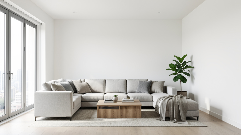
The Living Room: Cultivating Connection and Comfort
The living room thrives on texture—it’s a space for gathering and retreat. Goal: create zones that feel welcoming from afar and rewarding up close.
Layering approach:
1. Floor (anchor): Select a rug with intentional texture. For high-traffic zones, a durable flat-weave dhurrie offers subtle pattern. For intimate corners, a medium-pile wool rug adds softness. Tip: Layer rugs—a neutral sisal base with a smaller textured vintage piece—to define seating areas and add instant depth.
2. Seating (connector): Upholstery is a texture opportunity. Bouclé offers organic softness; corduroy brings nostalgic warmth; performance velvet provides subtle luster. If furniture is smooth (leather, tight-weave fabric), introduce texture through throws and cushions.
3. Walls and surfaces (detail): Move beyond flat paint. Limewash offers soft variation; Venetian plaster provides luminous depth; grasscloth wallpaper adds organic rhythm. On shelves, mix materials: rough wood bookends beside smooth glass vessels.
4. Lighting as texture: Fixtures contribute significantly. A rattan pendant casts intricate shadows; a matte metal floor lamp adds linear interest. At dusk, these elements become focal points.
Style-sensitive adaptations:
– Minimalist: Limit textures thoughtfully. Example: Smooth microcement floor (anchor), linear oak coffee table (connector), nubby wool throw (detail). Rhythm via repeated oak tones.
– Bohemian: Embrace layered abundance. Kilim rugs, macramé hangings, fringed pillows, hammered metal trays. Use rhythm through repeated earthy material families.
– Modern Farmhouse: Balance rough and refined. Shiplap walls (medium vertical texture) against a smooth leather sofa. Rhythm via repeated black metal accents in lighting and hardware.
Compact-space consideration: In smaller footprints, use texture to enhance perceived space. Light-reflective finishes (matte surfaces that diffuse light) brighten interiors. Vertical textures (floor-to-ceiling shelves with varied book spines) draw the eye upward. Avoid dense, light-absorbing textures that may feel heavy.
The Bedroom: Sanctuary Through Sensory Thoughtfulness
The bedroom benefits deeply from texture—it shapes how we feel upon waking and winding down. Prioritize surfaces encountered through touch: bedding, floors, walls.
Bedding as a texture study:
– Base layer (fine): High-thread-count percale or linen sheets—smooth against skin, supporting comfort.
– Mid layer (medium): A textured duvet cover—waffle weave for breathability, brushed cotton for softness.
– Top layer (accent): A chunky knit blanket or textured throw at the foot of the bed. This invites interaction and adds visual weight.
– Pillows: Mix sham textures—linen for relaxed texture, silk for cool smoothness, velvet for depth. Vary sizes to create visual rhythm.
Beyond the bed:
– Headboard zone: Upholstered in ribbed fabric or bouclé adds immediate texture. A DIY alternative: attach reclaimed wood planks to the wall (ensure secure mounting).
– Nightstands: Choose materials that contrast gently with the bed frame. A smooth metal bed pairs well with a wood-grain nightstand.
– Flooring: Beside the bed, a small textured rug (sheepskin alternative, woven cotton) offers warmth underfoot upon waking.
– Walls: Consider subtle texture above the bed—a woven textile art piece, framed fabric swatches, or a grasscloth accent panel.
Well-being note: Principles of biophilic design suggest that incorporating natural textures—wood, stone, linen—can support a sense of calm. Including three or more natural material references may enhance the room’s restorative quality.
Budget-conscious pathway:
– Under $50: Swap smooth pillowcases for linen; add a textured pillow cover.
– Under $150: Layer a textured bedspread; place a jute or sisal rug beside the bed.
– Long-term investment: A quality wool rug develops character over time, offering enduring value and evolving patina.
The Kitchen: Infusing Warmth into Functional Spaces
Kitchens often lean toward smooth, uniform surfaces. Thoughtful texture adds warmth while supporting function—improving grip, durability, and sensory appeal.
Strategic texture zones:
1. Backsplash (connector focal point): Explore beyond standard tile.
– Zellige-style tile: Hand-formed ceramics with gentle irregularities that interact beautifully with light.
– Textured ceramic: Embossed patterns (geometric, organic) create shadow play.
– Thin brick veneer: For rustic character (ensure proper sealing for splash zones).
2. Cabinetry:
– Painted finishes: Matte paints reveal subtle brushwork; visible wood grain adds organic detail.
– Open shelving: Display dishes with varied surfaces—matte stoneware, glossy ceramics, woven baskets for produce.
3. Countertops and islands:
– Concrete: Offers cool smoothness with subtle aggregate texture (requires sealing).
– Butcher block: Warm wood grain invites use; maintain with food-safe oil.
– Leathered stone: Honed finish with tactile, non-slip quality—ideal for active zones.
4. Flooring:
– Cork: Soft underfoot, naturally textured, and sustainable.
– Textured porcelain: Mimics wood or stone with added slip resistance.
Practical considerations:
– Cleanability: In high-splash areas, avoid deeply creviced textures that trap residue. Opt for smooth-but-not-glossy finishes.
– Safety: Textured flooring enhances slip resistance. Prioritize slight grip textures near sinks and stoves.
– Rhythm tip: Echo your backsplash texture in a small detail elsewhere—a matching soap dish, trivet, or utensil holder.
Transformation example: A kitchen with uniform white surfaces can feel sterile. Introducing: matte-finish cabinets showing wood grain, zellige-style backsplash in warm white, cork flooring with subtle pattern, and open shelves displaying handmade pottery. Outcome: A space that feels warm, human-scaled, and inviting for daily rituals.
The Bathroom: Elevating Utility into Sanctuary
Texture transforms the bathroom from purely functional to deeply restorative. Moisture resistance remains essential, yet many textured materials thrive here with proper selection.
Moisture-appropriate texture materials:
– Walls:
– Textured tile: Pebble mosaics for shower floors (providing gentle foot massage); ribbed ceramics for walls.
– Sealed plaster: Properly sealed Venetian plaster withstands humidity while offering luminous depth.
– Teak accents: For shower benches or wall niches—naturally water-resistant, developing a soft silver patina over time.
– Floors:
– Textured porcelain: Realistically mimics wood or stone without warping risk.
– Small mosaic tiles: Create non-slip surfaces with visual interest.
– Accessories:
– Bath mats: Memory foam with chenille top or sustainably sourced bamboo fiber.
– Towels: Loop-textured Turkish cotton for absorbency and tactile appeal.
– Storage: Woven seagrass or bamboo baskets for toiletries add organic warmth.
Creating a sensory sequence:
1. Entry: Smooth tile transitions to a textured bath mat.
2. Vanity: Matte-finish cabinetry contrasts with a smooth vessel sink.
3. Shower: Pebble floor underfoot, smooth teak bench for resting.
4. Details: Ribbed ceramic soap dispenser, hammered metal accessories.
Compact-bathroom strategy: Use large-format tiles with subtle texture (matte finish with faint veining) to avoid visual fragmentation. Introduce texture through accessories—replace smooth organizers with woven baskets or ceramic trays. A textured mirror frame (reclaimed wood, rattan) adds interest without consuming space.
Thoughtful investment:
– Focus investment: One meaningful textured element—like a hand-glazed ceramic sink.
– Budget enhancement: Moisture-resistant textured wallpaper on a vanity accent wall (verify product suitability).
– DIY note: For moisture-prone projects like bath mats, ensure materials are properly sealed; when uncertain, consult a professional.
The Dining Room: Setting a Tactile Table for Connection
Texture in the dining area shapes ambiance—from casual warmth to refined elegance. It enhances the sensory experience of shared meals.
Tabletop texture layering:
– Table covering: Linen for relaxed texture; smooth cotton sateen for formal occasions.
– Placemats: Woven rattan for warm months; felted wool for cooler seasons.
– Dinnerware: Combine matte stoneware plates with glossy ceramic bowls. Hammered metal flatware adds subtle tactile interest.
– Centerpiece: A rough wooden bowl holding smooth river stones; a smooth vase with dried pampas grass (soft, feathery texture).
Furniture and surroundings:
– Table: Live-edge wood showcases natural grain (large-scale texture). For contemporary spaces, a smooth concrete table with subtle aggregate.
– Chairs: Textured fabric seats (velvet, bouclé) contrast with smooth wood or metal frames.
– Lighting: A woven pendant casts dappled light patterns—functional texture that shapes mood.
– Walls: Textured wallcovering behind the buffet (e.g., grasscloth) adds depth without overwhelming.
Style-aligned suggestions:
– Farmhouse: Rough-hewn trestle table, chairs with woven seats, burlap runner.
– Mid-Century Modern: Smooth teak table, molded chairs with wool pads, geometric textured rug.
– Coastal: Driftwood centerpiece, rope-wrapped vase, sisal rug underfoot.
Insight from practice: In hospitality settings, thoughtfully textured table settings often enhance the perceived value of a meal. At home, a simple dinner feels elevated when served on handmade pottery with linen napkins—a small gesture with meaningful impact.
Home Office: Supporting Focus Through Sensory Balance
Workspaces benefit from intentional texture—it can reduce visual fatigue, inspire creativity, and improve comfort during extended use.
Ergonomic texture considerations:
– Desk surface: Smooth bamboo reduces wrist friction; a leather or cork desk pad adds writing comfort.
– Chair: Breathable mesh back (textured for airflow) with a smooth fabric seat.
– Flooring: A low-pile textured rug defines the workspace and absorbs ambient sound.
Inspiration zones:
– Wall behind desk: Corkboard offers subtle texture and function; a woven textile art piece provides visual calm.
– Shelving: Display books with varied spine textures (cloth, paper, leather). Include small textured objects: a smooth stone paperweight, a ceramic pen holder.
– Lighting: A fabric-shaded lamp diffuses light softly; avoid glossy shades that cause screen glare.
Biophilic integration: Incorporate natural textures associated with calm:
– A small wood desk organizer.
– A ceramic mug for tools.
– A sustainably sourced wood slice as a monitor riser.
Minimalist office example:
– Walls: Smooth matte paint.
– Desk: Light oak with visible grain.
– Chair: Black mesh.
– Accents: One intentional textured element—a woven seagrass wastebasket. Rhythm via repeated oak in shelf and frame. Result: Clean, focused, yet warmly human.
Entryway: Crafting a Welcoming First Impression
The entryway offers a brief but powerful sensory introduction to your home. Texture here sets an immediate tone of welcome and intention.
Layering in compact zones:
– Floor: A durable textured mat (coir for scraping, patterned rubber for grip) just inside the door.
– Seating or console: A wood-grain bench invites pausing to remove shoes; contrast with smooth metal hooks above.
– Walls: A textured wallcovering in a small powder area adds quiet luxury. A woven wall hanging offers visual interest without bulk.
– Accessories: A ceramic bowl for keys (smooth exterior, textured interior), a chunky knit basket for scarves.
Functional texture considerations:
– Durability: Choose textures that gracefully age—textured tiles mask minor scuffs; nubby fabrics conceal everyday wear.
– Lighting: A matte-finish sconce with a fabric shade creates a warm glow.
– Mirror: Frame in rattan or reclaimed wood to add texture without consuming visual space.
Compact-entry solution: In narrow spaces, vertical texture draws the eye upward. A slatted wood wall panel (medium scale), a sisal runner rug, and a live-edge wood console create layered warmth. Outcome: A space that feels intentionally welcoming, not merely transitional.
Beyond the Basics: Nuanced Texture Layering Approaches
With foundational understanding, explore these refined strategies to deepen your practice.
Texture Layering Across Design Styles
Each style carries a distinct textural signature. Aligning choices supports coherence and avoids unintended dissonance.
- Scandinavian/Hygge: Emphasize natural, soft textures. Light wood grain, chunky knit wool, sheepskin alternatives, matte ceramics. Minimize high-gloss or cold-feeling surfaces. Rhythm through repeated light wood tones.
- Industrial: Honor raw, unfinished qualities. Exposed brick (where appropriate), polished concrete, weathered metal, distressed leather. Contrast smooth metal elements with rough wood beams.
- Japanese Wabi-Sabi: Celebrate imperfection and transience. Hand-thrown pottery with organic glaze variation, unfinished wood with visible knots, washi paper screens. Contrast smooth stone with rough clay.
- Maximalist: Layer abundantly yet intentionally. Vintage textiles (embroidered, fringed), textured wallpapers, curated collections with varied surfaces. Use rhythm—repeating a material tone (like terracotta) across different textures—to unify complexity.
- Coastal: Evoke natural elements. Smooth sea glass, weathered driftwood, slubby linen, rope details. Balance cool smooth textures (glass, ceramic) with warm rough ones (jute, rattan).
Style fusion insight: Blend styles by merging their texture languages. Japandi (Scandinavian-Japanese) combines light wood simplicity (Scandi) with washi paper and unglazed ceramics (Japanese). The unifying thread? Natural, muted textures that honor material honesty.
Seasonal Texture Transitions
Allow your home’s texture palette to evolve with the seasons, supporting well-being and reflecting the world outside.
- Spring: Introduce light, airy textures. Swap heavy throws for linen; replace dark wood bowls with light rattan baskets; add fresh greenery (smooth leaves against rough pottery).
- Summer: Emphasize cool, smooth surfaces. Glass vases, smooth stone coasters, light cotton bedding. Incorporate water elements—a small fountain with a textured stone basin.
- Autumn: Welcome warm, cozy textures. Layer chunky knit blankets, textured wool pillows, rough-hewn wood trays. Use earthy materials: terracotta, unglazed ceramics.
- Winter: Deepen softness and shadow play. Pile on textured throws, velvet cushions, heavy woven curtains. Candlelight enhances texture depth—rough plaster walls glow warmly.
Practical system: Store off-season textiles in labeled containers. Rotate four key items per room seasonally (throw, pillow covers, table runner, small rug). This maintains freshness without constant redecorating.
Texture Strategy for Space Size
Adapt your approach to your home’s scale.
Compact spaces (under 800 sq ft):
– Goal: Enhance perceived space and avoid visual clutter.
– Approach: Use light-diffusing textures (matte finishes that soften light) to brighten. Prioritize vertical textures (floor-to-ceiling shelves with varied books) to draw eyes upward. Limit large-scale textures to one intentional anchor per room.
– Example: Studio apartment: Smooth matte walls (fine), vertical shiplap accent (medium), small textured rug (anchor). Rhythm via repeated light wood in furniture.
Expansive spaces (open-plan, high ceilings):
– Goal: Add coziness and define functional zones.
– Approach: Embrace large-scale textures to ground the space—textured fireplace surround, beam details. Use area rugs with pronounced texture to delineate living, dining, and work zones. Repeat textures across zones for cohesion (e.g., consistent wood tone in kitchen island and dining table).
– Example: Great room: Textured concrete fireplace (anchor), sisal area rug under seating (connector), bouclé sofa (connector), linen curtains (detail). Rhythm via repeated black metal in lighting and furniture legs.
Pro tip for large areas: Create “texture vignettes”—small grouped arrangements of contrasting textures (smooth ceramic lamp on rough wood side table with a nubby coaster). These intimate moments make vast spaces feel human-scaled and inviting.
Budget-Conscious Texture Layering
Meaningful texture layering is accessible at every budget level. Focus on intention over expense.
Under $25 per item:
– Thrifted treasures: Woven baskets, vintage wool blankets, ceramic pottery.
– DIY texture: Frame fabric swatches for a gallery wall; create a simple macramé plant hanger.
– Textile swaps: Replace smooth pillowcases with linen; use a chunky knit scarf as a throw.
$25–$100 per item:
– Textured rugs: Jute, sisal, or flat-weave options.
– Upholstery updates: Slipcovers in bouclé or corduroy fabric.
– Wall treatments: Peel-and-stick grasscloth wallpaper (verify suitability for your wall type); frame textured tile samples as art.
$100–$500 per item:
– Statement pieces: A bouclé accent chair, a live-edge wood stool.
– Custom textiles: Tailored linen curtains, a hand-finished wool pillow.
– Lighting: A rattan pendant, a ceramic table lamp.
Long-term value investments:
– Hardwood floors with visible grain (enduring beauty).
– Quality wool rug (develops character with age).
– Professional plaster wall finish (timeless, repairable).
Budget layering approach:
1. Anchor: One larger textured item (e.g., rug) from mid-range budget.
2. Connectors: 2–3 medium items from thrift/DIY sources (baskets, throws).
3. Details: Several fine-scale items from low budget (pillow covers, small ceramics).
This layered strategy creates perceived richness that exceeds the sum of its parts. Note: Prices vary by region and time; use as illustrative guidance.
Addressing Common Texture Layering Considerations
Even experienced designers encounter texture challenges. Here’s how to navigate frequent scenarios.
Consideration 1: Texture Overwhelm
– Signs: Space feels busy, chaotic, or visually fatiguing.
– Insight: Too many competing textures without clear hierarchy or rhythm.
– Approach: Apply a loose 60-30-10 guideline. Step back. Does the room feel calmer? Reintroduce only textures that clearly serve scale, contrast, or rhythm. Remove items that don’t contribute meaningfully.
Consideration 2: The Under-Textured Room
– Signs: Space feels sterile, impersonal, or hotel-like despite neutral colors.
– Insight: Lack of scale variation and contrast. All textures are fine-scale and similar.
– Approach: Introduce one large-scale texture (e.g., textured wall treatment) and one intentional contrast pairing (e.g., smooth lamp on rough wood table). Then layer fine-scale details thoughtfully.
Consideration 3: Neglecting Tactile Experience
– Signs: Room photographs well but feels cold or unwelcoming in person.
– Insight: Focus on visual texture alone, overlooking how surfaces feel to touch.
– Approach: Conduct a “touch audit.” Sit in the space. What do your hands and feet contact? Add soft textiles where skin meets surfaces (chair arms, sofa), warm materials underfoot (rug), and inviting textures (wooden armrests).
Consideration 4: Lighting and Texture Interaction
– Signs: Textures appear flat at certain times of day.
– Insight: Lighting doesn’t accentuate texture. Overhead lights can flatten surfaces; directional light reveals depth.
– Approach: Add adjustable task lighting. Position a floor lamp to graze a textured wall; use picture lights to highlight woven art. In evening, warm bulbs (2700K–3000K) enhance the coziness of soft textures.
Scenario refinement: A living area with smooth white walls, polished floors, leather sofa, and glass table may feel cool.
– Insight: Minimal texture variation; predominantly fine-scale and smooth surfaces.
– Refinement:
1. Add a medium-pile textured wool rug.
2. Replace glass table with a wood-grain surface (creating contrast with leather).
3. Introduce a woven pendant light (rhythm: echo rattan in a small shelf basket).
– Outcome: The space gains warmth and layered interest. Investment remains modest, focused on intentional change.
Your Questions, Answered
Q: Can texture layering work in a strictly minimalist space with very few objects?
A: Yes—and it becomes especially important. Minimalism relies on texture to prevent sterility. With fewer objects, each texture must carry intention. Focus on architectural elements: a plaster wall with subtle variation, wide-plank floors with visible grain, a single sculptural ceramic piece. Quality and placement matter more than quantity. Thoughtful texture ensures minimalism feels warm, not stark.
Q: How do I layer textures in a rental where I can’t change walls or floors?
A: Focus on portable, reversible layers. Begin with textiles: a textured area rug (use rug grippers), throws with varied weaves, pillow covers in bouclé, linen, or velvet. Add freestanding elements: a woven room divider, a live-edge wood stool, a macramé wall hanging (use removable hooks rated for the item’s weight). For walls, lean large textured art against the wall. Even small shifts—replacing smooth organizers with woven baskets—create meaningful impact. Always verify lease guidelines first.
Q: Are there textures that should never be mixed?
A: Design rarely has absolute rules—context and intent matter most. However, consider harmony:
– Potential mismatch: High-gloss vinyl flooring with rough, unfinished concrete walls may feel stylistically disjointed (one suggests polished modernity, the other raw industrial).
– Another example: Delicate silk pillows on a rough burlap sofa may feel uncomfortable and narratively inconsistent.
Instead, seek textures that share a story. Rough textures often harmonize with other natural materials (wood, stone, linen); smooth textures align with refined elements (metal, glass, polished stone). When bridging extremes, introduce a transitional texture—a medium-scale woven throw can soften the transition.
Q: How does lighting affect the perception of texture?
A: Lighting fundamentally shapes how texture is experienced. Directional light (window light, adjustable spots) casts shadows that reveal depth. A rough plaster wall lit from the side shows dramatic ridges; the same wall under flat overhead light appears smooth. For best results:
– Use adjustable track lighting or picture lights to graze textured walls.
– Position floor lamps to cast upward shadows on architectural details.
– In evening, warm bulbs (2700K–3000K) enhance the coziness of soft textures; cooler bulbs (3500K–4000K) can sharpen definition of hard textures.
Evaluate textures at different times of day and under artificial light before finalizing choices.
Q: Can texture layering make a small, dark room feel larger?
A: Yes, with strategic choices. Avoid heavy, light-absorbing textures (deep-pile rugs, dark velvet) that can diminish space. Instead:
– Use light-diffusing textures: matte finishes that soften light (limewash paint), subtle sheens (silk pillows), or reflective accents (ceramic vase).
– Emphasize vertical textures: floor-to-ceiling bookshelves with varied book spines draw the eye upward, suggesting height.
– Limit large-scale textures to one subtle accent wall (e.g., grasscloth) to add depth without overwhelming.
– Incorporate mirrors with textured frames to reflect light and add visual interest without physical bulk.
Q: How do I maintain textured surfaces, especially higher-maintenance ones like plaster or bouclé?
A: Care varies by material; prevention supports longevity:
– Plaster walls: Dust gently with a soft microfiber cloth. For stains, consult a professional—DIY repairs may cause further damage. Proper sealing during installation is crucial for moisture resistance.
– Bouclé fabric: Vacuum weekly with an upholstery attachment on low suction; avoid vigorous rubbing. Address spills immediately with a mild soap solution. Fabric protector spray may help in high-use areas (test in inconspicuous area first).
– Natural fiber rugs (jute, sisal): Shake out regularly; spot clean with dry-cleaning solvent. Avoid wet cleaning, which can cause shrinkage or discoloration.
– General guidance: Research care requirements before purchasing. For cherished items, professional cleaning is often worthwhile. When durability is a priority, explore performance fabrics designed to mimic texture while offering easy care.
Q: Is there a difference between visual texture and tactile texture, and does it matter?
A: Yes, and recognizing this distinction deepens your layering:
– Visual texture is perceived by the eye but not necessarily felt (e.g., a photograph of stone, printed fabric mimicking linen). It adds depth from a distance.
– Tactile texture is physically experienced (actual stone, real linen). It engages touch and fosters emotional connection.
In monochromatic design, prioritize tactile texture for surfaces you interact with (seating, bedding, floors). Use visual texture for distant elements (artwork, large wall treatments). The most resonant spaces thoughtfully combine both—a tactile bouclé sofa (felt up close) against a wall with visual texture from grasscloth wallpaper (seen across the room).
Q: How can I use texture to define zones in an open-concept space without walls?
A: Texture is an elegant zoning tool. Assign distinct but harmonious texture palettes to each zone:
– Living area: Soft, inviting textures (plush rug, bouclé sofa).
– Dining area: Smooth, clean textures (wood table, upholstered chairs).
– Kitchen: Durable, functional textures (textured backsplash, cork flooring).
Use area rugs with different textures to anchor each zone visually. Repeat one texture across zones for cohesion (e.g., oak wood tones in dining table and living room shelf). Lighting also supports zoning—a woven pendant over the dining table distinguishes it visually.
Q: What are thoughtful texture choices for homes with pets or children?
A: Prioritize durability and ease of care without sacrificing warmth:
– Rugs: Low-pile wool (naturally stain-resistant) or indoor/outdoor polypropylene (wipeable). Avoid deep-pile rugs that trap hair.
– Upholstery: Performance velvet (repels liquids, hides pet hair) or tightly woven canvas. Avoid delicate silks or loose weaves.
– Fabrics: Crypton®-treated or similar performance fabrics offer spill resistance with texture options like linen-look weaves.
– Floors: Textured porcelain tile (mimics wood, withstands scratches) or luxury vinyl plank with embossed grain.
Test fabric swatches with pet hair if possible—some textures show lint less than others. Medium to dark neutrals (charcoal, taupe) often hide everyday wear more gracefully than pure white.
Q: Can texture layering influence how a room feels temperature-wise?
A: Indirectly, through psychological and sensory association:
– Cooling association: Smooth, hard surfaces (stone, tile, glass) feel cooler to the touch and visually suggest refreshment. Helpful in sunrooms or south-facing rooms.
– Warming association: Soft, fibrous surfaces (wool, textured knits, heavy weaves) evoke coziness and visual warmth. Ideal for north-facing rooms or bedrooms.
While texture won’t alter actual room temperature, it influences human comfort perception. Pair with practical solutions: textured wool rugs over cool floors in winter; smooth tile floors in warm climates. Layer thoughtfully with seasonal needs.
Q: How do I know when I’ve added “enough” texture?
A: Trust these observational cues:
– The distance test: Stand 10 feet away. Can you identify at least three distinct textures? If yes, hierarchy is likely working.
– The touch test: Sit quietly in the room. Do surfaces invite gentle interaction? (e.g., you notice the weave of a throw, the grain of wood).
– The rest test: Does your eye find comfortable places to pause without feeling overwhelmed or underwhelmed?
– The intention test: Can you articulate why each texture is present? (e.g., “The jute rug grounds the space; the silk pillow introduces contrast.”)
When uncertain, step away for 24 hours. Return with fresh eyes—you’ll often instantly sense balance or imbalance.
Q: Are there cultural considerations when selecting textures?
A: Yes. Texture carries cultural significance and history. For example:
– In Japanese aesthetics, unfinished wood and paper textures honor wabi-sabi (beauty in imperfection and transience).
– In Moroccan design, intricate zellige tilework reflects centuries of artisanal tradition.
– In Scandinavian contexts, light wood and wool textures support hygge (coziness and presence).
When incorporating textures rooted in cultures outside your own, approach with respect and curiosity. Research their significance. Focus on appreciation over appropriation: choose textures that resonate with your personal story, support artisans ethically, or collaborate with cultural consultants when appropriate. Universally appreciated natural textures (wood, stone, linen) often provide a grounded starting point.
Conclusion and Next Step
Texture layering is a gentle yet powerful practice—a language of comfort, intention, and human connection. By engaging with the Tactile Triad of Scale, Contrast, and Rhythm, you gain a flexible framework for transforming any monochromatic space into one that feels layered, alive, and deeply personal. Remember: depth emerges not from color, but from the interplay of light across a plaster wall’s gentle ridges; the satisfying weight of a hand-formed ceramic mug; the quiet invitation of a woven textile under bare feet. These details accumulate into an environment that feels less like a backdrop and more like a sanctuary—crafted with care, experienced through the senses.
Recap: Three Guiding Principles
- Scale establishes hierarchy—anchor with large-scale textures, connect with medium, and delight with fine details.
- Contrast creates engagement—thoughtfully pair opposites (rough/smooth, matte/glossy) to highlight each texture’s character.
- Rhythm builds cohesion—repeat, progress, and alternate textures to guide the eye and tell a unified story.
The 24-Hour Invitation: One Small Step
Within the next day, complete this simple action: Identify one surface in your home that feels visually flat (a smooth wall section, a plain sofa, a bare floor corner) and introduce one new texture to it. It might be draping a woven blanket over a chair, placing a textured basket by the entry, or swapping a smooth vase for a ribbed ceramic one. No overthinking required. This small act breaks inertia and demonstrates that texture layering is accessible, immediate, and deeply personal. Notice how this subtle shift alters the room’s feeling—and your own connection to it.
The Evolving Practice: Texture as a Lifelong Companion
Your relationship with texture will naturally evolve. Seasons change, life circumstances shift, and your understanding of what “feels like home” deepens. Return to this framework not as a rigid rulebook, but as a compassionate guide. Collect textures that carry meaning: a seashell from a memorable walk, a quilt passed through generations, a pot crafted by a local artisan. In a world of mass production, these tactile moments become quiet acts of mindfulness. They slow us down, engage our senses, and remind us that beauty often resides in the details we can touch. Begin gently, layer with intention, and witness how your home transforms into a sanctuary of depth—without a single drop of color.
Explore Our Complete System:
The Science of Spatial Harmony: Arranging Furniture for Flow and Function | Material Matters: A Deep Dive into Sustainable Home Finishes | The Neutral Palette Decoded: Choosing Whites, Grays, and Earth Tones with Confidence | Lighting Layers: How to Sculpt Space with Ambient, Task, and Accent Light | Biophilic Design at Home: Integrating Nature for Well-Being | The Art of Display: Curating Shelves and Surfaces with Intention | Seasonal Home Transitions: A Room-by-Room Guide to Welcoming Each Season